alcohol packaging design
Alcohol Packaging Design: Creating Memorable and Premium Brands
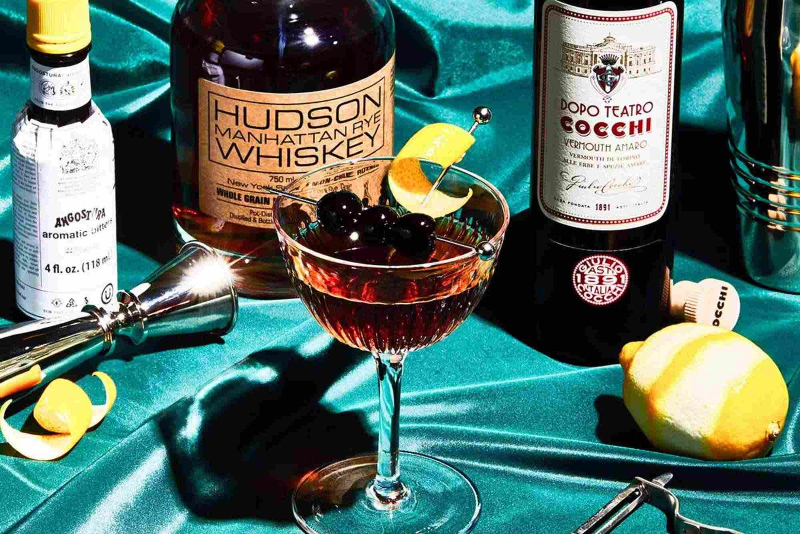
Alcohol packaging design plays a major role in how consumers perceive a drink before they taste it. A bottle can contain an excellent product, yet poor packaging may prevent customers from noticing it. In contrast, thoughtful packaging can communicate quality, personality and value within seconds.
Today, alcohol brands compete across crowded retail shelves, online shops and hospitality venues. Therefore, packaging needs to do more than protect the product. It should tell a story, create recognition and encourage customers to choose one bottle over another.
Effective alcohol packaging design combines visual appeal with practical performance. Typography, colour, bottle shape, labels, materials and finishing details must work together. At the same time, the packaging should reflect the brand’s positioning and target audience.
Why Alcohol Packaging Design Matters
The first impression of a product is often created by its packaging. Consumers may see dozens of bottles before finding one that attracts their attention. Consequently, strong alcohol packaging design can become an important competitive advantage.
Packaging communicates information without requiring a conversation. A premium whisky may use restrained typography and textured materials. A modern gin brand might use vivid colours and distinctive illustrations. Meanwhile, a craft beer can use playful graphics to express its personality.
Good design also supports brand recognition. When customers repeatedly see consistent colours, typography and visual elements, they begin associating those features with the brand.

Packaging can also influence perceived value. A carefully designed bottle may make a product feel more exclusive. This perception can support premium pricing when the product quality matches the presentation.
Understanding Your Brand Before Designing Packaging
Successful alcohol packaging design begins with the brand rather than the artwork. Designers need to understand what the product represents and whom it serves.
A luxury spirit requires a different visual approach from an affordable social drink. Similarly, packaging for an established heritage brand should not necessarily resemble packaging for a young craft producer.
Before beginning the creative process, consider the brand’s personality. Is it sophisticated, adventurous, traditional, rebellious or contemporary? The answer should influence every major design decision.
The target customer also matters. Packaging should appeal to the people most likely to purchase the product. Their expectations, purchasing habits and visual preferences can influence the final direction.
Choosing the Right Bottle Shape
Bottle shape is one of the strongest elements of alcohol packaging design. Consumers can often recognise a distinctive bottle from a distance.
A unique silhouette can create an immediate visual identity. However, unusual shapes should still be practical for manufacturing, transportation and storage.
The bottle should also feel comfortable when handled. Weight, balance and grip influence the physical experience of the product.
For premium products, heavier glass can sometimes create a stronger perception of quality. However, brands should consider sustainability and shipping costs before choosing heavier materials.
Designing Labels That Communicate Clearly
Labels provide an important communication area on alcohol packaging. They must look attractive while presenting essential information clearly.
Typography should match the brand personality. Serif fonts can create a traditional or sophisticated appearance. Sans-serif typography often feels cleaner and more contemporary.
Hierarchy is equally important. The brand name should usually be easy to identify. Product type, variant and other important information should follow a logical visual order.
Avoid filling the label with unnecessary decoration. A crowded design can make even an expensive product appear confusing.
Good alcohol packaging design creates visual balance. Every element should have a purpose and contribute to the overall message.
The Psychology of Colour in Packaging
Colour can influence how consumers interpret a product. Therefore, selecting colours should involve more than personal preference.
Dark tones can suggest sophistication, strength or luxury. Bright colours may communicate energy, creativity or accessibility. Metallic finishes can create a premium impression when used carefully.
Colour can also improve product differentiation. If competing products use similar dark labels, a carefully chosen contrasting colour may help a brand stand out.
However, colour meanings can vary between markets and cultures. International brands should consider local expectations before finalising their palettes.
Materials and Finishes That Add Value
Material selection can significantly influence the tactile experience of alcohol packaging design. Consumers often judge quality through both sight and touch.
Textured papers can create a handcrafted impression. Embossing can add depth to logos and lettering. Foil details can introduce a refined appearance.
Special coatings can also protect labels from moisture and handling. This is particularly useful for products stored in chilled environments.
Brands should avoid using finishing techniques simply because they look expensive. Every detail should support the product’s positioning and story.
Sustainable materials are becoming increasingly important. Recyclable glass, responsibly sourced paper and reduced plastic components can support environmental goals.
The Role of Custom Packaging
Custom Packaging gives alcohol brands greater control over the customer experience. Instead of relying on generic boxes or standard containers, brands can create packaging that reflects their unique identity.
Custom solutions can include specially shaped cartons, printed inserts, premium closures and tailored protective structures. These elements can make opening the product feel more memorable.
For gift-oriented spirits, custom packaging can also improve presentation. Customers may be willing to pay more when packaging feels suitable for gifting or special occasions.
However, customisation should balance creativity with production requirements. Complex structures can increase costs and create manufacturing challenges.
Creating Packaging for Different Alcohol Categories
Different alcohol categories often have different visual conventions. Understanding these conventions helps designers create appropriate packaging.
Whisky and Premium Spirits
Whisky packaging often benefits from heritage-inspired design. Strong typography, dark palettes, textured papers and detailed illustrations can communicate craftsmanship.
At the same time, modern whisky brands can challenge traditional conventions. Minimalist designs can appeal to younger consumers seeking contemporary products.
Gin Packaging
Gin packaging frequently uses botanical illustrations, distinctive colours and elegant typography. Because the category is highly competitive, unique visual identity can be especially valuable.
A successful gin bottle should communicate its flavour profile or brand personality without becoming visually overwhelming.
Beer Packaging
Beer packaging generally needs to communicate flavour, style and brand character quickly. Craft beer brands often use expressive illustrations and unusual typography.
The design should remain recognisable across cans, bottles, multipacks and promotional materials.
Wine Packaging
Wine labels often rely on storytelling and tradition. Typography, illustrations and paper quality can communicate the wine’s origin and positioning.
Minimalist wine labels can also work effectively when the brand wants to convey modern sophistication.
Making Packaging Work Across Digital Channels
Modern alcohol packaging design must work beyond physical shelves. Product images are increasingly viewed on websites, marketplaces and social media.
A design that looks impressive in person should remain recognisable in a small digital image. The brand name and key visual elements need sufficient contrast and clarity.
Photography should also capture important packaging details. Texture, embossing and special finishes can become powerful content when photographed correctly.
Digital consistency helps customers recognise products across multiple channels. The same visual identity should appear on the bottle, website, advertisements and social profiles.
Sustainability in Alcohol Packaging Design
Environmental considerations are changing packaging decisions across the alcohol industry. Customers increasingly notice unnecessary packaging and excessive material use.
Designers can reduce environmental impact through lightweight glass, recyclable paper and simplified structures. Removing unnecessary components can also reduce production and shipping costs.
Sustainability should be considered from the beginning rather than added after the design is complete.
A practical approach is to evaluate the entire packaging journey. Consider sourcing, manufacturing, transportation, storage, consumer use and disposal.
Common Alcohol Packaging Design Mistakes
One common mistake is prioritising appearance over usability. A beautiful package becomes ineffective if customers struggle to open, hold or store it.
Another problem is weak brand visibility. Excessive decoration can hide the product name and make the bottle difficult to identify.
Inconsistent branding can also reduce recognition. Colours, typography and visual elements should work together across product ranges.
Ignoring production limitations creates another challenge. A design may look excellent on screen but become expensive or impractical during manufacturing.
Finally, copying competitors can weaken differentiation. Research should identify category conventions, but the final design should establish a distinctive identity.
How to Improve Alcohol Packaging Design
Strong packaging usually develops through research, experimentation and testing. Begin by studying competing products and identifying opportunities for differentiation.
Create several design directions rather than immediately choosing one concept. Compare them against the brand’s positioning and target customer.
Physical prototypes are particularly valuable. A label can look different when wrapped around a curved bottle. Similarly, a carton may feel different when held in the hand.
Test the packaging under realistic conditions. Check readability, durability, shelf visibility and handling.
Gather feedback from people who match the target market. Their reactions can reveal problems that designers may overlook.
Packaging Design Tips for Better Results
Good packaging should communicate quickly. Customers should understand the product’s identity without studying every detail.
Using consistent visual elements across a product range can strengthen recognition. At the same time, individual variants can use subtle differences to remain distinctive.
Think about shelf distance as well. Important information should remain visible when the product is viewed from several metres away.
The phrase packaging design tips covers many practical decisions, but the most important principle is simple: every design choice should support the brand and customer.
Comparing Key Packaging Elements
| Packaging Element | Main Purpose | Design Consideration | Potential Benefit |
|---|---|---|---|
| Bottle Shape | Product recognition | Distinctive but practical form | Strong shelf identity |
| Label | Brand communication | Clear hierarchy and typography | Faster recognition |
| Colour | Emotional positioning | Match brand personality | Visual differentiation |
| Materials | Tactile experience | Quality and sustainability | Enhanced perceived value |
| Closure | Function and appearance | Easy to use and secure | Better user experience |
| Carton | Protection and presentation | Structural and visual consistency | Premium presentation |
| Finishes | Visual enhancement | Use selectively | Greater shelf appeal |
What Is the Future of Alcohol Packaging Design?
The future of alcohol packaging design will likely combine creativity, sustainability and technology. Brands are increasingly looking for packaging that feels distinctive without creating unnecessary environmental impact.
Digital technologies may also create new interactions. Smart labels, QR experiences and augmented content can connect physical packaging with digital brand experiences.
Personalisation may become another important area. Limited editions and targeted packaging can help brands create stronger connections with specific audiences.
However, technology should support the product rather than distract from it. The strongest packaging will continue to balance function, storytelling and visual appeal.
Frequently Asked Questions About Alcohol Packaging Design
What makes good alcohol packaging design?
Good alcohol packaging design combines attractive visuals, clear communication, practical functionality and strong brand identity. It should stand out while remaining appropriate for the target market.
How much does alcohol packaging design cost?
Costs vary according to the complexity of the design, materials, printing methods and packaging structure. Custom bottles and specialised finishes generally require larger budgets.
Why is packaging important for alcohol brands?
Packaging creates the first physical impression of a product. It can communicate quality, differentiate the brand and influence purchasing decisions.
What colours work best for alcohol packaging?
There is no universal colour choice. The best palette depends on the product category, positioning, audience and competitive environment.
How can I make my alcohol packaging more sustainable?
Consider recyclable materials, lightweight components and reduced packaging. Also review production and transportation requirements before finalising the design.
What are the most important packaging design tips?
Prioritise brand recognition, readability, shelf visibility, usability and consistency. Always test physical prototypes before committing to large production runs.
Conclusion
Alcohol packaging design is much more than decoration. It combines branding, psychology, functionality and storytelling to create a complete product experience.
The strongest designs make products recognisable while communicating their value quickly. They also consider practical requirements such as durability, production costs and sustainability.
Whether you are launching a new spirit or refreshing an established product, thoughtful packaging can create a powerful competitive advantage. Start with your brand story, understand your audience and build every visual decision around those foundations.
If you are ready to create packaging that looks distinctive and feels genuinely connected to your brand, explore professional Custom Packaging solutions and develop a design that customers remember.
For businesses researching a Buddy Packaging Location, consider how production access, logistics and distribution can influence your packaging decisions. Use these packaging design tips as a starting point, then test your concept with real customers before moving into full production.
Related Reading: beard oil packaging design
Related Reading: beard oil packaging design — full guide
Related Reading: craft beer packaging design — full guide
Related Reading: cd packaging design — full guide
Related Reading: adobe packaging design — full guide
Related Reading: beauty packaging design
Related Reading: asos packaging design — full guide
Related Reading: 7 packaging design trends — full guide
Shop the boxes from this guide
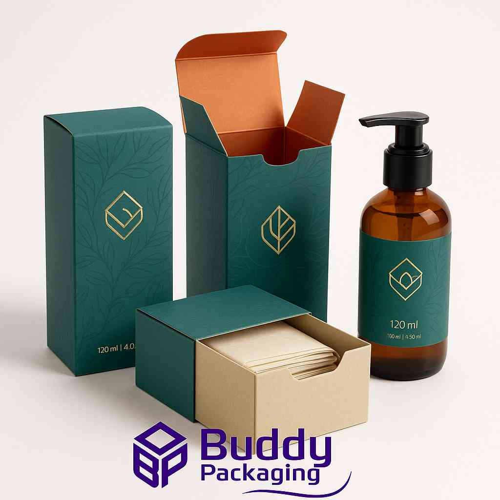
120ml Bottle Boxes
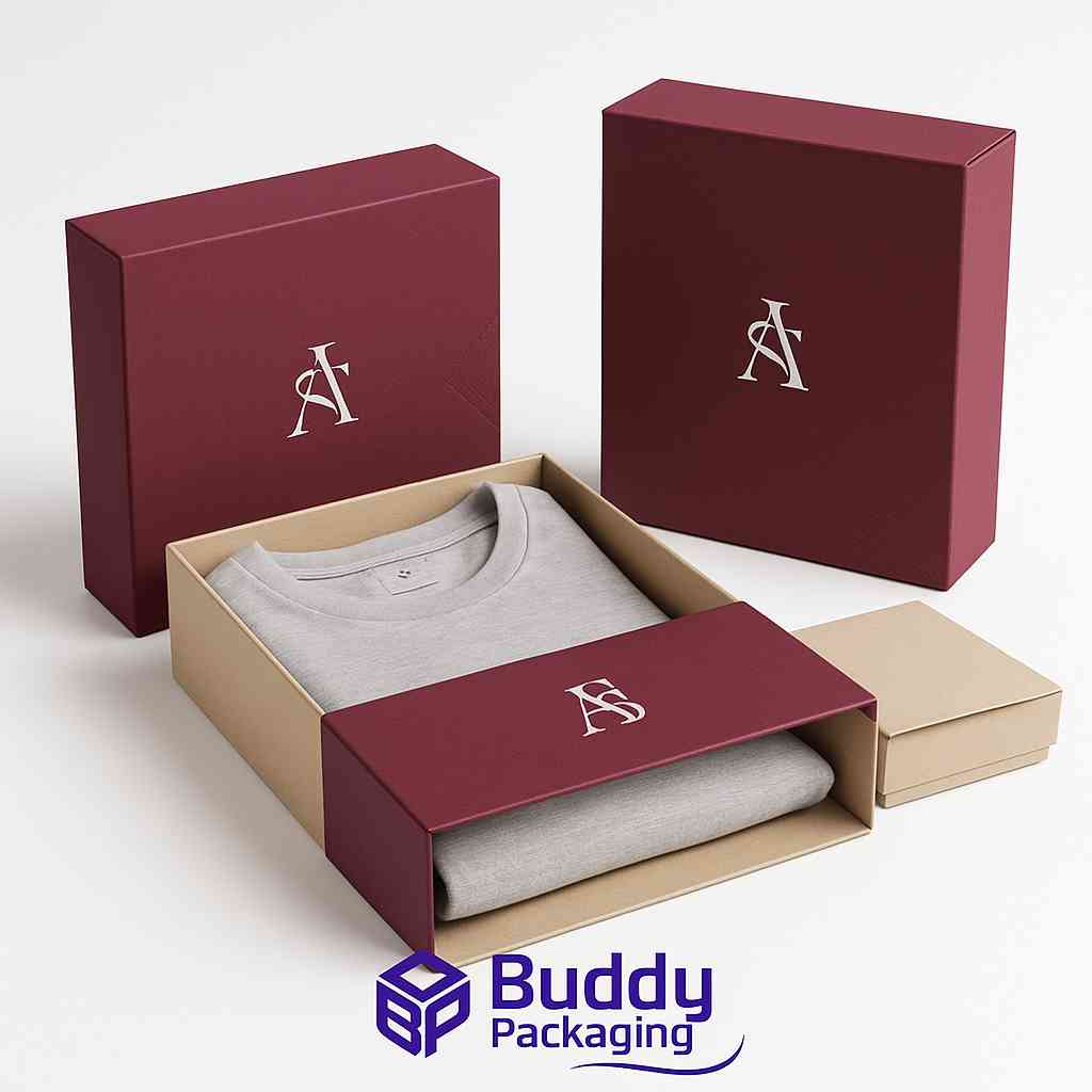
Apparel Sleeve Boxes
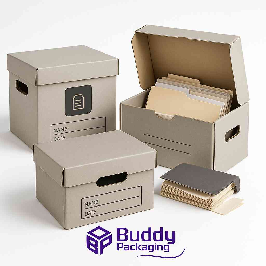
Archive Boxes

wafa
Packaging & Print SpecialistTechnical packaging specialist at Buddy Packaging UK, sharing insights on corrugated board packaging, custom dielines, and print production.
View all packaging articles by wafa →