cool food packaging design
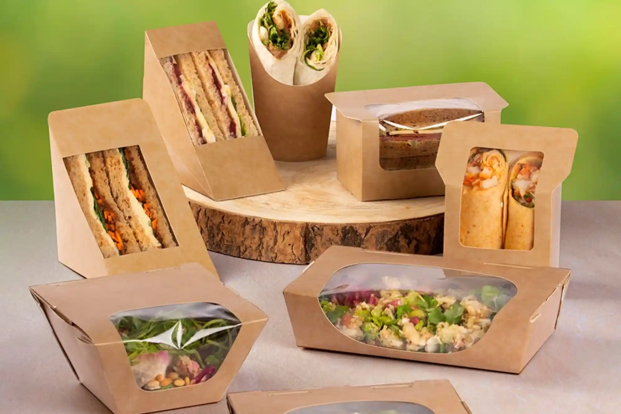
Cool Food Packaging Design: Creative Ideas That Make Food Brands Stand Out
In a crowded food market, packaging often creates the first impression. Before customers taste a product, they notice its colour, shape, typography, and overall presentation. This is why cool food packaging design has become an important part of modern food branding.
Great packaging does more than make food look attractive. It protects the product, communicates important information, supports brand recognition, and can influence purchasing decisions. A well-designed package can also make an ordinary product feel distinctive and memorable.
Today, food brands are moving beyond basic boxes, bags, jars, and cartons. They are exploring bold colours, unusual structures, sustainable materials, tactile finishes, and creative illustrations. However, good design must always balance creativity with practicality.
Whether you are launching snacks, bakery products, coffee, confectionery, sauces, frozen food, or takeaway products, thoughtful packaging can help your brand stand apart.
What Is Cool Food Packaging Design?
Cool food packaging design refers to packaging that combines visual appeal, functionality, brand personality, and customer convenience. It does not simply mean using bright colours or unusual shapes.
A successful design communicates the character of the food product within seconds. For example, a premium chocolate brand may use elegant typography and subtle finishes. A children’s snack brand may use playful illustrations and energetic colours.
The right approach depends on the product, audience, price point, and retail environment.
Food packaging also has practical responsibilities. It should protect food from contamination, damage, moisture, oxygen, and other environmental factors when required. Packaging can also make products easier to store, transport, open, use, and reseal.
Therefore, creativity should support the product rather than distract from it.
Why Does Cool Food Packaging Design Matter?
Packaging is one of the most visible parts of a food brand. Customers often encounter the package before they interact with the product itself.
Research and packaging education consistently recognise that packaging has several functions. It can protect food, communicate information, improve convenience, and support marketing.
A strong cool food packaging design can therefore contribute to a complete brand experience.
When packaging looks distinctive, customers can recognise it more easily. Consistent colours, typography, illustrations, and structural elements can also strengthen brand identity across a product range.
At the same time, attractive packaging should not hide important information. Product names, ingredients, nutritional information, allergens, quantities, storage instructions, and other required details need appropriate visibility.
The best packaging makes information easy to understand while maintaining an attractive visual hierarchy.
Key Elements of Cool Food Packaging Design
Colour Creates an Immediate Impression
Colour is one of the first elements customers notice. It can communicate mood, flavour, product category, or brand personality.
For instance, earthy tones can support a natural positioning. Bright colours may create a youthful and energetic appearance. Dark colours can create a premium feel when used thoughtfully.
However, colour choices should always consider contrast and readability. A beautiful colour combination becomes ineffective if customers cannot read the product name.
Typography Builds Brand Personality
Typography can make packaging feel modern, traditional, playful, luxurious, or approachable.
A food brand should choose fonts that match its personality. Strong display typography can attract attention, while simpler supporting fonts can improve readability.
Using too many typefaces can make packaging feel confusing. A focused typographic system usually creates a more professional result.
Illustrations Add Character
Illustration is particularly useful when a brand wants a distinctive visual identity.
Hand-drawn artwork can create warmth and authenticity. Geometric illustrations can create a contemporary appearance. Detailed food illustrations can help customers understand flavours and ingredients.
The important point is consistency. Illustrations should support the brand story rather than simply fill empty space.
Structural Design Makes Packaging Memorable
Packaging does not have to be visually interesting only from the front.
Shape, opening mechanisms, folds, handles, windows, closures, and unusual formats can make the customer experience more engaging.
However, structural creativity should have a practical purpose. The package still needs to protect the product and work efficiently during storage, transport, and retail handling.
How to Make Food Packaging Look Modern
Modern packaging often relies on clarity rather than excessive decoration.
A clean layout can help customers understand the product quickly. Strong contrast can make important information easier to find. Carefully selected imagery can communicate flavour without overwhelming the design.
Minimalism can work particularly well for premium products. Meanwhile, bold typography and expressive graphics can work effectively for products targeting younger audiences.
The goal is not to follow every design trend. Instead, brands should choose visual decisions that remain relevant to their identity.
A useful approach is to create a packaging system rather than designing every product separately. This allows different flavours and varieties to look connected while maintaining their individual character.
Cool Food Packaging Design and Sustainability
Sustainability has become increasingly important in packaging discussions. Customers are paying closer attention to material choices, unnecessary packaging, recyclability, and waste.
However, sustainable packaging should not be treated as a purely visual trend.
The material must be suitable for the food product and its storage conditions. It should also provide the required protection throughout distribution and handling.
A paperboard package may create a natural appearance, but its suitability depends on the product and construction. Similarly, reducing material can be beneficial, but not if it compromises food protection.
Good design considers the entire packaging system.
This is where practical print & finishing insights can help brands understand how materials, coatings, inks, textures, and production methods affect the final result.
How Packaging Can Improve the Customer Experience
Packaging continues to communicate after the customer has bought the product.
A convenient opening can reduce frustration. A resealable closure can improve storage. A clear window can allow customers to see the product. A carefully designed box can also make unboxing more enjoyable.
For takeaway food, functionality becomes even more important. Packaging may need to handle heat, moisture, sauces, movement, and repeated handling.
Therefore, cool food packaging design should consider what customers actually do with the package.
Designers should think about how the customer picks it up, opens it, reads it, carries it, stores it, and eventually disposes of it.
Choosing the Right Packaging Material
The material should be selected according to the food product and its requirements.
Paperboard can provide excellent print surfaces and works well for many dry food products. Flexible films can offer useful barrier properties and efficient formats. Glass can create a premium appearance and suit certain sauces, drinks, and preserved foods.
Metal can provide strength and protection for particular food categories. Meanwhile, newer material solutions continue to develop as brands search for more sustainable packaging options.
There is no universal material that works for every food.
The table below shows how different packaging materials can influence design and application.
| Packaging Material | Design Potential | Common Food Applications | Main Consideration |
|---|---|---|---|
| Paperboard | Excellent printing and finishing | Cereals, snacks, confectionery | Moisture protection |
| Corrugated board | Strong structural options | Food delivery and shipping | Size and storage space |
| Glass | Premium visual appearance | Sauces, drinks, preserves | Weight and breakage |
| Flexible film | Lightweight and versatile | Snacks, coffee, frozen foods | Barrier requirements |
| Metal | Strong and protective | Canned foods and drinks | Weight and production |
| Recyclable plastic | Flexible formats and clarity | Many food categories | Material selection and recycling |
The correct decision depends on the product, distribution method, shelf life, food-contact requirements, and intended customer experience.
Using Finishing Techniques to Create Premium Packaging
Finishing can transform an ordinary printed package into something more distinctive.
Matte finishes can create a sophisticated appearance. Gloss effects can make selected areas stand out. Foil details can add a premium visual accent. Embossing can introduce physical texture.
However, finishing should be purposeful.
Using every available effect can make packaging look crowded. A carefully selected finish can have a stronger impact than several competing effects.
For example, a simple box with subtle embossing may communicate luxury more effectively than a package covered in multiple decorative treatments.
This is where Custom Packaging can provide greater flexibility. Instead of relying entirely on standard formats, brands can develop packaging around their product, positioning, and customer experience.
Balancing Creativity With Food Safety
An attractive package still needs to perform its fundamental job.
Food packaging must be appropriate for the product and its intended conditions. Depending on the food, packaging may need to provide protection from oxygen, moisture, light, physical damage, or contamination.
Packaging also needs to support appropriate labelling and consumer information.
For this reason, designers, packaging suppliers, printers, and food manufacturers should work together from the beginning.
Creative design should never be developed separately from packaging performance.
How to Create Packaging That Stands Out on Shelves
Shelf visibility is an important consideration for retail products.
A package competes with many other products within a limited visual space. Customers may only glance at several products before deciding what to investigate further.
A distinctive colour palette can improve recognition. Strong typography can communicate the product category quickly. A clear brand mark can help customers identify the manufacturer.
However, standing out does not always mean becoming louder.
Sometimes the most noticeable package is the one that uses space differently. A calm, minimal package can attract attention when surrounding products are visually busy.
Understanding the retail environment is therefore essential.
The Importance of Brand Consistency
A successful food brand should look recognisable across its packaging range.
Suppose a company sells five flavours of the same snack. Each flavour can use different colours, but the fundamental layout, logo position, typography, and design language should remain connected.
This creates a visual family.
Consistency also helps customers recognise new products from an established brand. Over time, packaging can become part of the brand’s identity.
A strong packaging system therefore makes future product launches easier to manage.
For businesses developing regional or location-specific packaging solutions, reviewing the Buddy Packaging Location information can also help when considering packaging requirements for different markets.
Common Mistakes in Food Packaging Design
One common mistake is prioritising appearance over usability.
Packaging may look impressive in a design presentation but become difficult to open or transport. Another problem occurs when important information becomes too small because the package is overloaded with graphics.
Poor colour contrast can also reduce readability.
Another issue is copying popular packaging trends without considering brand identity. A design can look fashionable while failing to communicate what makes the product different.
Finally, businesses sometimes leave packaging decisions until late in the product development process. This can create production problems, increased costs, and unnecessary redesigns.
Early collaboration usually produces a smoother result.
What Makes a Good Food Package Design?
A good food package design should balance several functions.
It should communicate what the product is. It should make the brand recognisable. It should protect the food appropriately. It should provide useful information and support convenient use.
At the same time, it should look appropriate for its target audience and price position.
The strongest cool food packaging design is therefore not simply the most colourful or unusual option. It is the design that makes creative choices work together.
When structure, materials, graphics, typography, printing, and usability support the same brand idea, packaging becomes much more powerful.
Frequently Asked Questions About Food Packaging Design
What makes good food packaging design?
Good food packaging design combines attractive branding with functionality, readability, protection, and convenience. The package should clearly communicate the product while supporting its storage and use.
What are the 3 C’s of packaging?
The three Cs are commonly discussed as communication, convenience, and containment. These principles reflect the need for packaging to communicate with customers, make products easier to handle, and contain or protect the product effectively.
What are the 4 P’s of packaging?
Packaging discussions sometimes connect the four Ps with product, price, place, and promotion. Packaging can influence each area because it protects the product, affects perceived value, supports retail presentation, and communicates promotional messages.
How do you make food packaging attractive?
Start with a clear brand concept. Then choose suitable colours, typography, imagery, materials, and structural features. Keep the layout readable and make sure visual creativity supports the product’s identity.
Why is packaging design important for food products?
Packaging protects food while also communicating information and supporting marketing. It can influence recognition, convenience, perceived quality, and the overall customer experience.
buddypackaging.co.uk provides practical packaging solutions for businesses across the UK. From sturdy cardboard boxes to custom packaging options, its products help protect goods while creating a professional presentation. With flexible choices for different products, sizes and business needs, Buddy Packaging makes it easier to find reliable packaging that suits both everyday shipping and specialist requirements.
Conclusion: Build Packaging That Customers Remember
Effective cool food packaging design brings together creativity, functionality, branding, and customer experience. It should look attractive, but it must also work in the real world.
The strongest packaging communicates quickly without becoming confusing. It protects the product without unnecessary complexity. It creates a recognisable brand experience while giving customers useful information.
For food businesses, packaging should be treated as part of the product strategy rather than an afterthought.
Whether you are launching a new food brand or refreshing an existing range, thoughtful packaging can give your product a stronger presence and a more memorable identity.
Start by defining your audience, product requirements, brand personality, and packaging goals. Then develop the visual and structural concept around those foundations. With the right combination of materials, printing, finishing, and creative thinking, your packaging can become one of your brand’s strongest customer touchpoints.