Introduction to Cereal Packaging Design
Cereal Packaging Design plays a crucial role in shaping how consumers perceive breakfast products on crowded retail shelves. In today’s fast-moving FMCG market, brands compete not only on taste but also on visual appeal, sustainability, and storytelling.
When a shopper walks down a supermarket aisle, decisions are often made within seconds. This is where effective cereal packaging design becomes a silent salesperson. It communicates brand identity, product benefits, and emotional appeal instantly.
Interestingly, even unconventional creative inspirations such as “orange theory mountain” have started influencing modern packaging aesthetics, where colours psychology and natural landscapes merge into bold, memorable visual identities.
In this guide, we will explore how cereal packaging design impacts branding, consumer psychology, material innovation, and market success. You will also discover practical strategies to elevate your packaging from ordinary to iconic.
What is Cereal Packaging Design?
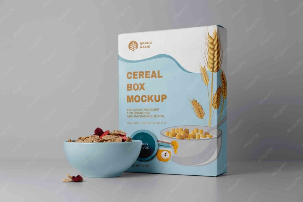
Cereal Packaging Design refers to the process of creating visually appealing, functional, and brand-aligned packaging for breakfast cereal products. It involves a combination of graphic design, material engineering, marketing psychology, and regulatory compliance.
At its core, cereal packaging design is not just about aesthetics. It is about communication. Every colours, font, illustration, and texture tells a story about the product inside the box.
Modern brands invest heavily in cereal packaging design because it directly influences purchase decisions. Research from Packaging Europe shows that packaging can influence up to 70% of buying decisions in-store, especially in food categories.
Importance of Cereal Packaging Design in FMCG Industry
Cereal Packaging Design is essential in the FMCG sector because it creates the first and often only impression before purchase. Unlike digital marketing, packaging works continuously at the point of sale without additional advertising spend.
One of the key roles of cereal packaging design is differentiation. With dozens of cereal brands competing in the same aisle, packaging helps consumers instantly recognise their preferred choice.
Another critical factor is emotional branding. Children are drawn to bright, playful packaging, while adults prefer minimalist and health-focused designs. Effective cereal packaging design adapts to these psychological triggers.
Additionally, compliance and clarity matter. Nutritional information, ingredient transparency, and certifications must be integrated seamlessly into the design without overwhelming the visual appeal.
Core Elements of Effective Cereal Packaging Design
Visual Identity and Brand Recognition
Strong cereal packaging design starts with visual identity. This includes colours palettes, typography, mascots, and logo placement. These elements must remain consistent across product lines to build long-term brand recognition.
Brands that succeed in cereal packaging design often maintain a signature visual style that customers can identify from a distance.
Typography and Messaging
Typography plays a subtle yet powerful role in cereal packaging design. Bold fonts communicate energy and fun, while clean sans-serif fonts suggest health and simplicity.
Clear messaging such as “high fibre,” “low sugar,” or “whole grain” must be easy to read at a glance. Overcomplicated messaging weakens the effectiveness of cereal packaging design.
Colours Psychology in Packaging
Colours is one of the most influential aspects of cereal packaging design. Bright reds and yellows attract attention, while greens and earthy tones suggest natural ingredients.
Interestingly, creative trends inspired by concepts like “orange theory mountain” show how warm orange tones combined with natural imagery can evoke energy, health, and adventure in cereal packaging design.
Trends Shaping Cereal Packaging Design in 2026
The future of cereal packaging design is evolving rapidly due to sustainability demands, digital printing advancements, and consumer lifestyle changes.
Minimalist design is becoming dominant, with brands stripping away clutter to highlight key product benefits. At the same time, bold retro aesthetics are making a comeback, especially in premium cereal packaging design segments.
Interactive packaging is another growing trend. QR codes, augmented reality, and storytelling elements are being integrated into cereal packaging design to engage digital-savvy consumers.
Sustainability in Cereal Packaging Design
Sustainable cereal packaging design focuses on reducing environmental impact while maintaining product integrity and visual appeal.
Brands are increasingly shifting towards recyclable cardboard, biodegradable inks, and reduced plastic usage. This shift not only benefits the environment but also strengthens brand reputation.
Consumers today actively choose brands that demonstrate environmental responsibility. Therefore, sustainable cereal packaging design is both an ethical and commercial necessity.
You can also explore sustainable packaging solutions through Custom Packaging which highlights eco-friendly design innovations used in modern packaging industries.
For physical location insights and packaging consultation services, you may explore Buddy Packaging Location for real-world reference and industry applications.
Branding Psychology Behind Cereal Packaging Design
Cereal Packaging Design heavily relies on consumer psychology. Every design choice influences perception, trust, and purchase intent.
For example, large product imagery creates a sense of abundance and taste appeal. Meanwhile, clean layouts suggest premium quality and health benefits.
Children’s cereals often use mascots and storytelling to create emotional attachment. Adult cereals, on the other hand, focus on lifestyle messaging and nutritional transparency.
This psychological balance is what makes cereal packaging design both an art and a science.
Materials and Innovation in Cereal Packaging Design
Modern cereal packaging design is no longer limited to cardboard boxes. Brands are experimenting with hybrid materials, resealable packs, and smart packaging technologies.
Barrier coatings are used to preserve freshness without compromising recyclability. Meanwhile, lightweight packaging reduces shipping costs and environmental impact.
Innovation in cereal packaging design also includes tactile finishes such as matte coatings, embossing, and soft-touch textures that enhance shelf appeal.
External research from Packaging World highlights how material innovation is reshaping FMCG packaging standards globally.
Common Mistakes in Cereal Packaging Design
Many brands fail in cereal packaging design due to overcrowded visuals, unclear messaging, or inconsistent branding.
One major mistake is overloading the front panel with too much information. This confuses consumers and reduces shelf impact.
Another issue is ignoring target audience preferences. A cereal packaging design meant for fitness-conscious adults should not resemble a children’s product.
Poor colours contrast and unreadable typography also weaken the effectiveness of cereal packaging design in competitive retail environments.
How to Create Effective Cereal Packaging Design
Developing successful cereal packaging design begins with understanding the target audience and market positioning.
Designers typically start with brand research, followed by concept development, visual prototyping, and material selection. Each stage refines the final packaging output.
Testing is also essential. Real-world shelf testing helps evaluate how cereal packaging design performs under retail lighting and competitive conditions.
Consistency across product lines ensures long-term brand recognition and customer loyalty.
Expert Insights on Cereal Packaging Design
Industry professionals agree that successful cereal packaging design blends creativity with strategy. It is not enough to create visually appealing packaging; it must also convert shoppers into buyers.
Experts also recommend studying competitor packaging to identify gaps in the market. This allows brands to position their cereal packaging design more effectively.
For further reading on industry techniques, you can explore advanced resources such as packaging design tips which provide professional design insights.
FAQ on Cereal Packaging Design
Why is cereal packaging design important for sales?
Cereal packaging design directly influences consumer decisions at the point of purchase. Strong visual appeal and clear messaging can significantly increase sales conversion rates.
What makes a good cereal packaging design?
A good cereal packaging design combines clarity, strong branding, appealing visuals, and relevant product information that resonates with the target audience.
How does sustainability affect cereal packaging design?
Sustainability is now a key factor in cereal packaging design. Eco-friendly materials and recyclable packaging improve brand reputation and meet consumer expectations.
What colours work best in cereal packaging design?
Bright colours attract attention, while natural tones suggest health and organic ingredients. The choice depends on the product positioning within cereal packaging design strategy.
How do brands improve cereal packaging design effectiveness?
Brands improve cereal packaging design by focusing on simplicity, strong hierarchy, consumer psychology, and consistent branding across all products.
The Future of Cereal Packaging Design
Cereal Packaging Design is far more than a visual wrapper. It is a powerful marketing tool that shapes perception, builds trust, and drives sales in competitive FMCG markets.
As consumer expectations evolve, brands must adopt innovation, sustainability, and emotional storytelling within their cereal packaging design strategies.
From colours psychology to material innovation, every detail matters. Even creative inspirations like “orange theory mountain” demonstrate how imagination can influence modern packaging trends.