Craft Beer Packaging Design: A Complete Guide
Introduction
Craft beer packaging design is more than an attractive label or colourful can. It is a powerful part of a brewery’s identity, marketing strategy and customer experience. In a competitive beer market, packaging often creates the first impression before customers taste the product.
Independent breweries use packaging to communicate personality, quality and brewing style. A bold design can suggest an adventurous IPA, while a refined layout can make a premium lager feel more sophisticated. Therefore, every visual choice should support the beer and the brand behind it.
Good craft beer packaging design combines creativity with practical thinking. It must look appealing while remaining readable, functional and suitable for production. It should also help customers recognise a brewery across different products and flavours.
Whether you are launching a new beer or refreshing an established brand, thoughtful packaging can make a significant difference. The right design helps your beer earn attention, encourage purchases and remain memorable after the first encounter.
Why Craft Beer Packaging Design Matters
The craft beer market is crowded with creative brands. Consequently, breweries need packaging that communicates their identity quickly. Customers may see dozens of cans on a retail shelf, so visual distinction matters.
Effective craft beer packaging design tells a story without requiring a long explanation. Colours, typography, illustrations and imagery can communicate the brewery’s character within seconds.
For example, earthy colours can suggest traditional brewing and natural ingredients. Meanwhile, bright colours and unusual illustrations can create a modern and energetic impression.
Packaging also builds recognition. When several beers share consistent design elements, customers can identify the brewery more easily. This consistency becomes particularly valuable when a brewery expands its product range.
Understanding Your Brand Before Designing Packaging
A successful design begins with a clear understanding of the brand. Before selecting fonts or illustrations, consider what the brewery represents.
Ask whether the brand is traditional, experimental, local, premium, playful or environmentally conscious. The answer should influence every part of the packaging.
Your target customer also matters. A design aimed at adventurous younger drinkers may look very different from packaging created for premium beer enthusiasts.
The beer itself should remain central to the creative direction. An intensely flavoured stout should not necessarily use the same visual language as a light summer ale.
Creating a Strong Visual Identity
A strong identity normally includes recognisable colours, typography, imagery and layout principles. These elements should work together rather than compete for attention.
Consistency does not mean every beer must look identical. Instead, create a flexible system that allows individual products to have their own personality.
For instance, each beer could use a different primary colour while retaining the same logo placement and typography. Customers can then recognise the brewery while distinguishing each flavour.
Choosing Colours for Beer Packaging
Colour has a major influence on customer perception. It can attract attention and establish expectations before someone reads the product description.
Dark shades can communicate richness and strength. Lighter tones may suggest freshness or a sessionable beer. Metallic effects can create a premium appearance when used carefully.
However, colour choices should also consider printing limitations. Colours appearing on a digital screen may differ from the final printed result.
Designers should therefore consider the actual packaging material and printing process early. This approach helps prevent unpleasant surprises during production.
Typography and Readability
Typography plays an important role in craft beer packaging design. Creative lettering can make a beer memorable, but readability should never be sacrificed.
The brewery name, beer name and essential information need to remain easy to identify. Customers should understand the product quickly, especially when viewing it from a distance.
A decorative typeface may work well for the main product name. However, supporting information usually benefits from a simpler font.
Hierarchy is equally important. The most important information should receive appropriate visual prominence. This creates a natural reading path across the package.
Illustration and Photography
Illustration can give craft beer packaging a distinctive personality. Hand-drawn artwork, geometric graphics and detailed scenes can all create different impressions.
Many independent breweries use illustrations to reflect their location, heritage or brewing philosophy. A local landscape, historic building or regional symbol can create a strong sense of place.
Photography can also work, although it requires careful execution. Poor-quality images can make packaging feel less professional.
The chosen imagery should support the brand story rather than simply decorate the container. Every visual element should have a reason for being there.
Packaging Materials and Formats
Craft beer packaging design must account for the physical package. Cans, bottles, cartons and multipacks each provide different creative opportunities.
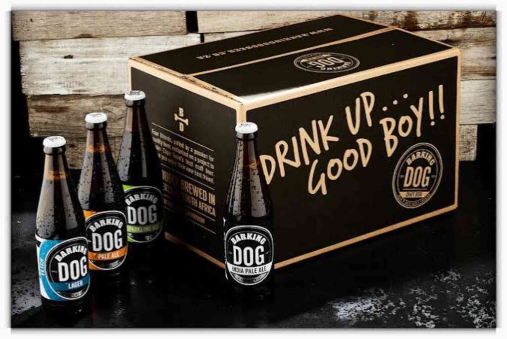
Cans offer a broad printable surface and can create strong visual impact. Bottles can provide a more traditional or premium appearance.
Secondary packaging also deserves attention. A customer may first notice a multipack before seeing the individual cans.
The design should therefore remain consistent across the complete packaging system. This creates a more professional customer experience.
| Packaging Format | Design Opportunity | Main Consideration |
|---|---|---|
| Aluminium cans | Large printable surface | Strong shelf visibility |
| Glass bottles | Premium and traditional appearance | Limited label area |
| Cardboard multipacks | Brand storytelling | Design consistency |
| Paper labels | Flexible visual styles | Material and print quality |
| Gift packaging | Premium presentation | Production cost |
Making Packaging Stand Out on Retail Shelves
Shelf competition makes differentiation essential. Your beer needs to attract attention without becoming visually confusing.
Contrast can help important elements stand out. A distinctive colour combination can also make the product easier to recognise.
However, excessive decoration can weaken the overall design. When every element demands attention, customers may struggle to understand the product.
Strong craft beer packaging design usually has a clear focal point. This might be the beer name, brewery logo or central illustration.
Whitespace can also improve impact. Leaving some areas uncluttered allows important information to breathe.
The Role of Sustainable Packaging
Sustainability has become increasingly important to consumers and breweries. Packaging decisions can therefore influence both brand perception and environmental impact.
Recyclable materials, lightweight containers and responsible printing choices can support sustainability goals. However, environmental claims should be accurate and transparent.
A brewery should avoid vague statements that could mislead customers. Instead, packaging can communicate specific information about materials and recycling where appropriate.
Sustainable design can also become part of the brand story. When presented honestly, it can strengthen customer trust.
Using Custom Packaging to Strengthen Branding
Custom packaging gives breweries greater control over how their products appear. Rather than relying on generic solutions, businesses can develop packaging that reflects their identity.
Custom Packaging can incorporate unique graphics, structural features and brand-specific details. These choices can help create a distinctive customer experience.
The most effective approach is not simply making packaging unusual. Instead, every custom feature should serve the brand or improve the customer experience.
A memorable package can encourage customers to photograph the product and share it online. This can create valuable organic exposure for smaller breweries.
Balancing Creativity and Production Costs
Creative ambition must work within a realistic budget. Complex printing techniques, unusual materials and custom structures can increase production expenses.
Therefore, designers should involve packaging suppliers early. Understanding available production methods can prevent costly redesigns later.
Finishing options such as embossing, foiling and special coatings can add premium appeal. Yet they should be used selectively.
A simple design with excellent typography and strong branding can often outperform an expensive design with too many effects.
Designing for Different Beer Styles
Each beer style can have its own visual personality while remaining part of the same brand family.
An IPA might use energetic colours and dynamic illustrations. A stout could use darker tones and a more restrained visual approach.
Seasonal beers provide additional opportunities. Limited editions can introduce new artwork while maintaining recognisable brand elements.
This balance helps breweries build variety without losing consistency.
The Importance of Location and Local Identity
Local identity can be particularly powerful for independent breweries. Customers often connect with businesses that reflect their community.
A brewery can incorporate regional landmarks, local traditions or cultural references into its packaging. These details can make the product feel authentic.
The Buddy Packaging Location concept can also inspire designers to think about how packaging relates to its physical environment and distribution audience.
However, local references should feel genuine. Forced imagery can appear artificial and weaken the brand story.
Testing Your Packaging Before Launch
Packaging should be tested before entering the market. Digital mock-ups are useful, but physical samples provide a more realistic impression.
View the package from different distances and lighting conditions. Check whether the brewery name and beer style remain easy to identify.
It is also useful to compare the design beside competing products. A package that looks impressive alone may disappear when placed among other beers.
Gather feedback from people who match your target market. Their reactions can reveal problems that the design team may overlook.
Common Craft Beer Packaging Mistakes
One common mistake is trying to communicate too much. Crowded packaging can make even excellent artwork difficult to appreciate.
Another issue is inconsistent branding. If every beer looks completely different, customers may not recognise the brewery.
Poor typography is another frequent problem. Decorative fonts can look attractive during design but become difficult to read at retail distance.
Finally, breweries sometimes focus entirely on appearance while ignoring production requirements. Packaging must work visually and technically.
Using Print and Finishing Techniques Effectively
Printing and finishing can transform an ordinary package into a premium product. Options include matte coatings, gloss finishes, embossing and metallic effects.
However, these techniques should support the design rather than dominate it. A subtle finish can create sophistication without making the package feel excessive.
Designers can explore print & finishing insights to understand how different production methods influence the final appearance.
Understanding these details before final artwork is prepared can save time and reduce production problems.
How Much Does Craft Beer Packaging Design Cost?
The cost varies considerably depending on the project. A simple label design may require fewer resources than a complete packaging system.
Factors include research, concept development, illustration, typography, revisions and production preparation.
Printing methods and finishing options can also affect the final budget. Therefore, breweries should establish a realistic budget before commissioning design work.
The goal should be strong value rather than simply choosing the cheapest option. Effective packaging can contribute directly to product recognition and sales.
How Do You Design Beer Packaging?
Beer packaging starts with brand strategy, followed by visual research and concept development. Designers then select typography, colours and imagery that match the beer.
The final artwork must be prepared according to production specifications. Physical testing is recommended before large-scale printing.
A successful process connects creative decisions with commercial objectives. The finished package should look attractive while communicating the product clearly.
What Makes Good Packaging Design?
Good packaging is distinctive, readable, relevant and consistent. It communicates the product quickly and creates an appropriate emotional response.
For craft beer, authenticity is especially important. Customers often expect independent breweries to have personality and originality.
Good design also works across different formats. The identity should remain recognisable on cans, bottles, cartons and digital platforms.
What Makes a Beer Brand Stand Out?
A beer brand stands out when it combines a strong identity with memorable packaging and a compelling product story.
Visual differentiation is important, but it should not replace quality. The best brands connect packaging with taste, experience and customer expectations.
Consistency also creates familiarity. Over time, customers should recognise the brewery even before reading its name.
What Is the Most Popular Beer Packaging?
Aluminium cans have become a highly visible packaging format within modern craft brewing. They offer strong branding opportunities and are convenient for distribution.
However, bottles remain important for certain premium and traditional beer categories. The right choice depends on the brewery, audience and product strategy.
Packaging should therefore be selected according to practical and marketing requirements rather than popularity alone.
Conclusion
Craft beer packaging design combines branding, creativity, production knowledge and customer psychology. A successful package does more than make beer look attractive. It communicates the brewery’s identity and gives customers a reason to notice the product.
Start with a clear brand strategy. Then develop a visual system that balances originality with readability. Consider materials, printing, sustainability and production costs throughout the process.
Most importantly, make the packaging authentic to the beer and the people who created it. Strong design can turn an ordinary shelf presence into a memorable brand experience.
If you are developing a new craft beer range or refreshing an existing identity, now is the right time to review your packaging strategy. Explore custom packaging solutions, study production possibilities and create a design that gives your beer the attention it deserves.