Packaging design layout plays a critical role in how customers see, feel, and trust a product. From first glance to final unboxing, layout choices guide attention and shape buying decisions. When done well, packaging becomes a silent salesperson. When done poorly, even great products struggle.
In today’s competitive market, brands must balance creativity, clarity, and compliance. This guide explores packaging design layout in depth, including structure, visual hierarchy, typography, and real-world inspiration such as Orange Theory Mountain View. Whether you are launching a new product or refining an existing one, understanding layout principles will help you stand out with confidence.
Understanding Packaging Design Layout
Packaging design layout refers to how visual and functional elements are arranged on a package. This includes logos, text, imagery, colours, and regulatory information. A strong layout ensures everything feels intentional and easy to understand.
More importantly, layout affects usability. Customers should instantly know what the product is, how to use it, and why it matters. When layout supports clarity, trust grows naturally.
From an SEO and branding perspective, consistent packaging design layout also reinforces brand recognition across shelves and digital platforms.
Why Packaging Layout Matters More Than Ever
Retail environments are crowded. Online shopping adds another layer of competition. Packaging often becomes the first physical touchpoint between brand and buyer.
A well-planned layout improves shelf impact. It guides the eye smoothly from brand name to key benefits. It also reduces confusion, which lowers the chance of lost sales.
Packaging design layout also supports compliance. Clear spacing ensures legal text is readable without overpowering the brand message. This balance is essential in regulated industries such as food, cosmetics, and supplements.
Core Elements of an Effective Packaging Design Layout
Every successful packaging layout starts with purpose. Designers must understand who the product is for and where it will be sold.
Visual hierarchy is the foundation. The brand name usually comes first, followed by the product name and primary benefit. Supporting details sit lower in the hierarchy, ensuring nothing competes for attention.
White space plays a quiet but powerful role. It gives the design room to breathe and helps key elements stand out. Crowded layouts often feel cheap or confusing.
Colours choice also shapes layout decisions. High-contrast combinations improve readability, while muted tones suggest premium quality. The layout must support these choices rather than fight them.
Structural Layout and Packaging Formats
Different packaging formats demand different layout approaches. Boxes, pouches, bottles, and sleeves all present unique challenges.
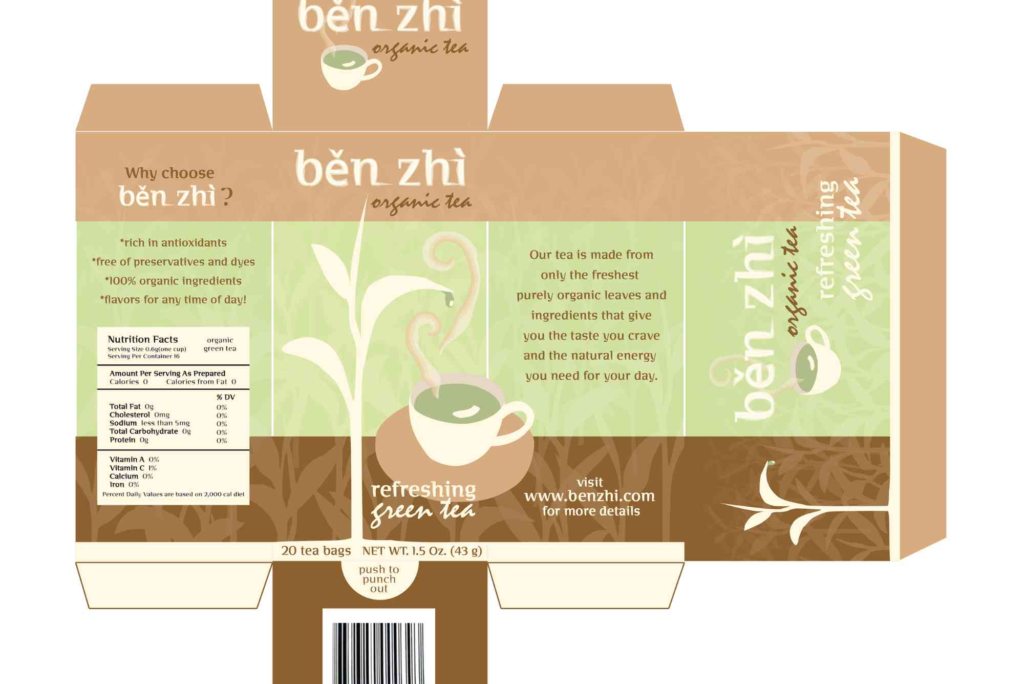
For box packaging, panels create natural zones. Front panels focus on branding, while sides handle information. Designers must plan how the layout wraps around edges to maintain consistency.
Flexible packaging requires even more care. Curves and folds can distort text if not planned correctly. A thoughtful packaging design layout anticipates these issues during the design stage.
Brands investing in Custom Packaging often gain more control over structure. This allows layouts to be designed alongside the box shape, rather than forced to fit later. You can explore tailored solutions through Custom Packaging to see how structure and layout work together.
Typography and Readability in Packaging Design Layout
Typography is more than font choice. It affects tone, clarity, and accessibility.
Sans-serif fonts often work well for modern brands. Serif fonts can add heritage or luxury appeal. The key is consistency across the layout.
Text size matters greatly. Important information should be readable at arm’s length. Secondary text can be smaller but must remain clear.
Line spacing and alignment also influence how comfortable the layout feels. Tight spacing may save room but often reduces legibility. A balanced layout always puts the user first.
Branding Consistency Across Packaging Layouts
Consistency builds trust. Customers should recognise your product instantly, even when packaging sizes change.
This means keeping logo placement, colours systems, and typography aligned across all layouts. Even limited edition designs should respect core layout rules.
Packaging design layout also needs to match other brand touchpoints. Website visuals, social media graphics, and printed materials should feel connected. For broader print considerations, professional print & finishing insights can help align packaging with wider brand production standards.
Real-World Inspiration: Orange Theory Mountain View
Orange Theory Mountain View offers a strong example of layout discipline applied beyond traditional retail packaging. Their branded materials focus on clarity, energy, and motivation.
Bold typography leads the layout, while colours blocks guide attention. Information is structured clearly, avoiding clutter. This approach reflects their brand promise of efficiency and results.
Packaging design layout lessons from such environments show how consistency and clarity drive engagement, even outside classic product packaging.
Packaging Layout for Sustainability and Function
Sustainability is now a key design consideration. Layout choices can support eco-friendly goals without sacrificing appeal.
Minimalist layouts often use fewer inks and coatings. Clear information placement also reduces the need for excessive packaging layers.
Functional layout supports reuse and recycling. Clear disposal instructions placed thoughtfully within the layout improve consumer compliance.
Designers must consider how sustainability messages fit into the hierarchy. They should inform without overwhelming the main brand story.
Regulatory and Informational Balance
Many products require legal text, symbols, and barcodes. These elements must be present but not disruptive.
A smart packaging design layout plans space for compliance from the start. This avoids last-minute clutter that damages the visual flow.
Information panels work well when grouped logically. Ingredients, instructions, and warnings should follow a predictable order.
This approach builds trust and reduces customer frustration.
Digital Shelf and Packaging Layout
Online shopping has changed how packaging is viewed. Thumbnails and product images often show only the front panel.
This means the front layout must communicate quickly and clearly. Fine details may be lost on smaller screens.
Designers now test layouts digitally before print. This ensures the design performs well both online and in-store.
Packaging design layout that works across channels gives brands a strong competitive edge.
Production Considerations and Layout Accuracy
Even the best layout can fail if production is ignored. Bleed areas, cut lines, and folds must be considered early.
Accurate dielines ensure text and images land correctly. Poor planning can lead to cropped logos or unreadable text.
Working closely with packaging suppliers helps avoid costly errors. Visiting production facilities, such as the Buddy Packaging Location, can provide valuable insight into how layouts translate into finished products.
Evolving Trends in Packaging Design Layout
Current trends lean towards simplicity and honesty. Clean layouts with clear messaging perform well across industries.
Hand-drawn elements and natural textures add warmth. These must be integrated carefully to avoid visual chaos.
Personalisation is also growing. Variable layouts allow brands to customize messaging while keeping the core structure intact.
Despite trends, timeless principles still apply. Clarity, balance, and purpose always win.
Common Mistakes to Avoid in Packaging Layout
One common mistake is overcrowding. Too much information reduces impact and confuses buyers.
Another issue is ignoring the physical form. Layouts designed flat without considering folds often fail in reality.
Inconsistent branding also weakens trust. Every layout variation should feel like part of the same family.
Avoiding these mistakes starts with planning and experience.
Measuring the Success of a Packaging Design Layout
Success is measured through sales, feedback, and engagement. If customers understand and trust the product, the layout is working.
A/B testing different layouts can reveal valuable insights. Small changes in hierarchy or colours placement can produce noticeable results.
Retail feedback and customer reviews also highlight layout strengths and weaknesses.
FAQs About Packaging Design Layout
What is packaging design layout?
Packaging design layout is the arrangement of visual and informational elements on a package. It guides how customers read and understand the product.
Why is packaging layout important for branding?
A strong layout builds recognition and trust. It ensures the brand message is clear and consistent across products.
How does packaging layout affect buying decisions?
Clear layouts reduce confusion and highlight benefits. This makes it easier for customers to choose your product.
What should be included on a packaging layout?
Key elements include brand name, product name, benefits, legal information, and instructions. These must be arranged clearly.
How do I improve my packaging design layout?
Start with customer needs. Focus on hierarchy, readability, and consistency. Testing and feedback also help refine the layout.
Designing Layouts That Work
Packaging design layout is both an art and a science. It combines creativity with strategy, structure with storytelling. When done well, it enhances brand value and improves customer experience.
From typography and hierarchy to sustainability and production, every decision matters. Real-world examples like Orange Theory Mountain View show how disciplined layouts support strong brand identities.