Fenty Packaging Design has become a benchmark in modern beauty branding, reshaping how consumers perceive luxury and inclusivity. From Rihanna’s vision to its flawless execution, every aspect of Fenty’s visual identity tells a powerful story. The sleek, minimal, and inclusive approach of Fenty Beauty not only changed the beauty industry but also set new expectations for packaging design across the world.
The Vision Behind Fenty Packaging Design
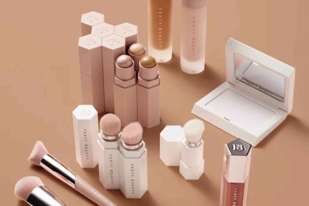
When Rihanna launched Fenty Beauty in 2017, she aimed to create a beauty line that represented everyone. But her mission didn’t stop at product formulation. The Fenty Packaging Design was just as revolutionary, combining inclusivity, sustainability, and luxury into one cohesive identity. Each element — from the hexagonal foundation bottles to the clean typography — reflects accessibility, innovation, and sophistication.
Fenty’s design language speaks directly to its audience. The packaging doesn’t shout luxury; it whispers confidence. Its neutral tones, soft matte finishes, and geometric shapes were created to appeal to people of all skin tones and genders. This design philosophy made Fenty stand out immediately, capturing attention both online and on store shelves.
The Design Elements That Define Fenty
Minimalism with Purpose
Fenty’s packaging is minimal but meaningful. The subtle design approach avoids clutter and allows the brand to focus on what truly matters — the product itself. Every shape, line, and material was chosen deliberately to represent beauty without barriers.
The foundation bottles, for instance, have a hexagonal shape that allows them to be easily arranged, reflecting Fenty’s theme of unity and diversity. The neutral color palette emphasizes inclusivity, aligning with the brand’s commitment to representing all skin tones.
Functional Luxury
Unlike many luxury brands that prioritize aesthetics over usability, Fenty takes a different approach. Its packaging combines elegance with practicality. The foundation bottles are easy to grip, the compacts open effortlessly, and the design ensures that each item feels comfortable in hand. This fusion of beauty and functionality shows that luxury can be both beautiful and convenient.
Inclusive Branding Through Design
Fenty Beauty’s inclusive branding goes beyond the shades of its products. The Fenty Packaging Design mirrors this inclusivity by being gender-neutral, accessible, and universally appealing. The design doesn’t rely on stereotypically “feminine” cues but instead embraces a balance of strength and softness that resonates with a wider audience.
This deliberate design choice communicates that beauty is for everyone. In doing so, Fenty successfully broke free from traditional beauty norms, making its packaging a visual symbol of equality.
The Emotional Connection: How Packaging Tells a Story
A brand’s packaging often acts as its first impression, and Fenty understood this perfectly. The Fenty Packaging Design creates an emotional connection before consumers even open the product. The textures, colors, and forms evoke empowerment and self-expression — two values central to the Fenty philosophy.
By focusing on tactile and visual experiences, the packaging becomes a sensory representation of the brand’s identity. It feels personal, authentic, and bold — just like Rihanna herself.
Sustainability in Fenty Packaging Design
Sustainability has become an essential part of modern packaging, and Fenty is no exception. The brand has made notable efforts to minimize its environmental footprint through recyclable materials and reduced plastic use. Fenty Skin, in particular, introduced refillable packaging to promote sustainability without compromising aesthetics.
This sustainable direction aligns with consumer expectations today. Modern customers are more environmentally conscious and value brands that take responsibility. Fenty’s sustainable packaging not only enhances its credibility but also demonstrates a forward-thinking attitude that keeps it ahead in the beauty industry.
The Role of Typography and Color
Typography and color play critical roles in establishing brand identity. Fenty’s use of clean, sans-serif fonts and subtle color palettes reinforces its contemporary feel. The neutral tones are intentional — they mirror the skin tones Fenty celebrates, ensuring the brand visually aligns with its inclusive mission.
Every package communicates calm confidence. The soft blush, nude, and beige hues make Fenty products instantly recognizable and align them with the minimalist aesthetic of modern luxury.
How Fenty Packaging Inspires the Industry
Fenty’s design success has inspired countless brands to rethink their packaging strategies. It showed that packaging is more than a container — it’s a communication tool that conveys values and emotions. The beauty industry began to adopt similar principles: inclusivity, sustainability, and clean aesthetics.
Brands realized that appealing packaging could transform how consumers feel about a product. Fenty Packaging Design proved that authenticity and thoughtful design build trust and loyalty.
Fenty Packaging Design and Orange Theory Mountain View
Interestingly, the creative energy behind Fenty’s packaging design can be compared to the motivational environment found at Orange Theory Mountain View. Just as Orange Theory promotes balance between intensity and mindfulness, Fenty Packaging Design achieves harmony between boldness and subtlety.
Both emphasize individuality, progress, and empowerment. This shared philosophy explains why both appeal strongly to audiences seeking authenticity and excellence. Fenty’s visual storytelling echoes the motivational drive seen in wellness and lifestyle spaces like Orange Theory, where presentation and experience work hand in hand.
Digital Presence and Unboxing Experience
In the age of social media, unboxing has become a powerful marketing tool. Fenty understood this early on. Its packaging was designed to be camera-friendly, from the clean lines to the elegant product placement. When consumers share their Fenty unboxing experiences online, they’re not just showing products — they’re sharing an aesthetic moment.
The seamless packaging experience reinforces brand loyalty. Every unboxing feels like opening a personal gift from Rihanna herself, filled with authenticity and confidence.
Lessons for Modern Brands
Brands today can learn valuable lessons from Fenty Packaging Design. The most successful packaging doesn’t just look good — it tells a story, builds emotion, and reinforces purpose. Fenty demonstrates how intentional design can elevate an entire brand narrative.
For businesses seeking to follow Fenty’s example, focusing on design integrity, sustainability, and inclusivity is essential. Partnering with professionals who understand these principles is crucial for success. Companies like Custom Packaging providers offer tailored solutions that align with a brand’s story, ensuring packaging becomes a true extension of identity.
To keep up with the latest design innovations and material trends, brands can also explore print & finishing insights for expert guidance and updates on packaging technologies.
Fenty Packaging and Brand Consistency
Consistency is key to brand recognition, and Fenty excels in this area. Across all products — from makeup to skincare — the cohesive design language maintains a unified look. This consistency helps build trust and makes the brand instantly identifiable, whether in-store or online.
By maintaining the same tone, color scheme, and typography, Fenty creates a holistic brand experience. Every product feels connected, reinforcing a sense of community and belonging among customers.
The Power of Fenty Packaging Design
Fenty Packaging Design is more than just an aesthetic achievement; it’s a cultural statement. It challenges conventions, embraces inclusivity, and sets new standards for beauty branding. Rihanna’s vision translated into a packaging philosophy that celebrates individuality, sustainability, and self-expression.
In a world where first impressions matter, Fenty proves that design can be both beautiful and meaningful. The next time you hold a Fenty product, remember that it represents more than makeup — it’s a piece of art designed to empower.
If you’re inspired by Fenty’s innovation and want to elevate your brand packaging, explore Custom Packaging solutions and visit Buddy Packaging Location to discover creative ways to bring your brand story to life.
Frequently Asked Questions
What makes Fenty Packaging Design unique?
Fenty’s design stands out for its inclusive, minimalist, and functional approach that caters to all skin tones and genders.
Is Fenty Beauty packaging sustainable?
Yes. Fenty Skin, in particular, uses recyclable and refillable materials to promote sustainability and reduce waste.
How does Fenty’s packaging reflect its brand values?
The packaging embodies inclusivity, confidence, and authenticity — the same values that define Fenty’s mission.
Why is Fenty considered a leader in packaging innovation?
Because it seamlessly combines design, function, and emotional storytelling to create a powerful and consistent brand experience.
What can other brands learn from Fenty’s packaging design?
They can learn the importance of authenticity, user experience, and sustainability in building trust and long-term brand loyalty.