Introduction
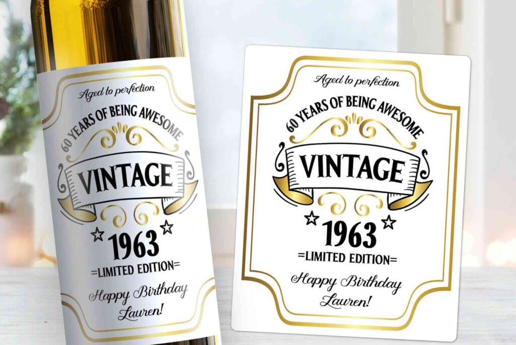
Vintage wine label design is more than decoration. It is a visual language that tells a story of heritage, craftsmanship, and authenticity. In a competitive wine market, labels often make the first impression. Before a cork is pulled, the label shapes expectations about quality, origin, and character. A well-crafted vintage wine label design connects the past with the present, helping brands stand out while feeling familiar and trustworthy.
In the UK and global wine markets, consumers are increasingly drawn to tradition. They look for cues that suggest history, care, and expertise. Vintage wine label design delivers exactly that. By blending classic typography, muted colour palettes, and heritage-inspired illustrations, brands can communicate depth and credibility at a glance.
Understanding the Roots of Vintage Wine Label Design
To appreciate vintage wine label design, it helps to understand its origins. Early wine labels were functional rather than promotional. They identified the producer, region, and vintage year. Over time, these labels evolved into brand assets. They reflected regional culture, printing techniques, and artistic trends of their era.
Many vintage labels were influenced by engraving and letterpress printing. These methods produced textured lines and subtle imperfections. Today, designers intentionally recreate these effects. They evoke authenticity and human craftsmanship, which modern consumers value deeply.
Vintage wine label design also draws from European art history. French, Italian, and Spanish wine labels often featured coats of arms, crests, and vineyard illustrations. These elements signalled lineage and pride. Modern interpretations borrow these motifs while adapting them for contemporary shelves.
Why Vintage Wine Label Design Still Works Today
Despite modern minimalism, vintage wine label design remains powerful. It appeals to emotion rather than trend. Wine buyers often seek reassurance, especially when choosing unfamiliar brands. A vintage-style label suggests reliability and tradition, even for newer wineries.
Another reason vintage wine label design works is its versatility. It suits premium wines, boutique producers, and limited editions. Even affordable wines benefit from a heritage look. It creates perceived value without alienating everyday buyers.
From a marketing perspective, vintage wine label design also performs well online. On digital shelves, intricate details and classic typography stand out against flat, generic designs. This visual contrast increases click-through rates and time spent viewing products.
Key Visual Elements in Vintage Wine Label Design
Typography That Feels Timeless
Typography sits at the heart of vintage wine label design. Serif fonts dominate because they feel established and elegant. Hand-lettered scripts are also common. They add personality and warmth.
Designers often combine two or three typefaces. One font handles the winery name. Another supports details like region or grape variety. This hierarchy improves readability while maintaining a classic feel.
Spacing matters as much as font choice. Vintage wine label design often uses generous spacing. This approach mirrors older printing layouts and prevents clutter.
Colour Palettes Inspired by History
Colour choices play a major role in vintage wine label design. Muted tones such as cream, burgundy, forest green, and sepia are popular. These colours age well visually and suggest maturity.
Gold and copper accents often appear in premium labels. When used sparingly, they enhance elegance without feeling flashy. The goal is subtle sophistication, not modern shine.
Paper colour also influences perception. Off-white or textured stock reinforces the vintage look. Bright white paper can feel too modern for traditional designs.
Illustrations and Symbolism
Illustrations give vintage wine label design its narrative power. Vineyards, châteaux, barrels, and harvest scenes are common. These visuals tell a story without words.
Symbolism is equally important. Crests, shields, and emblems convey authority and history. Even fictional symbols can feel authentic when designed thoughtfully.
Hand-drawn illustrations work best. They add organic charm and avoid the sterile feel of stock imagery. This approach supports Google’s E-E-A-T principles by signalling real care and expertise.
Balancing Tradition with Modern Expectations
While vintage wine label design looks backwards, it must function in the present. Modern consumers still expect clarity. Essential information like alcohol content and origin must be easy to read.
Designers achieve balance by simplifying layouts. They keep vintage aesthetics while removing unnecessary clutter. This restraint ensures labels feel refined rather than dated.
Sustainability is another modern concern. Many wineries now choose eco-friendly papers and inks. Vintage wine label design adapts well to this shift. Natural textures and earthy tones align perfectly with sustainable branding.
The Role of Materials and Printing Techniques
Materials elevate vintage wine label design from good to exceptional. Textured papers such as cotton or laid stock add tactile appeal. When customers touch the bottle, the label reinforces quality.
Printing techniques also matter. Letterpress, embossing, and foil stamping enhance depth. These methods echo historical production while offering premium finishes.
Even digital printing can achieve a vintage look. Skilled designers use grain, noise, and colour variation to mimic traditional processes. The key lies in thoughtful execution, not technology alone.
Branding Benefits of Vintage Wine Label Design
Vintage wine label design strengthens brand identity. It creates consistency across product ranges and marketing materials. This coherence builds recognition over time.
It also supports storytelling. Wineries can weave narratives about heritage, terroir, or philosophy directly into their labels. Consumers remember stories more than specifications.
For businesses exploring packaging solutions, integrating Custom Labels into a broader branding strategy can elevate shelf presence. Thoughtful label choices reinforce authenticity and professionalism, especially in competitive retail environments.
Common Mistakes to Avoid
Despite its appeal, vintage wine label design can fail if mishandled. Overcrowding is a frequent issue. Too many fonts or illustrations confuse the eye.
Another mistake is forced ageing. Artificial distressing can look inauthentic if overdone. Subtlety is essential. Vintage does not mean worn out.
Ignoring legibility is also risky. Decorative fonts should never compromise clarity. Even the most beautiful label must communicate clearly.
For designers seeking guidance, studying proven label design tips from established creative resources can prevent these pitfalls. Learning from industry examples ensures designs remain effective and authentic.
How Vintage Wine Label Design Influences Buying Decisions
Research shows that packaging heavily influences purchase behaviour. In wine retail, labels often decide the sale. Vintage wine label design triggers emotional responses linked to nostalgia and trust.
Consumers associate traditional design with craftsmanship. They assume the wine has been made with care. This perception increases willingness to pay and brand loyalty.
In gifting scenarios, vintage wine label design also performs well. It feels appropriate and thoughtful, reducing the buyer’s risk of choosing poorly.
Vintage Wine Label Design in the Digital Age
E-commerce has changed how labels are viewed. Shoppers often see small images first. Vintage wine label design must remain legible at reduced sizes.
Strong contrast and clear typography help achieve this. Designers test labels at thumbnail scale to ensure impact.
Social media also plays a role. Instagram favours visually rich content. Vintage wine label design photographs beautifully, especially with textured materials and warm lighting.
The Future of Vintage Wine Label Design
Vintage wine label design continues to evolve. Designers now blend historical elements with contemporary simplicity. This hybrid approach appeals to younger consumers while retaining classic charm.
Personalisation is another growing trend. Limited editions with unique label variations create exclusivity. Vintage aesthetics enhance this sense of rarity.
As technology advances, designers will gain more tools to recreate traditional effects sustainably. The core principles, however, will remain unchanged. Authenticity, clarity, and storytelling will always define successful vintage wine label design.
Buddypackaging.co.uk offers reliable and high-quality packaging solutions tailored to meet modern business needs. From durable custom boxes to eco-friendly packaging options, the company focuses on protecting products while enhancing brand presentation. With a commitment to affordability, fast turnaround times, and customer satisfaction, Buddy Packaging is a trusted choice for businesses across the UK looking for professional packaging services.
FAQs
What makes a wine label look vintage?
A vintage look comes from classic typography, muted colours, and traditional illustrations. Texture and printing effects also play a role.
Why do wineries choose vintage wine label design?
Wineries use it to convey heritage, trust, and craftsmanship. It helps products stand out and feel premium.
Is vintage wine label design suitable for modern brands?
Yes, when balanced correctly. Many new wineries adopt vintage styles to build instant credibility.
Does vintage wine label design affect sales?
Absolutely. Labels strongly influence buying decisions, especially for unfamiliar wines.
Can vintage wine label design work for digital sales?
Yes. With clear typography and strong contrast, vintage labels perform well online.
Creating Timeless Appeal Through Design
Vintage wine label design remains a powerful branding tool. It connects consumers to tradition while supporting modern marketing needs. When executed with care, it builds trust, enhances storytelling, and influences purchasing decisions.
Whether you are launching a new wine or refreshing an existing range, investing in thoughtful vintage wine label design can transform perception. Focus on authenticity, clarity, and quality materials. Avoid shortcuts and trends that dilute the message.
If you are ready to elevate your packaging and brand presence, explore professional design solutions and refine your approach. A well-designed vintage label does not just sell wine. It tells a story that customers want to take home.

