Vintage Label Design continues to shape modern branding in powerful ways. In an era of sleek minimalism, many brands are turning back to heritage aesthetics to build authenticity and trust. From artisan foods to premium cosmetics, vintage-inspired packaging evokes emotion, tradition, and craftsmanship.
When executed correctly, Vintage Label Design does more than decorate a product. It tells a story, connects with customers, and differentiates a brand in crowded markets. This article explores the principles, history, techniques, and commercial impact of Vintage Label Design, helping businesses create packaging that feels both nostalgic and relevant.
The Enduring Appeal of Vintage Label Design
Vintage Label Design resonates because it taps into collective memory. Consumers associate retro typography, ornate frames, and muted colours palettes with heritage and reliability. This perception can influence buying decisions more than modern graphic trends.
Psychologically, nostalgia creates comfort. Research from sources like the American Psychological Association suggests nostalgic cues increase emotional warmth and brand attachment. Therefore, incorporating vintage elements can strengthen emotional engagement while elevating perceived value.
Furthermore, heritage aesthetics signal craftsmanship. When customers see intricate borders or classic serif fonts, they subconsciously link the design to tradition and quality. As a result, Vintage Label Design often supports premium pricing strategies.
A Brief History of Vintage Label Design
Vintage Label Design draws inspiration from late nineteenth and early twentieth century packaging. During the Victorian and Edwardian eras, printing technology advanced rapidly. Decorative labels became status symbols for goods like tea, tobacco, and soap.
Later, the Art Deco movement of the 1920s introduced geometric symmetry and bold typography. Meanwhile, mid-century packaging embraced hand-drawn illustrations and playful scripts. Each period contributed distinct visual cues that modern designers reinterpret today.
Importantly, historical printing limitations shaped these aesthetics. Letterpress and lithography required bold outlines and limited colours palettes. Those constraints produced the distinctive charm that defines authentic Vintage Label Design.
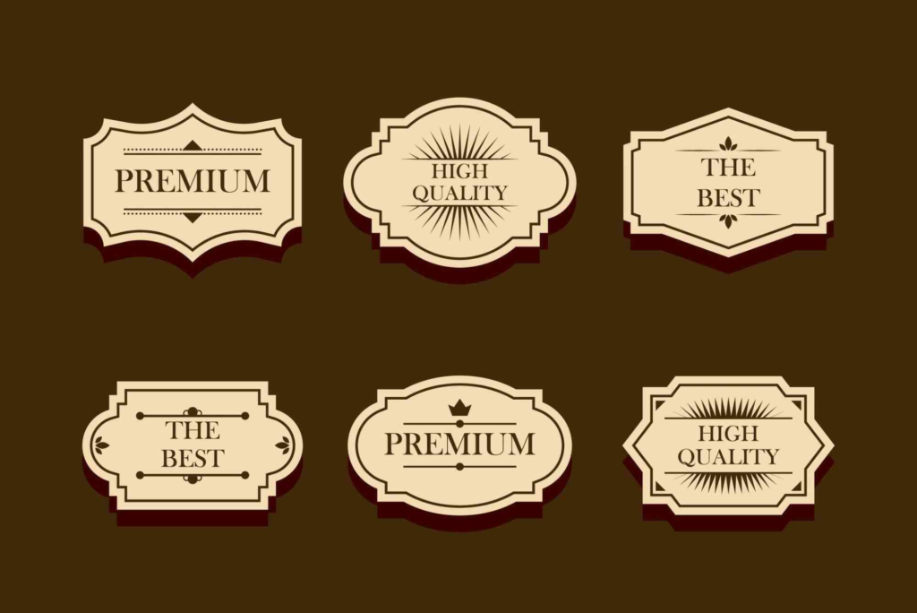
Core Elements of Authentic Vintage Label Design
Typography That Reflects Heritage
Typography forms the backbone of Vintage Label Design. Classic serif fonts, engraved type styles, and script lettering evoke craftsmanship and tradition. However, readability must remain a priority. Combining a bold display font with a simple secondary typeface often creates balance.
Designers frequently study historic signage and archive prints for inspiration. Institutions like the Victoria and Albert Museum offer extensive collections of period typography and decorative arts. Referencing authentic sources ensures designs feel genuine rather than cliché.
Ornamental Frames and Illustrations
Decorative borders and flourishes distinguish Vintage Label Design from contemporary minimal packaging. These elements frame product information while adding sophistication. Hand-drawn illustrations, especially botanical or heraldic motifs, reinforce heritage appeal.
However, restraint is crucial. Overcrowding the label reduces clarity. A strong focal point supported by subtle ornamentation creates visual hierarchy and improves shelf impact.
Muted and Heritage Colours Palettes
Vintage Label Design often relies on earthy tones, faded pastels, or limited two-colours combinations. Cream, navy, burgundy, forest green, and sepia are common choices. These shades mimic historical ink processes and age-related patina.
Modern designers sometimes simulate texture digitally to replicate worn paper or ink imperfections. Nevertheless, the effect should feel intentional rather than artificially distressed.
Vintage Label Design in Modern Branding
While rooted in history, Vintage Label Design works effectively in contemporary markets. Craft breweries, organic skincare brands, and speciality coffee companies frequently use heritage-inspired packaging to express authenticity.
For example, many boutique food producers combine traditional typography with sustainable materials. This approach communicates both heritage and environmental responsibility. The balance between old-world charm and modern values is essential.
Businesses seeking tailored packaging solutions often explore Custom Labels to achieve this look. Thoughtful structure and material choice can elevate a vintage concept from decorative to commercially strategic. Explore bespoke packaging options through Custom Labels.
Print Techniques That Enhance Vintage Label Design
Print finish plays a critical role in authentic Vintage Label Design. Without the right production methods, even the best artwork may fall flat. Letterpress printing creates tactile depth that reflects historic processes. Similarly, foil stamping adds elegance reminiscent of early luxury packaging.
Embossing and debossing further enhance texture. These techniques add dimension and reinforce premium perception. Choosing uncoated paper stocks also contributes to authenticity, as glossy laminates rarely align with traditional aesthetics.
Staying informed about evolving production methods helps designers maintain quality. Industry platforms like PrintWeek provide valuable print & finishing insights at, offering updates on technology that can support vintage-inspired packaging.
Balancing Authenticity with Compliance
Although Vintage Label Design celebrates the past, modern regulations still apply. Product labels must meet current legal standards regarding ingredients, barcodes, and safety information. Designers must integrate these requirements without compromising aesthetic integrity.
Strategic layout planning solves this challenge. Secondary panels can house mandatory details, while the front label preserves visual storytelling. This approach ensures compliance while maintaining cohesive branding.
How Vintage Label Design Influences Consumer Behaviour
Studies consistently show that packaging influences purchasing decisions within seconds. Vintage Label Design captures attention by contrasting with sleek, modern competitors. On crowded shelves, ornate borders and classic type stand out.
Moreover, consumers often associate vintage visuals with small-batch production. Even large brands can benefit from this perception when launching premium lines. The sense of authenticity encourages trust and repeat purchase behaviour.
Importantly, authenticity must be genuine. If branding promises heritage but product quality disappoints, trust erodes quickly. Therefore, Vintage Label Design should align with real brand values and product excellence.
Creating Vintage Label Design for Different Industries
Different sectors interpret Vintage Label Design uniquely. In the beverage industry, labels may feature elaborate crests and detailed illustrations. Meanwhile, skincare brands might favour botanical engravings and soft pastel tones.
Food packaging often references farm traditions and handcrafted recipes. In contrast, stationery brands may highlight calligraphic scripts and antique-inspired layouts. Each application requires careful adaptation to audience expectations.
Businesses operating in specific regions can also incorporate local heritage cues. For instance, referencing architectural motifs or historic typography from Mountain View may create regional authenticity. Physical presence and accessibility can further reinforce trust, as seen through Buddy Packaging Location at .
Common Mistakes in Vintage Label Design
One frequent mistake is overcomplicating the layout. Vintage Label Design should feel rich but not chaotic. Clear hierarchy ensures customers quickly identify product name and key benefits.
Another issue involves using generic “retro” fonts without historical grounding. Authenticity requires research. Designers should understand the origin of stylistic elements rather than applying them randomly.
Finally, poor material selection undermines credibility. High-gloss finishes rarely suit heritage concepts. Texture, weight, and print technique must align with the visual theme.
Sustainability and Vintage Label Design
Interestingly, Vintage Label Design pairs naturally with sustainability trends. Uncoated recycled paper and soy-based inks complement heritage aesthetics. These materials also support environmental commitments.
Consumers increasingly seek eco-conscious brands. Therefore, combining vintage visuals with responsible sourcing strengthens both emotional and ethical appeal. Transparency about materials and processes further enhances credibility.
Why Brands Invest in Vintage Label Design
Brands invest in Vintage Label Design because it builds differentiation. In saturated markets, visual storytelling matters more than ever. Heritage cues help products feel established, even if the company is new.
Additionally, vintage aesthetics support premium positioning. Customers often perceive traditional design as a sign of care and craftsmanship. This perception allows brands to justify higher price points.
Ultimately, Vintage Label Design is not about copying the past. It is about reinterpreting history to create meaningful modern experiences.
Frequently Asked Questions About Vintage Label Design
What makes a label design look vintage?
A label appears vintage when it uses heritage typography, muted colours, and ornamental details. Traditional printing textures also enhance authenticity. However, balance remains essential for readability and compliance.
Is Vintage Label Design suitable for modern brands?
Yes, Vintage Label Design works well for modern brands seeking authenticity. It creates emotional connection while supporting premium positioning. The key is aligning design with genuine brand values.
Which industries benefit most from Vintage Label Design?
Craft food, beverages, cosmetics, and artisan goods benefit greatly. These sectors rely on storytelling and perceived craftsmanship. Vintage aesthetics reinforce those narratives effectively.
How do you print authentic vintage labels?
Authentic results often involve letterpress, embossing, or foil stamping. Choosing uncoated textured stock also improves realism. Modern digital techniques can replicate these effects when budgets are limited.
Elevate Your Brand with Vintage Label Design
Vintage Label Design remains one of the most powerful tools in packaging strategy. By blending historical inspiration with modern precision, brands create labels that resonate emotionally and commercially. The key lies in authenticity, craftsmanship, and thoughtful production.