Record Label Logo Design: Crafting a Visual Identity That Resonates
In the music industry, visual identity is just as powerful as sound. A record label’s logo is not merely a symbol; it represents creativity, culture, and credibility. A well-designed logo tells your story, builds brand recognition, and helps musicians, producers, and listeners instantly connect with your label’s mission. Whether you are an emerging indie label or an established production house, investing in a professional record label logo design can set the tone for your brand’s long-term success.
Why a Record Label Logo Matters
Your logo is often the first impression people have of your record label. In a world where visuals dominate, a distinctive design acts as a visual shorthand for your label’s personality. It helps communicate what genre of music you represent—whether it’s electronic beats, soulful jazz, or experimental rock. More importantly, it builds trust. Artists want to sign with labels that look established and serious about their craft. Fans, on the other hand, associate the logo with quality music production and artistic credibility.
A memorable record label logo design bridges the gap between your creative essence and your professional identity. It embodies your sound and philosophy visually, ensuring you stand out in a saturated market.
Core Principles of Effective Record Label Logo Design
When designing a logo for your label, it’s essential to consider certain key principles that make it timeless and recognisable.
Simplicity and Clarity
Simplicity ensures your logo remains versatile across platforms—whether it’s a website, album cover, T-shirt, or social media profile. A clear design helps fans recognise your brand instantly, even at a glance.
Relevance to Your Genre
Your design should reflect your music genre. For instance, a hip-hop label might opt for bold, urban-inspired typography, while a classical label may lean towards elegant serif fonts and minimalist icons.
Typography with Personality
Typography can make or break a logo. Choose fonts that match your label’s character. Custom typefaces are ideal for adding uniqueness and avoiding clichés. Think of iconic labels like Def Jam or Motown—each has distinct typography that became a brand signature.
Symbolism and Imagery
Visual symbols such as vinyl records, microphones, or waveforms can add personality, but they must be used thoughtfully. The goal is to evoke your label’s spirit, not overload the design with literal imagery.
Colour Psychology
Colours evoke emotions. Black and white logos suggest sophistication and authority, while bright hues convey energy and modernity. Your colour choice should reflect your target audience and genre’s vibe.
Finding the Right Design Process for Your Label
Creating a professional logo is a process that blends creativity and strategy. It involves research, brainstorming, and experimentation.
Research and Inspiration
Before designing, explore other record labels and creative studios. Analyse what works and what doesn’t. Sites like label design inspiration can help you explore a vast range of visual ideas to guide your creative direction.
Define Your Brand Voice
Your logo should reflect your label’s mission, sound, and audience. Are you edgy and experimental or soulful and classic? Define your brand identity clearly—it will influence your design decisions.
Sketch and Conceptualise
Start with rough sketches to explore different visual directions. Experiment with symbols, initials, and abstract shapes that might capture your brand essence.
Digital Execution
Once you narrow down your sketches, move to digital design using software like Adobe Illustrator. Focus on precision, scalability, and colour balance.
Test Across Platforms
A great logo must look consistent across different mediums—from merchandise to streaming platforms. Test your design in black and white and on both small and large scales to ensure flexibility.
Trends in Modern Record Label Logo Design
While timelessness is key, staying aware of design trends keeps your logo relevant.
Minimalism with Meaning
Modern labels often prefer minimal designs that communicate confidence. A single shape, line, or letter can convey a lot when executed well.
Retro Revival
Some labels use retro-inspired designs reminiscent of the 70s and 80s vinyl era, bringing a sense of nostalgia and authenticity.
Custom Lettermarks
Lettermark logos—those based on initials—are popular for labels seeking a clean, professional look. Examples include OVO, RCA, and TDE.
Gradient and Texture Use
Gradients and textures are back in subtle ways, offering depth and uniqueness without overwhelming the design.
Monogram Style Logos
Monograms combine letters creatively, allowing for instant brand recognition—ideal for smaller record labels aiming for elegance and impact.
Common Mistakes to Avoid in Record Label Logo Design
Even creative professionals can fall into certain traps during logo creation. Avoiding these can save time and maintain brand integrity.
- Overcomplicating the design with excessive details.
- Using generic music icons without uniqueness.
- Ignoring scalability—logos that don’t resize well lose professional appeal.
- Following trends blindly instead of building long-term relevance.
- Neglecting colour contrast and typography balance.
A strong record label logo design should age gracefully while adapting to evolving platforms and marketing trends.
The Importance of Professional Collaboration
While DIY design tools can be tempting, professional designers bring expertise that ensures your logo stands the test of time. They understand composition, balance, and branding psychology. Partnering with an experienced designer or agency allows your brand identity to shine through clearly.
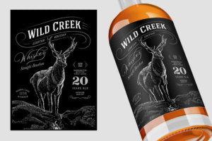
If your record label also produces merchandise or packaging for physical albums, working with creative branding partners like Buddy Packaging Location can help you integrate your logo across packaging and promotional materials seamlessly. You can even explore design collaborations with packaging experts like record label logo design specialists who understand the intersection between music branding and product presentation.
How to Make Your Record Label Logo Memorable
Tell a Story
Your logo should capture your label’s journey or philosophy. Think of it as a visual signature that artists and fans will remember.
Balance Creativity and Professionalism
A record label needs to be both artistic and credible. Aim for a design that’s expressive yet refined.
Keep it Timeless
Avoid overly trendy visuals that might look outdated in a few years. Strive for simplicity with lasting appeal.
Ensure Versatility
Your logo should work across different contexts—from business cards to billboards. Versatility ensures consistent branding across platforms.
Test Audience Reactions
Gather feedback from artists, designers, and fans. Their insights can help refine your design and strengthen brand resonance.
Integrating Your Logo into Brand Strategy
Your logo is the foundation of your brand identity, but it should also fit within a cohesive visual system. Use it consistently across your website, social media, and album releases. Develop a style guide outlining colour codes, logo spacing, and typography standards.
Brand consistency helps audiences remember your label and associate it with quality and creativity. A consistent visual language across promotional materials strengthens credibility and loyalty.
Future-Proofing Your Record Label Logo
As music consumption evolves—from vinyl to streaming—your logo should remain relevant. Digital-first design ensures it looks sharp on screens, app icons, and social media thumbnails. Avoid overdependence on fine details that might blur in small formats.
Also, consider adaptive versions of your logo: a full version for official documents and a compact version for social media or merchandise. Flexibility ensures brand consistency without losing visual strength.
Designing a Legacy Through Your Label’s Logo
Your record label’s logo is more than a design—it’s your signature in the music world. It conveys your values, creativity, and professionalism. From concept to execution, a successful record label logo design merges artistry with strategy, ensuring your label stands out in a competitive Custom Labels market. By understanding your brand identity, embracing design principles, and avoiding common pitfalls, you can create a logo that resonates with both artists and audiences. Whether you’re inspired by minimalism or retro aesthetics, the goal remains the same—to capture your sound in a symbol that lasts.
If you’re ready to elevate your label’s visual identity, start exploring creative collaborations today. Visit record label logo design for expert packaging and branding solutions, and discover more creative ideas at label design inspiration. Your logo is the heart of your record label. Make it memorable, meaningful, and musically aligned with your brand’s rhythm.
Boost your brand with professional print and packaging design services that make products stand out on the shelf and online. From creative concepts to high-quality finishes, expert designers ensure your packaging reflects your identity and captivates customers.
FAQs
1. What makes a good record label logo?
A great logo is simple, relevant, and memorable. It reflects your music genre and communicates your label’s essence clearly.
2. How do I choose the right colours for my label’s logo?
Choose colours that align with your label’s identity. For example, dark tones signify sophistication, while bright colours evoke creativity and energy.
3. Should I include music symbols in my logo?
You can, but use them subtly. Overusing clichés like notes or microphones may make the design look generic. Focus on originality.
4. Can I design my logo myself?
You can, but hiring a professional designer ensures better results. They understand typography, scalability, and branding strategy.
5. How often should I update my record label logo?
Update only when necessary—such as a rebrand or major market shift. Frequent changes can confuse your audience.
6. How can I ensure my logo stands out?
Focus on storytelling, originality, and emotional connection. A well-thought-out concept always outshines trend-driven visuals.
7. Where can I get packaging to match my label’s branding?
Check out creative solutions at Buddy Packaging Location to align your logo with custom packaging and promotional material.