Packaging Design Typography: A Complete Guide to Fonts That Sell
Packaging is often the first conversation a brand has with a customer—and typography is the voice of that conversation. Packaging design typography plays a crucial role in how a product is perceived, understood, and remembered. From luxury cosmetics to everyday food items, the right typography can elevate packaging from ordinary to irresistible.
In this in-depth guide, we’ll explore what packaging design typography is, why it matters, how to choose the right fonts, common mistakes to avoid, and real-world best practices used by successful brands.
What Is Packaging Design Typography?
Packaging design typography refers to the selection, arrangement, and styling of typefaces used on product packaging. This includes:
- Brand names and logos
- Product descriptions
- Ingredients and instructions
- Legal and regulatory text
- Taglines and marketing messages
Good typography doesn’t just look attractive—it communicates brand values, improves readability, and influences buying decisions.
Why Packaging Design Typography Matters
Typography is not decoration; it’s strategy. Here’s why packaging design typography is critical to a product’s success:
First Impressions Drive Purchases
Consumers often make split-second decisions. Typography helps instantly convey whether a product is premium, playful, organic, or functional.
Brand Recognition and Consistency
Consistent typography across packaging builds familiarity and trust. Think of how easily you recognize brands like Coca-Cola or Apple—type plays a major role.
Readability and Compliance
Packaging must communicate essential information clearly, especially in food, cosmetics, and pharmaceuticals. Poor typography can lead to confusion—or worse, regulatory issues.
Key Elements of Effective Packaging Design Typography
Typeface Selection
Choosing the right font sets the tone of your packaging.
- Serif fonts convey tradition, elegance, and trust
- Sans-serif fonts feel modern, clean, and approachable
- Script fonts add personality but should be used sparingly
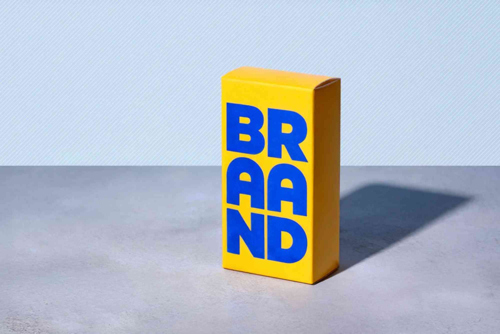
- Display fonts are eye-catching but best for headlines only
Font Hierarchy
Hierarchy guides the customer’s eye:
- Brand name
- Product name
- Key benefits
- Supporting details
Clear hierarchy ensures the most important information is seen first.
Letter Spacing and Line Height
Crowded text reduces readability. Proper kerning, tracking, and leading improve clarity—especially on small packaging.
How Typography Influences Consumer Psychology
Typography subtly affects how consumers feel about a product:
- Bold fonts suggest confidence and strength
- Rounded fonts feel friendly and approachable
- Thin fonts often signal elegance or luxury
- Handwritten styles suggest authenticity or craftsmanship
In packaging design typography, these psychological cues can directly influence buying behavior.
Typography and Brand Identity on Packaging
Your typography should align with your overall brand identity. Ask these questions:
- Is the brand playful or professional?
- Is it premium or affordable?
- Is the target audience young, mature, or niche?
Typography should reinforce these answers consistently across all packaging formats.
Typography for Different Packaging Types
Food and Beverage Packaging
Readability is essential. Fonts should clearly display ingredients, nutritional facts, and expiry dates while still feeling appetizing.
Luxury Product Packaging
Minimal typography, refined serif fonts, and generous spacing are often used to signal exclusivity.
Eco-Friendly and Sustainable Packaging
Natural, organic-feeling fonts and muted tones reinforce sustainability messaging.
Common Packaging Design Typography Mistakes to Avoid
Overusing Fonts
Using too many fonts creates visual chaos. Stick to 1–2 complementary typefaces.
Ignoring Scale
Text that looks good on-screen may be unreadable on small boxes or curved surfaces.
Prioritizing Style Over Clarity
Decorative fonts may look attractive but often sacrifice legibility.
Poor Contrast
Low contrast between text and background makes packaging hard to read under retail lighting.
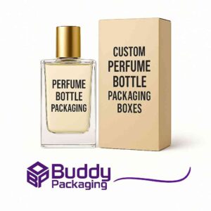
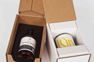
Packaging Design Typography and Custom Packaging
When working with Custom Packaging, typography choices become even more important. Custom boxes allow brands to tailor font size, placement, and finishes (like embossing or foil stamping) to enhance typographic impact.
Typography combined with custom packaging materials can dramatically improve shelf presence and unboxing experiences.
Printing Considerations for Packaging Typography
Typography must survive the printing process:
- Thin fonts may disappear on textured materials
- Ink spread can reduce sharpness
- Metallic or matte finishes affect contrast
Always test typography on the actual packaging material before mass production.
Accessibility in Packaging Design Typography
Inclusive typography ensures everyone can read your packaging:
- Use sufficient font size
- Maintain high contrast
- Avoid overly stylized fonts for essential information
Accessible packaging builds trust and expands your audience.
Trends in Packaging Design Typography
Minimalist Typography
Clean, bold fonts with ample white space remain popular.
Retro and Vintage Fonts
Brands use nostalgia-driven typography to evoke emotion and authenticity.
Handcrafted Typography
Hand-drawn fonts add personality and stand out in crowded markets.
For more inspiration and packaging design tips, exploring design-focused resources can help designers stay ahead of trends.
Real-World Example: Typography in Retail Success
Brands that invest in thoughtful packaging design typography often see:
- Increased shelf visibility
- Higher perceived value
- Stronger brand recall
Design isn’t just about aesthetics—it’s a measurable business asset.
Local Branding and Typography
For businesses serving specific regions, typography can reflect local identity. Visiting or understanding your Buddy Packaging Location can provide insight into customer preferences, retail environments, and cultural expectations that influence typographic choices.
Best Practices for Packaging Design Typography
- Start with brand personality
- Prioritize readability
- Limit font variety
- Test on real packaging
- Align typography with materials and finishes
Following these principles ensures typography supports both design and function.
FAQs
What is packaging design typography?
Packaging design typography is the strategic use of fonts, spacing, and layout on product packaging to communicate brand identity and product information effectively.
How many fonts should be used on packaging?
Most designers recommend using one primary font and one secondary font to maintain clarity and consistency.
Why is typography important in packaging design?
Typography influences readability, brand perception, emotional response, and purchasing decisions.
What fonts work best for packaging?
The best font depends on the brand. Sans-serif fonts work well for modern brands, while serif fonts suittraditional or luxury products.
How does typography affect sales?
Clear, attractive typography improves shelf visibility, builds trust, and helps customers quickly understand product benefits—leading to higher conversion rates.
Typography Is the Silent Salesperson
Packaging design typography is more than choosing a font—it’s about telling a brand story at a glance. When done right, typography enhances clarity, builds trust, and influences buying decisions without saying a word.