Introduction
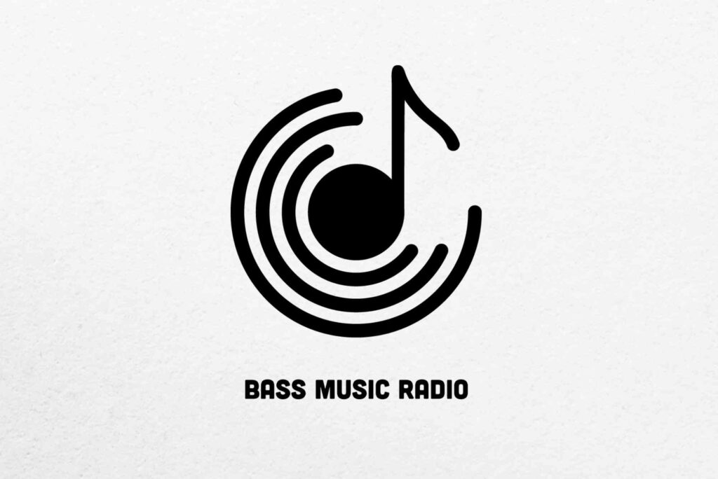
Music label logo design plays a powerful role in shaping how an audience feels about a brand before hearing a single note. In today’s competitive music industry, a logo is more than a visual mark. It is a symbol of credibility, culture, and creative direction. From independent record labels to global music empires, the right logo helps define identity, attract artists, and build long-term trust with listeners.
A strong music label logo design communicates the genre, values, and ambition of a label instantly. Whether the style is minimal, bold, vintage, or experimental, the logo must feel authentic. It should reflect the sound, the story, and the audience the label serves. When done well, it becomes recognisable across albums, streaming platforms, merchandise, and live events.
Why Music Label Logo Design Matters
In the music business, branding often shapes perception as much as sound quality. A professional logo signals that a label takes its craft seriously. Artists want to associate with labels that look established and confident. Fans also feel more connected to brands that appear consistent and thoughtful.
Music label logo design also supports marketing. It helps labels stand out on crowded digital platforms where attention spans are short. A memorable logo encourages repeat recognition. Over time, it becomes a visual shortcut for quality and style. This is why iconic labels are remembered not only for artists but also for their logos.
Understanding the Role of Identity in Music Branding
A logo is the foundation of a label’s visual identity. It influences colour palettes, typography, album artwork, and promotional materials. When a logo aligns with the label’s mission, everything else feels cohesive.
For example, a hip-hop label may use bold typography and sharp edges to convey energy and confidence. An electronic music label might prefer clean lines and abstract forms. A classical or jazz label often leans towards elegant fonts and restrained colours. Music label logo design must always begin with a clear understanding of the brand’s personality.
Key Elements of Effective Music Label Logo Design
Typography is often the most important element. Letterforms communicate mood and genre quickly. Serif fonts can feel timeless and refined. Sans-serif fonts often feel modern and accessible. Hand-drawn or custom lettering adds personality and originality.
Colour choice also matters. Dark tones may suggest depth or intensity. Bright colours can express energy and youth. Many successful labels use limited colour palettes to keep the logo versatile. A logo should work in colour, black, and white without losing impact.
Symbols and icons are another common feature. These elements can reference sound, culture, or emotion. However, simplicity is crucial. Overly complex logos lose clarity when scaled down for streaming platforms or social media.
Simplicity and Versatility in Logo Design
One of the most common mistakes in music label logo design is trying to say too much at once. A logo does not need to explain everything. It needs to feel right. Simple logos are easier to remember and more adaptable.
Versatility is essential. A logo must look strong on album covers, websites, social media, posters, and merchandise. It should also translate well into packaging, such as vinyl sleeves or branded boxes. Many labels also work with physical products, where professional packaging matters. This is where thoughtful branding aligns well with solutions like Custom Labels that enhance presentation and brand consistency. You can explore packaging options at to see how design and branding work together.
Trends Shaping Modern Music Label Logo Design
Design trends evolve alongside music culture. In recent years, minimalism has become popular. Clean logos with strong typography dominate digital spaces. This approach ensures clarity on small screens and streaming apps.
At the same time, there is a renewed interest in retro and vintage styles. Many labels draw inspiration from the past to create authenticity. Grain textures, classic fonts, and muted colours help evoke nostalgia while still feeling relevant.
Experimental logos are also gaining attention. Some labels embrace abstract forms or dynamic logos that change depending on context. This reflects the fluid nature of modern music genres and creative expression.
How Genre Influences Logo Design Choices
Genre plays a major role in music label logo design. Fans often recognise genre cues visually before hearing music. A metal label logo may feature sharp edges and aggressive forms. A pop label might use playful typography and bright colours. Indie labels often prefer understated designs that feel artistic and personal.
Understanding the audience is key. A logo should resonate with listeners and artists alike. When the visual language matches the sound, branding feels natural and believable.
The Importance of Originality and Authenticity
Originality builds trust. Copying trends or imitating well-known logos can damage credibility. A music label logo design should feel unique while still fitting the industry context. Authentic design reflects genuine values rather than forced aesthetics.
Working with experienced designers helps achieve this balance. Professionals understand how to translate ideas into visuals that feel intentional. They also consider legal aspects, ensuring the logo is distinctive and trademark-ready.
Research and Inspiration in the Design Process
Strong logos are rarely created in isolation. Research plays a vital role. Designers study competitors, audiences, and cultural references. This helps avoid clichés and uncover fresh ideas.
Many creatives explore global platforms for label design inspiration to understand how visual trends evolve across industries. Sites like showcase innovative branding from around the world. Reviewing diverse examples can spark ideas while reinforcing the importance of originality.
Music Label Logo Design for Digital Platforms
Today, most listeners discover music online. Logos must perform well in digital environments. This means clarity at small sizes, especially on streaming services. A logo that looks great on a billboard but fails as a profile image loses effectiveness.
Responsive design is now essential. Some labels create logo variations for different uses. A simplified icon may be used for avatars, while the full logo appears on websites and merchandise. Consistency across versions maintains brand recognition.
Building Trust Through Consistent Branding
Consistency strengthens brand memory. When a logo is used consistently, audiences begin to associate it with quality and reliability. This applies to album artwork, social media posts, and promotional campaigns.
Music label logo design should be supported by clear brand guidelines. These guidelines define colours, spacing, and usage rules. Over time, this consistency builds professional credibility and audience loyalty.
Common Mistakes to Avoid
Overcomplication is a frequent issue. Too many colours, fonts, or symbols can confuse viewers. Another mistake is ignoring scalability. A logo must remain clear at all sizes.
Trendy designs can also be risky. Trends change quickly, but a logo should last for years. Timeless design choices often outperform fashionable ones in the long term.
Working With Designers and Agencies
Choosing the right designer is crucial. Look for professionals with branding experience and a strong portfolio. Communication is equally important. Clear briefs lead to better results.
Music label logo design benefits from collaboration. Labels should share their vision, influences, and long-term goals. This helps designers create logos that align with strategy rather than just aesthetics.
The Business Impact of Strong Logo Design
A well-designed logo supports growth. It attracts artists, partners, and fans. It also adds value to merchandise and live events. Over time, it becomes an asset that represents reputation and success.
In competitive markets, branding can influence decisions. Artists often choose labels that feel established and aligned with their identity. A strong logo helps communicate that alignment instantly.
Future-Proofing Your Music Label Logo
Future-proof design focuses on flexibility and clarity. Avoid overly detailed elements that may age poorly. Choose typography and colours that can evolve without losing identity.
Regular brand reviews also help. As a label grows, subtle refinements may be needed. However, these updates should respect the original essence of the logo to maintain recognition.
Investing in Music Label Logo Design
Music label logo design is not just a creative exercise. It is a strategic investment in brand identity and long-term success. A thoughtful logo communicates values, attracts the right audience, and builds trust across platforms.
Whether launching a new label or rebranding an existing one, prioritising professional design makes a difference. A strong logo supports marketing, merchandising, and artist relationships. If you want your label to stand out, start by investing in a logo that truly represents your sound and vision. Now is the time to refine your brand and create a visual identity that resonates for years to come.
Crafting standout engine oil label design is essential for brand recognition and compliance in the automotive market. A well-designed label not only highlights key product features and specifications but also builds trust with customers browsing shelves or online. For inspiration and practical examples, explore this resource on
Frequently Asked Questions
What makes a good music label logo design?
A good music label logo design is simple, memorable, and aligned with the label’s genre and values. It should work across digital and physical platforms.
How much does music label logo design usually cost?
Costs vary depending on experience and scope. Freelancers may charge less, while agencies offer full branding packages at higher rates.
Can I design my own music label logo?
You can, but professional designers bring expertise in branding, scalability, and originality. This often leads to stronger long-term results.
How often should a music label update its logo?
Most labels keep their logos for many years. Updates are usually subtle and happen only when the brand evolves significantly.
Why is simplicity important in logo design?
Simple logos are easier to recognise, scale better, and remain effective across different platforms and uses.

