Gold Packaging Design: Elevating Brands with Timeless Luxury
Gold packaging design has long been associated with luxury, prestige, and trust. In today’s competitive market, packaging is no longer just a protective layer. It is a silent salesperson that influences buying decisions in seconds. When used correctly, gold packaging design communicates quality, exclusivity, and confidence without saying a word.
Brands across cosmetics, food, fashion, and gifting rely on gold tones to position products as premium. However, successful gold packaging design goes far beyond simply adding a metallic colour. It requires balance, strategy, and a clear understanding of consumer psychology. This guide explores how gold packaging design works, why it converts, and how brands can use it effectively.
Understanding the Power of Gold Packaging Design
Gold has symbolic meaning across cultures. It represents wealth, success, and achievement. In packaging, these associations transfer directly to the product. When customers see gold packaging design on shelves or online, they often expect higher quality and better performance.
From an emotional perspective, gold packaging design triggers aspiration. Consumers feel they are buying something special. This emotional response increases perceived value, even before the product is used. As a result, brands can justify premium pricing more easily.
Gold packaging design also improves visibility. Metallic finishes reflect light, drawing attention in retail environments. This makes products stand out among flat or neutral packaging designs.
Why Brands Choose Gold Packaging Design
Many premium brands choose gold packaging design because it builds instant credibility. New brands can use gold elements to appear established and trustworthy. Established brands use it to reinforce heritage and excellence.
Gold packaging design also performs well in digital marketing. On product pages and social media, gold finishes photograph beautifully. They create contrast and depth, which improves engagement and click-through rates.
Another reason brands prefer gold packaging design is versatility. Gold pairs well with black, white, navy, green, and even pastel shades. This flexibility allows designers to create unique identities while maintaining a premium feel.
The Psychology Behind Gold Packaging Design
Colour psychology plays a key role in packaging success. Gold signals reward and achievement. It activates feelings of celebration and self-worth. This makes gold packaging design ideal for gifts, limited editions, and special releases.
Consumers often associate gold packaging design with craftsmanship. It suggests attention to detail and careful production. Even simple products appear refined when presented in gold-accented packaging.
Trust is another psychological benefit. Gold has historical value and permanence. In packaging, it suggests reliability and long-term worth. This is especially effective in skincare, health, and luxury food products.
Types of Gold Finishes in Packaging
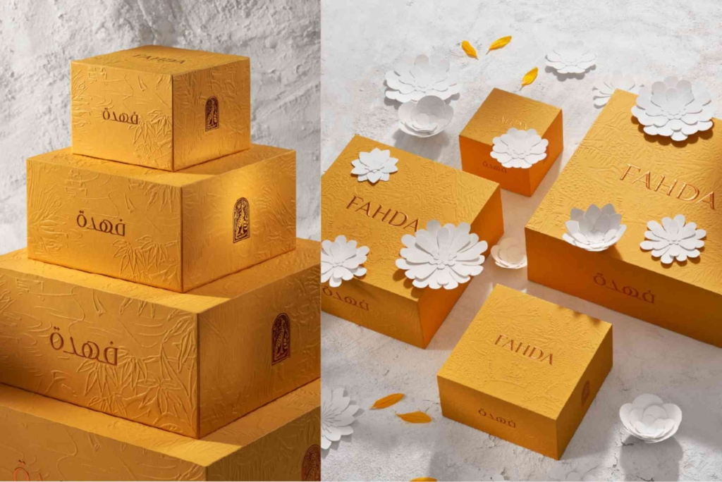
Gold packaging design can be executed in many ways. Foil stamping is one of the most popular methods. It creates sharp, reflective details that feel tactile and premium. Foil works well for logos, borders, and typography.
Matte gold finishes offer a softer, more modern appearance. They reduce glare while maintaining elegance. Matte gold packaging design is popular with minimalist brands and contemporary products.
Embossed gold elements add depth and texture. When customers run their fingers over the packaging, it creates a sensory experience. This physical interaction strengthens brand memory.
Printed gold inks provide a cost-effective option. While less reflective, they still deliver visual warmth and sophistication when used carefully.
Balancing Elegance and Overdesign
One common mistake in gold packaging design is excess. Too much gold can overwhelm the design and reduce clarity. Effective gold packaging design uses restraint and purpose.
Designers often pair gold accents with clean layouts. White space allows gold elements to breathe. This contrast enhances readability and visual appeal.
Typography also matters. Simple fonts work best with gold packaging design. Overly decorative fonts can clash with metallic finishes and reduce legibility.
Gold Packaging Design Across Industries
In cosmetics, gold packaging design signals luxury and efficacy. High-end skincare brands use gold accents to suggest advanced formulations and visible results.
In food and beverage, gold packaging design is often used for premium chocolates, teas, and spirits. It communicates indulgence and quality ingredients. Consumers expect a superior taste experience.
Fashion and accessories brands use gold packaging design to reinforce exclusivity. A gold-accented box enhances the unboxing experience and encourages social sharing.
For corporate gifting, gold packaging design conveys appreciation and value. It shows recipients that effort and thought were invested in presentation.
Sustainability and Gold Packaging Design
Modern consumers care deeply about sustainability. Gold packaging design must adapt to these expectations. Fortunately, luxury and sustainability can coexist.
Many brands now use recyclable foils and eco-friendly inks. Gold effects can be achieved without excessive materials. Minimalist gold packaging design often uses fewer resources overall.
Sustainable materials combined with gold accents create a powerful message. They show that the brand values both quality and responsibility. This approach builds long-term trust with conscious consumers.
Customisation in Gold Packaging Design
Customisation is a major trend in packaging. Brands want unique designs that reflect their identity. Gold packaging design works exceptionally well with custom shapes, finishes, and details.
Using Custom Packaging allows brands to tailor gold elements to their exact needs. Custom sizes, textures, and layouts ensure the gold packaging design aligns perfectly with the brand story. This level of detail strengthens recognition and customer loyalty.
Personalised gold packaging design is also popular for limited editions. Names, dates, or messages in gold foil create emotional connections and encourage repeat purchases.
Gold Packaging Design for Branding Consistency
Consistency is essential for strong branding. Gold packaging design should align with the overall brand identity. Colours, tone, and messaging must work together seamlessly.
When used consistently, gold packaging design becomes a signature element. Customers begin to recognise the brand instantly. This recognition builds trust and speeds up purchasing decisions.
Brands should also ensure gold packaging design matches their digital presence. Website visuals, social media graphics, and product photography should reflect the same premium aesthetic.
Trends Shaping Gold Packaging Design
Current trends favour subtlety and sophistication. Rather than full gold coverage, designers use fine lines, patterns, and accents. This approach feels modern and refined.
Another trend is contrast. Deep colours like black, emerald, and navy paired with gold create striking visuals. These combinations photograph well and perform strongly online.
Texture is also gaining importance. Soft-touch finishes combined with gold details enhance the tactile experience. Customers remember how the packaging feels, not just how it looks.
Designers often seek packaging design inspiration from global showcases. Studying innovative examples helps brands stay relevant while maintaining timeless appeal.
Gold Packaging Design and Consumer Experience
Packaging influences how customers feel before using a product. Gold packaging design elevates this moment. The unboxing experience becomes memorable and shareable.
When customers associate positive emotions with packaging, they are more likely to repurchase. They may also recommend the product to others. Gold packaging design supports word-of-mouth marketing naturally.
This emotional connection is especially important in competitive markets. When products are similar, packaging becomes the deciding factor.
Common Mistakes to Avoid
One mistake is using gold packaging design without purpose. Gold should support the brand message, not replace it. Without a clear concept, gold elements feel decorative rather than meaningful.
Another issue is poor print quality. Low-quality gold finishes can look cheap and inconsistent. Investing in proper materials and production is essential.
Ignoring cultural context can also be risky. While gold is generally positive, its meaning varies slightly across markets. Brands should research their audience carefully.
Measuring the Impact of Gold Packaging Design
Brands often see higher perceived value after switching to gold packaging design. Customer feedback frequently mentions premium feel and improved presentation.
Sales data can also reflect packaging changes. Products with gold packaging design often perform better during gifting seasons and promotions.
Online engagement is another indicator. Gold-accented packaging images tend to receive more likes, shares, and saves on social platforms.
FAQs
What makes gold packaging design look premium?
Gold packaging design looks premium because it reflects light and symbolises value. It triggers luxury associations and enhances perceived quality instantly.
Is gold packaging design suitable for all products?
Gold packaging design works best for premium or aspirational products. However, subtle gold accents can enhance many categories when used carefully.
Can gold packaging design be sustainable?
Yes, gold packaging design can be sustainable. Eco-friendly foils, recyclable materials, and minimal designs support environmental goals without losing elegance.
How much gold should be used in packaging design?
Less is often more. Strategic accents usually create stronger impact than full gold coverage. Balance ensures clarity and sophistication.
Does gold packaging design increase sales?
In many cases, yes. Gold packaging design improves shelf impact and perceived value, which can positively influence purchasing decisions.
Is Gold Packaging Design Right for Your Brand?
Gold packaging design remains a powerful tool for brands seeking distinction and trust. When executed thoughtfully, it communicates luxury, quality, and confidence. It enhances customer experience and supports premium positioning across industries.
The key lies in balance, consistency, and quality execution. Gold should enhance the story, not overpower it. With the right strategy, gold packaging design can transform how customers perceive and remember your brand.