Food Packaging Logo Design: The Complete Expert Guide
Food packaging logo design is more than just placing a symbol on a box or wrapper. It is the visual handshake between a food brand and its customers, often influencing buying decisions in just a few seconds. In crowded supermarket aisles and online stores, your logo on the packaging must communicate trust, taste, quality, and brand personality instantly. A well-crafted food packaging logo design does not only look attractive; it tells a story, builds emotional connection, and reinforces brand recall.
In this in-depth guide, we will explore how food packaging logo design works, why it matters, what elements make it effective, and how brands can leverage design to stand out while remaining compliant and credible. This article is written from a practical branding and packaging perspective, following Google’s E-E-A-T principles and real-world design experience.
Why Food Packaging Logo Design Matters So Much
Food packaging logo design plays a crucial role in shaping first impressions. Consumers often make split-second decisions based on packaging alone, especially for food items where taste cannot be tested beforehand. A strong logo helps reassure buyers about safety, quality, and consistency.
Beyond aesthetics, food packaging logo design also supports brand recognition. When customers repeatedly see the same logo across different products, shelves, or platforms, it creates familiarity. Familiar brands feel safer, and safety is especially important in the food industry.
Another reason food packaging logo design matters is differentiation. Many food categories are saturated with similar products. A distinctive logo helps your product stand out without needing aggressive pricing or promotions.
Understanding the Psychology Behind Food Packaging Logos
Food packaging logo design works best when it aligns with human psychology. Colours, shapes, and typography all trigger subconscious responses. Warm colours often stimulate appetite, while cooler tones suggest freshness or health. Rounded shapes can feel friendly and comforting, while sharp lines may suggest premium or bold flavors.
Typography in food packaging logo design also affects perception. Handwritten or script fonts can signal homemade or artisanal qualities, while clean sans-serif fonts often represent modern, healthy, or minimal brands. Serif fonts may suggest tradition and heritage, which works well for long-established food products.
When these psychological cues are combined thoughtfully, food packaging logo design becomes a powerful communication tool rather than just decoration.
Core Elements of an Effective Food Packaging Logo Design
Simplicity and Clarity
In food packaging logo design, simplicity is essential. Packaging often needs to be readable from a distance or at small sizes. Overly complex logos can lose impact when scaled down or printed on different materials. Clear shapes and legible typography ensure your logo works across labels, boxes, pouches, and digital displays.
Brand Consistency Across Packaging
Consistency builds trust. Your food packaging logo design should look cohesive across all product lines, even if flavors or variants change. Consistent use of logo placement, colour systems, and proportions helps customers quickly identify your brand, regardless of the specific product.
Adaptability for Different Packaging Types
Food packaging comes in many forms, including boxes, bags, jars, and wrappers. A successful food packaging logo design must adapt well to different shapes and surfaces. This includes working in monochrome, embossing, or foil stamping without losing identity.
The Role of Packaging Materials in Logo Design
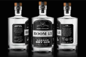
Food packaging logo design does not exist in isolation; it interacts directly with packaging materials. Cardboard, kraft paper, plastic, glass, and metal all influence how a logo appears. Matte finishes can create a premium, organic feel, while glossy finishes may enhance colour vibrancy.
Brands investing in Custom Packaging often achieve better logo visibility and consistency because the packaging is designed around the logo, not the other way around. Tailored solutions allow designers to consider texture, print quality, and structural design together. For brands exploring tailored solutions, professional options like custom boxes can make a noticeable difference in how a logo performs in real-world conditions.
Food Packaging Logo Design and Legal Considerations
In the food industry, compliance is critical. Food packaging logo design must leave room for mandatory information such as ingredients, nutritional facts, certifications, and expiry dates. A good designer understands how to balance branding with regulatory requirements without cluttering the packaging.
Additionally, trademarks play a major role. A unique food packaging logo design should be legally protectable. Conducting trademark checks early in the design process helps avoid costly rebranding later.
Trends Shaping Modern Food Packaging Logo Design
Food packaging logo design trends evolve with consumer values. Today, transparency, sustainability, and authenticity dominate the market. Many brands are simplifying logos to improve readability and digital performance. Minimalist logos also align well with eco-friendly packaging materials.
Illustration-based logos are gaining popularity for brands that want to tell a story or emphasize natural ingredients. At the same time, retro-inspired designs are making a comeback, especially for snacks and beverages that want to evoke nostalgia.
For designers and brand owners looking for real-world examples and creative ideas, browsing platforms that showcase global work can be helpful. Sites focused on packaging design inspiration often highlight how successful brands balance creativity with functionality.
How Food Packaging Logo Design Builds Trust
Trust is one of the most valuable assets in the food business. Food packaging logo design contributes to trust by signaling professionalism and quality. Poor design can raise doubts about hygiene, safety, or authenticity, even if the product itself is excellent.
Clear logos, balanced layouts, and thoughtful colour choices suggest that a brand pays attention to detail. Certifications or quality marks integrated carefully into the logo area can further reinforce credibility without overwhelming the design.
Designing for Local and Global Audiences
Food packaging logo design must consider cultural context. Colours, symbols, and even typography can have different meanings across regions. A logo that works well in one market may need adaptation for another.
Brands operating locally benefit from understanding their audience’s preferences and expectations. Knowing where your packaging is produced and distributed can also influence design decisions. If you want to understand the physical presence and accessibility of a packaging provider, viewing their Buddy Packaging Location can offer reassurance and transparency. You can check it here.
The Collaboration Between Designers and Food Brands
Successful food packaging logo design is usually the result of collaboration. Designers need clear brand values, target audience insights, and product positioning from the business side. In return, designers translate those insights into visual language that works on shelves and screens.
Brands that involve designers early in the packaging development process often achieve better results. This allows logo design, packaging structure, and material selection to work together seamlessly rather than being forced into limitations later.
Measuring the Success of Food Packaging Logo Design
Food packaging logo design success can be measured in several ways. Sales performance is an obvious indicator, but brand recall, customer feedback, and repeat purchases also matter. A logo that customers remember and recognize contributes to long-term brand equity.
A/B testing different logo placements or design variations on packaging can provide valuable insights. Even small adjustments in size, contrast, or positioning can significantly impact visibility and perception.
FAQs
What makes a good food packaging logo design?
A good food packaging logo design is simple, memorable, and aligned with the brand’s values. It should be easy to recognize, adaptable to different packaging formats, and appealing to the target audience.
How important is colour in food packaging logo design?
Colour is extremely important in food packaging logo design because it influences appetite, mood, and brand perception. Choosing the right colour palette helps communicate flavor, freshness, and quality instantly.
Should a food packaging logo be different from a regular brand logo?
In most cases, the core logo remains the same, but food packaging logo design may require slight adaptations for readability, size, or compliance with packaging regulations.
How often should a food brand update its packaging logo design?
A food brand should only update its packaging logo design when necessary, such as during rebranding, market expansion, or when the design no longer reflects the brand’s values. Frequent changes can confuse customers.
Can small food businesses benefit from professional logo design?
Yes, small food businesses often benefit the most. A professional food packaging logo design helps build trust, compete with established brands, and create a strong first impression.
Investing in Food Packaging Logo Design
Food packaging logo design is not an afterthought; it is a strategic investment in brand success. From psychology and materials to compliance and trust, every detail matters. A well-designed logo enhances visibility, strengthens credibility, and supports long-term growth in a competitive market.