Introduction
Ferrero Rocher is more than just a chocolate; it is a symbol of luxury, celebration, and thoughtful gifting. The brand’s packaging design has played a pivotal role in elevating its status in the confectionery market. From the golden foil to the transparent boxes that reveal the chocolate’s intricate layers, Ferrero Rocher packaging is an example of how design can enhance both perceived value and consumer experience. In this article, we’ll explore the intricate details, creative choices, and marketing strategies behind Ferrero Rocher packaging design, offering insights for enthusiasts and professionals alike.
The History of Ferrero Rocher Packaging
Since its launch in 1982, Ferrero Rocher has carefully crafted a brand image that revolves around elegance and indulgence. The packaging has always been central to this image. Early packaging used simple clear boxes, but as the brand grew, its design evolved to emphasise luxury. The now-iconic gold foil was introduced not just for aesthetics but also to convey premium quality.
The triangular boxes and gift packs further reinforced the brand’s luxurious positioning. By focusing on the unboxing experience, Ferrero Rocher ensured that customers feel a sense of excitement and prestige every time they open a box. This historical progression demonstrates the strategic importance of packaging design in brand storytelling.
Elements That Define Ferrero Rocher Packaging Design
Gold Foil Wrapping
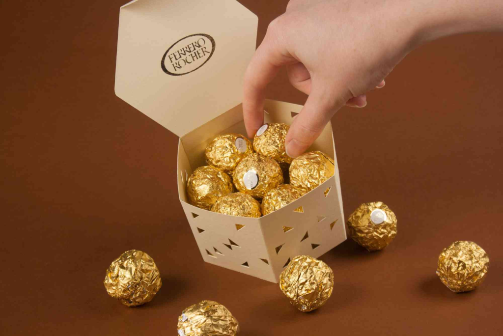
The gold foil wrapping is arguably the most recognisable element of Ferrero Rocher packaging. Beyond aesthetics, the foil serves a functional purpose by protecting the chocolate from environmental factors. The choice of gold communicates premium quality, making it suitable for gifting and special occasions. Its reflective surface also captures attention on retail shelves, a crucial factor in marketing.
Transparent Boxes and Trays
Ferrero Rocher’s use of transparent boxes allows consumers to see the chocolates inside, combining temptation with trust. The packaging balances visibility with protection, ensuring each chocolate remains intact. The trays inside the box prevent movement, keeping the chocolates perfectly aligned. This careful attention to detail enhances the unboxing experience, making it feel like an event rather than a simple snack.
Typography and Branding
Even the typography on Ferrero Rocher packaging contributes to the luxury image. The brand’s classic serif font exudes sophistication and reliability, while the strategic placement of logos reinforces brand recognition. Every element, from font choice to logo size, is designed to maintain consistency and reinforce the premium feel.
Sustainability in Ferrero Rocher Packaging
Modern consumers increasingly value eco-friendly packaging, and Ferrero Rocher has begun exploring sustainable options. While the gold foil is iconic, the brand has been experimenting with recyclable and biodegradable materials for certain components. This approach balances environmental responsibility with brand aesthetics, showing that luxury packaging and sustainability can coexist.
Sustainable practices in packaging not only benefit the environment but also appeal to ethically conscious customers, further enhancing brand loyalty. By prioritising both design and sustainability, Ferrero Rocher continues to lead in packaging innovation.
Marketing Impact of Ferrero Rocher Packaging
Packaging is not just a protective shell; it is a marketing tool. Ferrero Rocher’s packaging design has helped the brand maintain a premium position in a highly competitive market. The gold foil, elegant boxes, and gift-ready presentation communicate value without the need for excessive advertising.
The packaging design also influences consumer behaviour, encouraging impulse purchases. Shoppers often select Ferrero Rocher when looking for a sophisticated gift, and the packaging itself plays a significant role in that decision-making process. This demonstrates the powerful intersection of design, psychology, and marketing strategy.
Innovations in Ferrero Rocher Packaging
Ferrero Rocher has continuously innovated to keep its packaging fresh and appealing. Limited edition packaging, festive designs, and seasonal gift packs showcase the brand’s creativity. Innovations are not just visual; ergonomic and practical considerations, such as easy-open lids and resealable boxes, enhance the user experience.
These innovations highlight how thoughtful packaging design can adapt to changing consumer expectations while maintaining brand identity. By blending creativity with functionality, Ferrero Rocher ensures that its packaging remains relevant and desirable.
Inspiration for Packaging Designers
Ferrero Rocher packaging design serves as a case study for designers and marketers alike. Its success demonstrates the importance of balancing aesthetics, functionality, and brand storytelling. Designers can draw inspiration from the brand’s use of metallic colours, clear visibility, and structured layouts to craft packaging that resonates with consumers.
For those seeking further ideas, platforms for packaging design inspiration provide a wide range of innovative designs, highlighting global trends in packaging creativity. Professionals can also explore Custom Packaging solutions to adapt these principles for different products.
Ferrero Rocher Packaging Around the World
Packaging preferences can vary globally, and Ferrero Rocher adapts its designs to meet regional tastes. In Europe, traditional gold boxes remain popular, while in Asia, limited-edition festive packaging is widely embraced. By tailoring its designs, Ferrero Rocher ensures that packaging resonates culturally while preserving its brand identity.
This global approach also illustrates the flexibility of packaging design. Designers must consider cultural, functional, and marketing factors when creating packaging that appeals to diverse audiences.
Where to Experience Ferrero Rocher Packaging First-Hand
For enthusiasts and professionals, seeing the packaging in person offers insights into its quality and design intricacies. Stores and boutiques provide the opportunity to examine the gold foil, transparent trays, and premium box textures up close. Visiting a Buddy Packaging Location can also provide inspiration for creating high-quality, luxury packaging solutions.
Ferrero Rocher packaging design is a masterclass in combining elegance, functionality, and marketing strategy. Every element—from the gold foil to transparent boxes—is designed to create an elevated consumer experience. The brand demonstrates how thoughtful packaging can enhance product perception, drive sales, and foster brand loyalty.
Whether you are a designer, marketer, or chocolate lover, Ferrero Rocher’s packaging offers valuable lessons in balancing aesthetics, usability, and brand storytelling. Explore your own creative journey in packaging by embracing these principles and considering bespoke solutions for your products.
Take the first step toward premium packaging today with Custom Packaging.
FAQ
Why is Ferrero Rocher packaging gold?
The gold foil conveys luxury, premium quality, and gift-worthiness. It also protects the chocolate and attracts attention in stores.
How does Ferrero Rocher packaging enhance the consumer experience?
Transparent boxes, protective trays, and elegant wrapping create a visually appealing and tactile unboxing experience.
Is Ferrero Rocher packaging sustainable?
The brand is exploring recyclable and biodegradable materials while maintaining its signature gold foil design.
Can Ferrero Rocher packaging be reused?
Yes, many consumers repurpose the boxes for storage, gift-giving, or decoration due to their durability and elegant design.
Where can I find packaging design inspiration like Ferrero Rocher?
Platforms like Packaging of the World showcase global packaging innovations for designers and brands.