Introduction
Drink bottle label design plays a crucial role in how consumers perceive a beverage brand. In today’s competitive market, shoppers often decide within seconds whether to pick up a product. The label is usually the first thing they see. It communicates quality, flavour, values, and trust without a single word being spoken. A well-crafted drink bottle label design does more than look attractive. It tells a story, creates emotional connection, and helps brands stand out on crowded shelves.
Whether you are launching a new beverage or refreshing an existing product, understanding drink bottle label design is essential. From colour psychology to typography and material choices, every detail matters. This guide explores the key aspects, trends, and best practices of drink bottle label design while keeping a strong focus on usability, compliance, and brand growth.
Why Drink Bottle Label Design Matters
Drink bottle label design is not just about decoration. It is a strategic branding tool. A strong label helps consumers recognise your brand instantly. It also builds trust by presenting information clearly and professionally. When a label looks cheap or confusing, people often assume the product quality is the same.
In retail environments, beverages compete side by side. A thoughtful drink bottle label design can catch attention even from a distance. It also supports premium pricing by signalling value. Many successful brands invest heavily in label design because they know it directly influences purchase decisions.
Understanding Your Target Audience
Before creating a drink bottle label design, it is vital to understand who you are selling to. Different audiences respond to different visual cues. Health-conscious buyers prefer clean designs with soft colours and clear ingredient details. Younger audiences often enjoy bold colours, playful fonts, and modern graphics.
A label should speak the language of its audience. For example, a sports drink label design focuses on energy and performance. In contrast, a luxury bottled water label design emphasises purity and elegance. When the audience feels understood, they are more likely to trust the product.
Core Elements of Effective Drink Bottle Label Design
Colour Psychology in Beverage Labels
Colour strongly affects emotions and buying behaviour. Drink bottle label design uses colour to signal flavour, mood, and purpose. Green often suggests freshness or health. Blue communicates purity and hydration. Red can imply energy or sweetness.
Choosing the right colour palette ensures your label aligns with your brand message. Consistent colours across products also strengthen brand recognition over time.
Typography and Readability
Typography is a key part of drink bottle label design. Fonts must be readable at a glance. Overly decorative fonts may look attractive but can reduce clarity. Clear typography helps customers quickly understand the product name, flavour, and benefits.
Font choice should also match brand personality. A modern sans-serif font feels clean and contemporary. A serif font can feel traditional and premium. Balance is essential to avoid visual clutter.
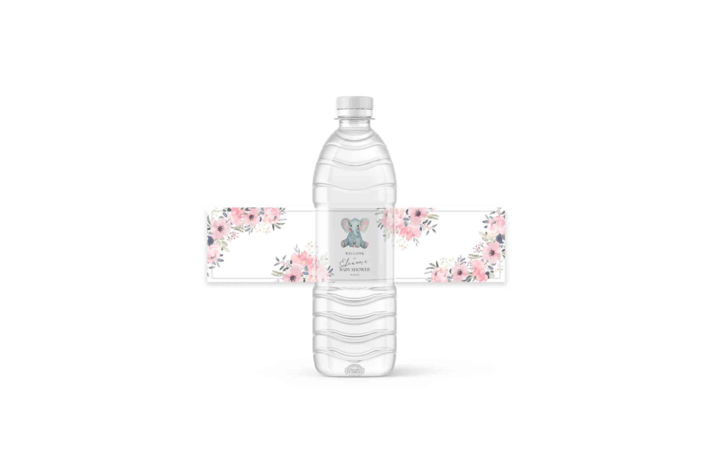
Imagery and Graphics
Images and illustrations help communicate flavour and lifestyle. Fruit visuals are common in juice drink bottle label design. Minimal graphics often work well for premium beverages. However, images must be high quality and relevant.
Too many graphics can overwhelm the label. Simplicity often improves impact. The goal is to support the message, not distract from it.
Material and Finish Choices
Drink bottle label design extends beyond visuals. The physical feel of the label influences perception. Matte finishes feel sophisticated. Glossy finishes feel vibrant and energetic. Textured materials can create a memorable tactile experience.
Water resistance is also critical. Beverage bottles often face condensation. Durable label materials prevent peeling and fading, maintaining brand quality over time.
Regulatory and Information Requirements
A successful drink bottle label design must also meet legal requirements. Information such as ingredients, nutritional values, allergens, and barcode placement must be clear and accurate. In the UK, compliance with food labelling regulations is essential.
Clear information builds consumer trust. When customers can easily read what they are drinking, they feel more confident in their purchase decision.
Brand Consistency Across Packaging
Drink bottle label design should align with the overall packaging strategy. Labels, caps, and boxes should feel connected. Many brands enhance their presentation using Custom Bottle Boxes that match the label design and reinforce brand identity. Consistency across all packaging touchpoints strengthens recognition and professionalism.
Packaging that feels cohesive also improves unboxing experiences. This is especially important for online sales and gifting.
Trends Shaping Modern Drink Bottle Label Design
Minimalism remains a strong trend in drink bottle label design. Clean layouts with plenty of white space feel modern and trustworthy. Sustainable design is also gaining attention. Eco-friendly materials and natural colours appeal to environmentally aware consumers.
Personalisation is another growing trend. Limited edition labels and seasonal designs help brands stay fresh. Transparency in design, including clear bottles and simple labels, also continues to grow in popularity.
Balancing Creativity and Clarity
Creative expression is important, but clarity should never be sacrificed. Drink bottle label design must communicate essential details quickly. A beautiful label that confuses customers often fails commercially.
Testing designs with real users can reveal issues early. Feedback helps refine layout, font size, and colour contrast. This practical approach aligns with real-world experience and improves outcomes.
The Role of Internal Links and Brand Authority
Strong branding goes beyond the bottle. Supporting content, guides, and resources help build authority. Learning from expert label design tips can inspire better design decisions and keep your brand competitive.
Physical presence also matters. Knowing the Buddy Packaging Location helps customers trust the business behind the product. Transparency strengthens brand credibility.
SEO Benefits of Thoughtful Label Design Content
Although drink bottle label design is visual, written content about it supports SEO efforts. Blogs, guides, and case studies help attract organic traffic. Using natural language and answering real questions improves search visibility.
Brands that share knowledge demonstrate expertise. This supports Google’s E-E-A-T principles and builds long-term trust with audiences.
Drink bottle label design is a powerful tool that shapes first impressions and drives purchasing decisions. From colour and typography to materials and compliance, every detail contributes to success. A well-designed label communicates quality, builds trust, and strengthens brand identity in competitive markets.
Effective label-design-for-bottles plays a vital role in branding, customer trust, and shelf appeal. A well-designed bottle label clearly communicates product information while reflecting the brand’s identity and quality. From colour choices to typography, professional label design helps products stand out in competitive UK markets and leaves a lasting impression on consumers.
FAQ Section
What makes a good drink bottle label design?
A good drink bottle label design combines clear information, strong branding, and visual appeal. It should be readable, compliant, and emotionally engaging while reflecting the brand’s values.
How important is colour in drink bottle label design?
Colour is extremely important. It influences perception, mood, and flavour expectations. The right colours help products stand out and connect with the target audience.
Should drink bottle labels be minimal or detailed?
The choice depends on the brand and audience. Minimal labels feel modern and premium. Detailed labels work well for products needing explanation. Balance is key.
Do label materials affect consumer trust?
Yes, material quality affects perception. Durable, well-finished labels suggest higher product quality and professionalism.
How often should brands update their drink bottle label design?
Brands should review their design every few years. Updates help stay relevant while maintaining brand recognition.