Introduction
Creative water bottle label design plays a vital role in how a brand is perceived. In today’s competitive market, a bottle is no longer just a container. It is a silent salesperson sitting on shelves, at events, and in customers’ hands. A well-designed label can instantly communicate quality, trust, and personality. For brands in the UK, where consumers are design-aware and brand-loyal, investing in thoughtful label design is essential.
This article explores creative water bottle label design in depth. It explains how design choices influence buying decisions, how to balance creativity with compliance, and how to design labels that truly connect with your audience. Whether you are launching a new bottled water brand or refreshing an existing one, this guide will help you make informed decisions.
Why Creative Water Bottle Label Design Matters
Creative water bottle label design directly affects consumer behaviour. When shoppers face dozens of similar products, visual appeal becomes the deciding factor. A label that looks premium, friendly, or eco-conscious can attract attention within seconds.
Design also builds trust. Clear typography, balanced layouts, and professional finishes suggest reliability and safety. In contrast, cluttered or outdated designs can raise doubts about quality. In the bottled water industry, where the product itself is transparent and similar across brands, the label often carries the entire brand story.
Moreover, creative water bottle label design supports brand recognition. Consistent colours, fonts, and imagery help customers remember your brand. Over time, this recognition turns into loyalty, which is invaluable in a crowded market.
Understanding Your Audience Before Designing
Before starting any creative water bottle label design, it is important to understand who you are designing for. Different audiences respond to different visual cues. A fitness-focused audience may prefer clean layouts and bold typography. Families may respond better to friendly colours and reassuring messages. Premium buyers often expect minimalist designs with subtle details.
Cultural context also matters in the UK. British consumers often appreciate understated elegance over loud visuals. Designs that feel balanced and refined tend to perform better. Understanding these preferences helps you make creative choices that feel natural rather than forced.
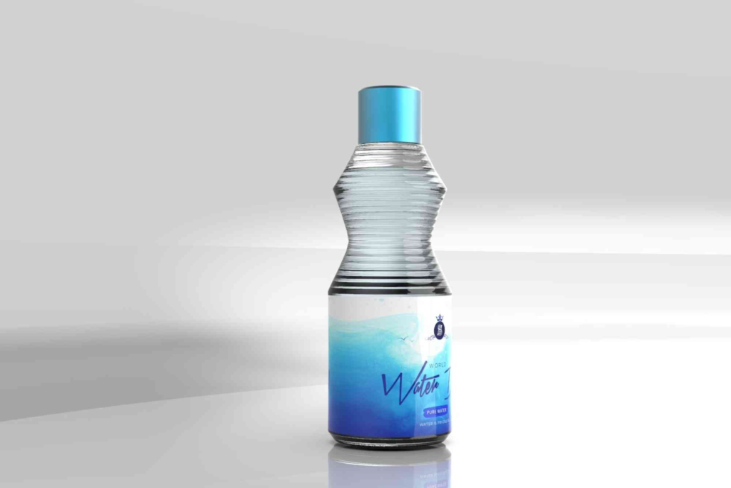
Core Elements of Creative Water Bottle Label Design
Creative water bottle label design relies on several key elements working together. Typography is one of the most important. Fonts should be easy to read while reflecting brand personality. Sans-serif fonts often feel modern and clean, while serif fonts can suggest tradition and trust.
Colour choice is equally crucial. Blues and greens are common in water branding because they signal freshness and purity. However, creative brands often use unexpected accent colours to stand out. The key is balance. Colours should enhance readability, not overpower it.
Imagery and graphics also play a role. Some brands use landscapes, droplets, or abstract patterns. Others rely on strong typography alone. There is no single right approach. The best creative water bottle label design aligns visuals with the brand’s message and values.
Balancing Creativity with Compliance
While creativity is important, water bottle labels must meet legal requirements. In the UK, labels must include specific information such as volume, source details, and manufacturer information. Ignoring these rules can lead to costly issues.
The challenge is integrating required information without harming the design. Skilled designers treat compliance text as part of the layout. They use hierarchy, spacing, and font size to keep the label clean and readable. Creative water bottle label design is not about ignoring rules. It is about working creatively within them.
Sustainable Design as a Creative Opportunity
Sustainability is no longer optional. Many UK consumers actively seek eco-friendly brands. Creative water bottle label design can support this expectation. Using recyclable materials, minimal ink coverage, or natural textures can communicate environmental responsibility.
Design choices can also reinforce sustainability messaging. Earthy colours, simple layouts, and honest language help build credibility. When sustainability is genuine and clearly communicated, it strengthens brand trust. This approach works especially well when combined with thoughtful packaging solutions, such as Custom Bottle Boxes that protect products while reducing environmental impact.
Trends Shaping Creative Water Bottle Label Design
Trends in creative water bottle label design continue to evolve. Minimalism remains popular, especially for premium brands. Clean lines, limited colours, and plenty of white space create a calm and confident look.
Personalisation is another growing trend. Limited editions, event-specific labels, or regional designs help brands connect emotionally with customers. This approach works well for promotional campaigns and special occasions.
Illustration-led designs are also gaining attention. Hand-drawn elements add warmth and authenticity. They can tell stories about water sources, brand heritage, or lifestyle values. Designers often explore platforms like label design inspiration to study global trends and adapt them to local markets.
Typography as a Storytelling Tool
Typography does more than display text. It tells a story. In creative water bottle label design, typography sets the tone before a single word is read. Rounded fonts feel friendly and approachable. Sharp fonts feel modern and energetic. Elegant fonts suggest luxury.
Line spacing, alignment, and hierarchy also matter. Clear headings guide the eye. Supporting text should feel secondary but readable. When typography is handled well, the label feels effortless, even if the design is complex.
Colour Psychology in Water Branding
Colour psychology plays a powerful role in creative water bottle label design. Blue is associated with trust and cleanliness. Green suggests nature and health. White communicates purity and simplicity. These associations are deeply ingrained.
However, creative brands sometimes break conventions. Using black can suggest luxury. Pastel tones can feel soft and modern. Bold colours can attract younger audiences. The key is consistency. Colours should align with brand values and target audience expectations.
The Role of Texture and Finish
Texture and finish add a tactile dimension to creative water bottle label design. Matte finishes feel premium and modern. Glossy finishes feel fresh and vibrant. Embossing or foil details add a sense of craftsmanship.
These choices influence how a bottle feels in hand. This physical interaction reinforces brand perception. A well-finished label can make a simple product feel special, encouraging repeat purchases.
Designing for Different Sales Channels
Creative water bottle label design should consider where the product will be sold. Labels for retail shelves must stand out at a distance. Online listings require labels that look clear in photographs. Event bottles may focus more on personalisation and messaging.
Designing with these contexts in mind improves effectiveness. A flexible design system allows small adjustments without losing brand consistency. This adaptability is a sign of thoughtful design planning.
Common Mistakes to Avoid
One common mistake in creative water bottle label design is overcrowding. Too much text or too many visuals confuse the viewer. Simplicity often communicates confidence better than excess detail.
Another mistake is following trends blindly. Trends fade quickly. A label should feel current but timeless. Focusing on core brand values helps avoid designs that feel outdated within a year.
Ignoring print quality is another issue. Colours may look different on screen than in print. Always test samples before final production. This step protects both design integrity and brand reputation.
Measuring the Success of Your Label Design
Success in creative water bottle label design can be measured in several ways. Increased sales and repeat purchases are clear indicators. Customer feedback also provides valuable insight. Positive comments about appearance or feel suggest strong design impact.
Brand recognition over time is another measure. When customers recognise your bottle without reading the label, the design is doing its job. Consistency across products strengthens this recognition.
Elevating Your Brand Through Design
Creative water bottle label design is a powerful branding tool. It combines visual appeal, storytelling, and strategy into a single surface. When done well, it attracts attention, builds trust, and encourages loyalty.
By understanding your audience, respecting regulations, and embracing thoughtful creativity, you can design labels that truly stand out. Every colour, font, and finish choice matters. Together, they shape how your brand is seen and remembered.
If you are planning a new label or refreshing an existing one, now is the perfect time to invest in design that reflects your brand’s value. Explore professional packaging solutions, seek inspiration from leading platforms, and work with experts who understand both creativity and compliance. A strong label today can define your brand’s success tomorrow.
Frequently Asked Questions
What makes a water bottle label design creative?
A creative water bottle label design combines originality with clarity. It reflects brand values while remaining easy to read and visually appealing.
How important is label design for bottled water brands?
Label design is extremely important. It often influences first impressions and purchasing decisions in a competitive market.
Can minimalist designs work for water bottle labels?
Yes, minimalist designs work very well. They communicate purity, quality, and confidence when executed correctly.
How do I ensure my label design meets UK regulations?
Work with experienced designers and printers. Always review legal requirements before finalising your design.
Should sustainability be part of label design?
Absolutely. Sustainable materials and messaging appeal strongly to UK consumers and enhance brand credibility.