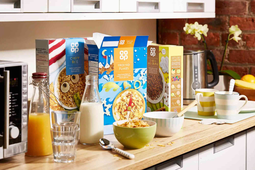
Cool Cereal Box Designs: Creative Ideas That Stand Out
Designing cool cereal box designs is no longer about placing a mascot beside a bowl of flakes. Today’s cereal aisle is a competitive visual battlefield, and the packaging must work hard to grab attention. Brands now focus on creativity, storytelling, color psychology, and user engagement. In this guide, you will learn how cool cereal box designs are created, what makes them effective, and how you can apply these insights to your own packaging projects.
Using insights from packaging experts, real brand examples, and practical design principles, this article explains what separates average boxes from unforgettable ones.
Why Cool Cereal Box Designs Matter
Eye-catching cereal boxes do far more than look good. Great design influences purchasing decisions and brand loyalty. As shoppers walk past dozens of cereal boxes, only a few manage to spark curiosity. That spark usually comes from thoughtful visuals, clever messaging, or unique structural elements.
When brands invest in cool cereal box designs, they communicate quality, creativity, and trust. Studies from design and marketing journals show that packaging affects how consumers perceive flavor, freshness, and even health benefits. So, cool cereal box designs are a strategic investment, not just an artistic choice.
Key Elements That Define Cool Cereal Box Designs
Color Psychology and Mood
Colors influence emotions. Warm colors create excitement. Cool tones suggest calmness. Bold contrasts help a cereal stand out in crowded aisles. Smart brands choose color palettes that match the cereal’s personality, whether fun, healthy, or nostalgic.
Typography That Pops
Typography should be readable but expressive. Curved fonts may appeal to kids, while sleek, modern fonts attract adults. Effective cool cereal box designs use typography to guide the eye, highlight benefits, and strengthen the brand voice.
Characters and Mascots
Mascots create nostalgia and brand attachment. Even minimalistic adult-focused brands benefit from subtle character design. Characters help shoppers find your cereal quickly, especially in large supermarkets.
Structural Creativity
While most cereal boxes follow a standard shape, creative structures can make a product unforgettable. Slight angles, windows, or textured panels make shoppers pick up the box out of curiosity.
Popular Trends in Cool Cereal Box Designs
Minimalist Aesthetic
Minimal design focuses on clean layouts, simple icons, and strong typography. It appeals to health-conscious adults who want clarity about ingredients.
Retro and Vintage Style
Nostalgia is powerful. Retro cereal boxes transport adults back to childhood. These cool cereal box designs often use old-school mascots, hand-drawn fonts, and vintage color schemes.
Eco-Friendly Designs
Sustainability matters. Many brands now use recycled materials and earthy textures that reflect environmental responsibility. Clear labeling about recyclability also improves trust.
Vibrant, Kid-Focused Art
Bright colors, cartoon characters, and interactive games are still effective for children’s cereals. Brands know that kids influence purchase decisions, so fun packaging matters.
Crafting Cool Cereal Box Designs: Step-by-Step Insights
Start With a Strong Brand Story
Every cereal must have a purpose. Healthy? Fun? Gourmet? Once the story is clear, the visuals follow naturally. Shoppers want authenticity, so storytelling shapes expectations.
Use Balanced Visual Hierarchy
Consumers scan boxes quickly. Highlight the product name, flavor, and key benefits first. Place secondary details like nutrition facts where eyes naturally land.
Add Texture and Tactile Effects
Embossing, matte finishes, and raised elements create a premium experience. When customers physically enjoy holding the box, they often buy it.
Make the Back Panel Engaging
Many buyers flip the box. You can add recipes, trivia, fun puzzles, or origin stories. This keeps customers engaged longer and increases brand loyalty.
Test Designs From a Distance
Designs must be readable from several feet away. If the main message disappears when viewed from afar, the design needs improvement.
Learn From Professional Resources
If you want deeper guidance, explore expert sources such as packaging studios, designers specializing in cereal boxes, or companies offering Custom Boxes and packaging solutions. You can also explore industry-trusted box design tips to improve layout, storytelling, and branding.
If you want to visit a physical packaging supplier for material samples or consultation, check Buddy Packaging Location in your area and see how professionals handle real box prototypes.
Examples of What Makes Cereal Boxes Truly Cool
Clever Use of Characters
Some brands use characters that interact with the background or hold the cereal bowl. This adds charm and personality.
Storytelling Panels
Boxes that tell origin stories or share fun facts connect with consumers emotionally. People love learning about ingredients, farmers, or the brand mission.
Interactive QR Codes
Modern cool cereal box designs integrate QR codes leading to games, recipes, or videos. This keeps tech-savvy shoppers engaged.
Innovative Structural Shapes
Some premium cereals use smart fold lines, slim boxes, or die-cut windows. These designs feel unique without being impractical.
Tips for Making Your Cereal Box Design Memorable
Keep the Message Clear
Avoid clutter. Consumers must understand flavor, texture, and benefits at a glance.
Use Authentic Imagery
Show real ingredients. Shoppers trust images that reflect reality.
Create a Unique Flavor Identity
Color and font should match the flavor. box design tips For example, berry cereals often use purple tones, while chocolate cereals use browns and golds.
Make Health Claims Trustworthy
If your cereal is high in fiber or protein, ensure the label is compliant with nutrition guidelines.
Focus on Shelf Differentiation
Visit a real store. See what your competitors are doing. Then design something distinct.
How Cool Cereal Box Designs Influence Buying Behavior
Visual Attraction
People notice bright or unusual designs first. This increases the chances of the cereal being picked up.
Emotional Connection
Mascots and stories make brands memorable. Families often repurchase the same cereal because of emotional comfort.
Perceived Quality
Premium finishes make cereals seem healthier or more flavorful. Shoppers use packaging as a gauge for value.
Child-Driven Selections
Kids often choose cereals based on characters or fun designs. Eye-level placement also influences their choices.
Create Cereal Boxes That Truly Stand Out
Cool cereal box designs help brands capture attention, build loyalty, and increase sales. Whether you prefer a minimalist adult aesthetic or a bold kid-friendly look, smart packaging choices can elevate your cereal above the competition. Buddy Packaging Location Start by understanding your audience, applying strong design principles, and testing visuals in real-world environments.
If you want to design packaging that engages buyers and strengthens your brand, now is the time to take action. Explore professional resources, brainstorm creative ideas, and start crafting a cereal box design that truly stands out.
FAQs About Cool Cereal Box Designs
What makes a cereal box design attractive?
Shoppers are drawn to clear typography, appealing colors, strong visuals, and storytelling that makes the cereal feel unique.
How do brands choose colors for cereal boxes?
They use color psychology to match the cereal’s personality and stand out on shelves.
Why do cereal boxes often use mascots?
Mascots create emotional connection and help kids identify the cereal quickly in stores.
Are sustainable cereal box designs becoming popular?
Yes, many brands now use recycled materials and eco-friendly inks to meet growing environmental demands.
Should cereal box designs highlight health benefits?
Yes, clear health claims help shoppers trust the product, especially in adult-focused cereals.