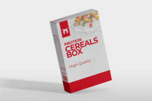
Cereal Box Packaging Design: A Complete Guide to Creating Standout Cereal Packaging
Cereal box packaging design plays a huge role in capturing customer attention on crowded shelves. With endless options available today, brands must rely on clever design, strong storytelling, and smart packaging choices to stand out. A well-designed cereal box not only attracts buyers but also strengthens brand identity and enhances the overall customer experience.
In this guide, you’ll learn how cereal box packaging design works, what elements matter most, and how to create packaging that is both visually appealing and strategically effective.
Understanding the Power of Cereal Box Packaging Design
Cereal is often an impulse-buy product. Most customers choose based on packaging, especially when shopping for something new. Effective cereal box packaging design helps you communicate flavor, quality, nutrition, and brand personality within seconds. Because shoppers compare many options quickly, your box must offer instant clarity and appeal.
Strong packaging also improves brand recall and increases the chances of repeat purchases. When buyers remember your design, they remember your product.
Key Elements of an Effective Cereal Box Packaging Design
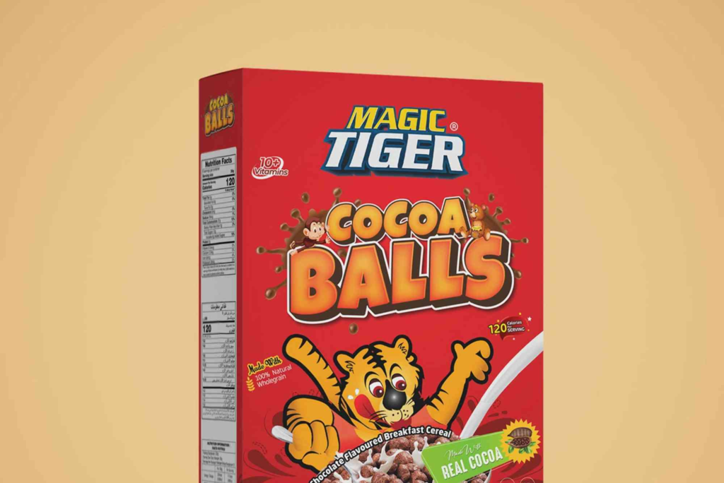
Front Panel Strategy
The front of the box creates the first impression. It should grab attention but also communicate the product clearly.
Use Vibrant but Balanced Colours
Bright colours work well for kids’ cereals, while earthy or muted tones suit adult-focused or healthy brands. Choose colours that reflect your cereal’s flavor or theme.
Display Your Product Name Clearly
The product name must be readable from a distance. Large, bold text helps buyers make quick decisions.
Add a High-Quality Visual
A mouthwatering image of the cereal or ingredients helps customers imagine the taste instantly. This visual storytelling increases your conversion rate.
Back Panel Storytelling
The back of the cereal box helps build emotional connection and deliver added value.
Tell Your Brand Story
Customers love authenticity. Share what makes your story different. Focus on origin, values, or unique ingredients.
Add Fun Elements for Engagement
Puzzle games, facts, characters, or educational content make your cereal memorable, especially for families with children.
Side Panels for Functional Details
Side panels often hold nutritional data, ingredients, and allergy information.
Keep Nutrition Clear and Transparent
Use simple layout and readable fonts. Many buyers compare cereals based on health benefits.
Highlight Certifications
Gluten-free, vegan, organic, or non-GMO labels build trust and credibility.
Design Principles That Improve Cereal Box Packaging
Typography That Enhances Readability
Font choices influence perception. Use playful fonts for kids but clean, modern fonts for adults. Maintain a hierarchy that guides users naturally.
Consistent Brand Identity
Use your brand’s colour palette, typography, and tone to create consistency across products. Strong identity builds long-term trust.
Balanced Layout
Avoid clutter. Use white space to help important elements stand out. A balanced layout feels more premium and professional.
High-Quality Material Choices
The type of cardboard or finishing you choose shapes customer perception. Glossy finishes enhance appearance, while matte feels elegant.
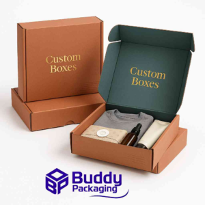
When you want premium packaging results, consider exploring Custom Boxes for improved durability and branding impact.
Creative Approaches to Modern Cereal Box Packaging Design
Eco-Friendly Packaging Trends
More customers prefer sustainable packaging. Recyclable, biodegradable, or reusable materials appeal to environmentally conscious buyers. A green commitment also elevates brand reputation.
Minimalist Design
Minimalism is trending across the food industry. Clean layouts and soft colours evoke trust and healthiness, which work well for granola and organic cereals.
Interactive Packaging
AR-enabled cereal boxes and QR codes allow brands to deliver digital experiences. These interactive elements increase engagement and encourage customers to revisit your product.
Inspirational Design Ideas
To spark creativity, many designers explore box design inspiration galleries. Studying global designs helps you understand trends, colour psychology, and layout ideas that work well.
Practical Tips for an Impactful Cereal Box Packaging Design
Focus on Your Target Audience
Kids, adults, and fitness enthusiasts respond to different visuals. Tailor your graphics, colours, and messaging for your audience.
Use Clear Messaging
Explain what makes your cereal unique. High protein, whole grains, or new flavors should be highlighted immediately.
Make Your Logo Visible
Place your logo at eye level and ensure it’s clear. Brand recognition drives customer loyalty.
Emphasize Benefits
Use short, bold statements like:
• “High in fiber”
• “No added sugar”
• “Includes real fruit”
These features influence purchase decisions quickly.
Consider Shelf Placement
Think about how your cereal will look beside competitors. Test how the design appears at eye level, mid-shelf, and bottom shelf.
Ensure Printer-Friendly Design
Complex gradients or extremely fine details may distort during printing. A clean, high-resolution design ensures crisp packaging.
The Role of Packaging Quality in Customer Decision-Making
Design is important, but so is durability. A sturdy box protects the cereal from moisture, crushing, and transport issues. Premium packaging also signals premium quality.
If you’re producing cereal packaging at scale, knowing the supplier’s location is helpful. You can check Buddy Packaging Location for guidance on where to source durable and customisable boxes.
Common Mistakes to Avoid in Cereal Box Packaging Design
Overcrowding the Layout
Too many colours, fonts, or graphics confuse buyers. Keep it simple.
Ignoring Colour Psychology
Every colour communicates emotion. Choose soothing or vibrant tones based on your message.
Confusing Messaging
Consumers won’t buy if they don’t understand the product quickly.
Using Low-Quality Images
Blurry images weaken trust. Use professional photography for best results.
Not Updating the Design Regularly
Trends change. Refresh your cereal box packaging design every few years to stay relevant.
FAQs
What makes good cereal box design?
Good cereal box design includes clear visuals, readable text, strong branding, and colours that match the product and audience. It also offers nutritional clarity and emotional appeal.
How do cereal boxes attract customers?
Cereal boxes attract customers through bold colours, engaging characters, appealing images, and easy-to-read benefits. Packaging also uses design psychology to create familiarity and trust.
Why is cereal packaging important?
Cereal packaging protects the product and influences purchase decisions. It communicates flavor, quality, and brand identity. Effective packaging can increase sales significantly.
How do you design a cereal box for kids?
Designing a cereal box for kids involves bright colours, fun characters, simple messaging, and interactive elements like games or puzzles to boost engagement.
What materials are used for cereal packaging?
Most cereal boxes use paperboard with an inner plastic or biodegradable liner. Brands increasingly prefer eco-friendly alternatives to reduce waste.
Cereal box packaging design is more than visuals. It’s a blend of strategy, storytelling, branding, and user psychology. With the right mix of creativity and functionality, you can create packaging that not only captures attention but also builds long-term brand loyalty.