Cereal Box Design Ideas: How to Create Eye-Catching Packaging That Sells
Designing a cereal box is far more than choosing colors and printing a logo. Today’s brands need cereal box design ideas that capture attention, tell a story, and stand out on crowded shelves. Whether you are building a new cereal brand or refreshing an existing one, your packaging plays a central role in customer perception, trust, and sales. With years of experience working around packaging concepts, I’ve seen how powerful a well-designed cereal box can be. In this guide, you’ll learn practical, creative, and brand-boosting ideas used by real experts in the packaging world.
Why Cereal Box Design Matters
A cereal box is often a customer’s first interaction with your product. Shoppers have only a few seconds to decide what to pick, so your packaging must instantly communicate value. Good design improves brand recognition, conveys flavor and benefits, and builds customer loyalty. When done well, these design choices increase sales and help establish a long-term identity.
Key Principles Behind Effective Cereal Box Design Ideas
Before exploring individual concepts, it’s important to understand the fundamentals. These principles guide successful brands and help you make smart decisions based on psychology and consumer behavior.
Keep Messaging Clear
Customers want clarity. The product name, main benefit, and flavor should be easily readable. Clutter can confuse buyers and reduce trust.
Choose Colors That Match Flavor Expectations
Color psychology plays a role in how cereal is perceived. Warm colors signal sweetness, while earthy tones imply natural ingredients.
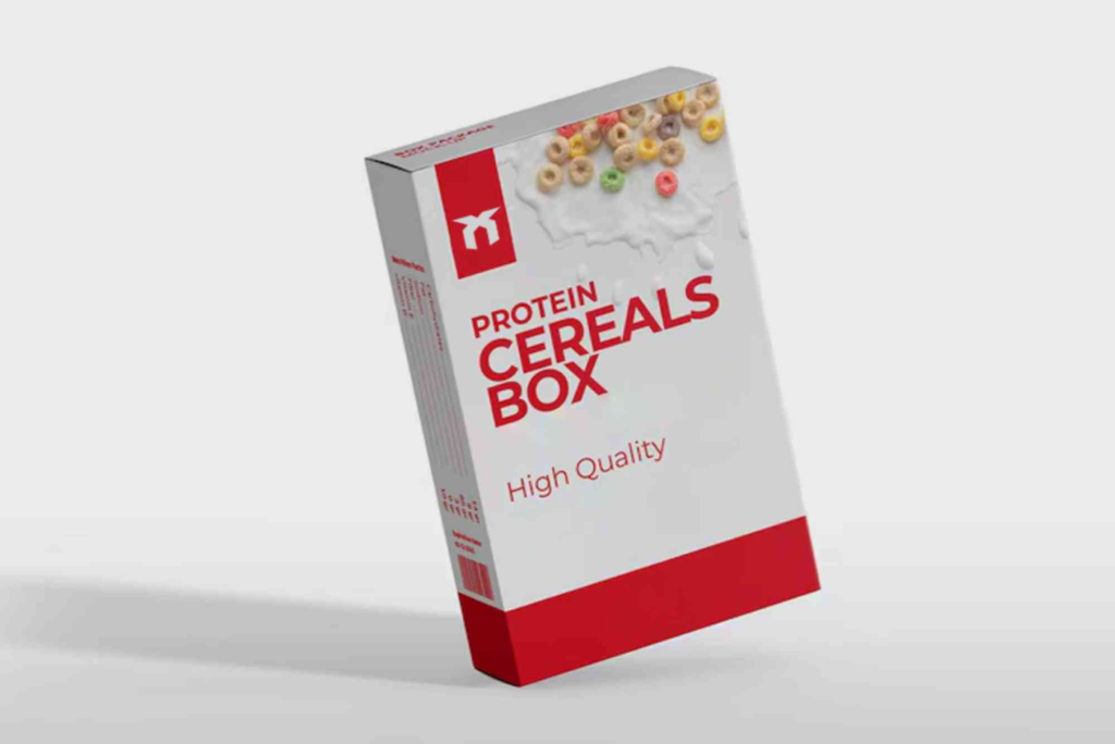
Use High-Quality Imagery
Cereal boxes rely heavily on imagery, such as flavor illustrations or ingredient photography. Sharp images instantly add credibility.
Maintain Branding Consistency
Your design should reflect your brand’s character. Is it fun, healthy, premium, or kid-friendly? Consistency creates long-term trust.
Best Cereal Box Design Ideas for Modern Brands
Below are creative and proven cereal box design ideas inspired by real industry practices. These concepts help increase visual impact, customer engagement, and brand storytelling.
Minimalist Front Panels
Minimalism is a fast-growing trend. Clean layouts with plenty of white space make your cereal box look modern and premium.
Simple Fonts
Choose a single, legible typeface. Clear text improves readability and enhances professionalism.
Focused Imagery
Use one strong visual element instead of many small illustrations. This keeps your message bold and direct.
Playful Kid-Focused Designs
Cereal for children requires energy, color, and fun. Kids are drawn to lively illustrations, characters, and surprises.
Character Mascots
A friendly mascot builds long-term recognition and gives kids a reason to reach for the box again.
Hidden Games
Puzzles or mini-stories on the back panel keep kids engaged and make the brand memorable.
Healthy & Natural Packaging Styles
Health-focused cereals use earthy aesthetics that represent natural ingredients and wellness.
Earth Tones
Colors like brown, beige, and green communicate authenticity and organic quality.
Ingredient Highlights
Show real oats, grains, nuts, or fruits to reinforce transparency and trust.
Bold Typography Designs
Typography-rich packaging stands out, especially on adult-focused cereals.
Oversized Titles
A large, bold product name instantly grabs attention from across the aisle.
Contrast Fonts
Mixing serif and sans-serif letters creates a dynamic and modern look.
Vintage & Retro Cereal Box Concepts
Nostalgia sells. Retro styles remind adults of childhood and build emotional connection.
Classic Color Palettes
Use warm reds, muted yellows, and off-white backgrounds to echo past designs.
Old-Style Illustrations
Hand-drawn graphics add charm and authenticity.
Story-Driven Packaging
Telling a story on your cereal box adds personality and depth.
Brand Mission Section
Share your brand purpose or farmer’s story. Customers appreciate transparency.
Ingredient Journey
Explain how the cereal is made or sourced to build trust.
Flavor-Centered Layouts
Highlighting the flavor visually and verbally helps customers understand the experience immediately.
Hero Image
Show a spoonful of cereal with milk and toppings to evoke appetite appeal.
Clear Flavor Labels
Use tags like “Honey Almond,” “Chocolate Crunch,” or “Strawberry Burst” prominently.
Texture-Based Designs
Adding texture to your cereal box improves tactile engagement and premium perception.
Embossed Logos
Raised logos stand out physically and visually.
Matte or Soft-Touch Finish
These finishes feel luxurious and attract high-end buyers.
Eco-Friendly Packaging Ideas
Sustainability is now a major selling point.
Recyclable Materials
Use natural cardboard textures to indicate responsibility.
Minimal Ink Printing
Reduce ink coverage for a raw, natural appearance.
Practical Tips for Bringing These Cereal Box Design Ideas to Life
If you want your cereal box to perform well, visual creativity must pair with smart strategy. Use the following insights to turn concepts into market-ready packaging.
Know Your Target Audience
Understanding your buyer helps you choose the right design language. Healthy eaters prefer calm, natural visuals, while kids want energy and fun.
Prioritize Readability
Text should be legible from three to four feet away. Avoid overly decorative fonts that compromise clarity.
Balance Creativity with Regulation
Packaging must follow food labeling rules. Nutrition facts, ingredients, weight, and barcodes require proper placement.
Test Multiple Prototypes
Brands often print several mockups to test colors, visibility, and shelf impact before final approval.
Study Competitors for Inspiration
Walking through a supermarket helps you spot trends. You will instantly see what works and what blends in.
Work with Professional Packaging Suppliers
Experienced suppliers provide better printing accuracy and material quality. Companies offering Custom Boxes help ensure your cereal packaging meets both branding and functional needs.
Learn From Proven Industry Advice
Applying expert knowledge such as box design tips improves layout, structure, and user appeal.
Visit Packaging Facilities
If possible, visit a supplier. Seeing real production at locations like Buddy Packaging Location gives you deeper insight into materials and processes.
Mistakes to Avoid When Creating Cereal Box Designs
Avoiding common errors improves your final packaging and prevents costly redesigns.
Overcrowding the Layout
Too many graphics confuse customers. Keep your message clear.
Using Inconsistent Colors
Random colors weaken your brand identity.
Ignoring Printing Limitations
Bright colors and gradients look different on cardboard than on screens.
Forgetting the Side Panels
Side panels are perfect for nutritional details, QR codes, or storytelling.
Neglecting Shelf Visibility
Designs must look strong when placed beside competing products.
How to Make Your Cereal Box More Interactive
Interactive elements engage customers and enhance brand loyalty.
QR Codes
Codes can lead to recipes, videos, or fitness challenges.
Collectible Cards
Kids love collecting themed cards or stickers inside the box.
Augmented Reality
Some modern brands connect boxes with AR games for an immersive experience.
Advanced Branding Ideas for Premium Cereal Packaging
Premium brands rely on refined aesthetics and sensory appeal.
Metallic Foil Accents
Gold and silver foil communicate luxury.
Window Cutouts
A small transparent window shows the real cereal inside. This increases trust and appetite appeal.
Specialty Shapes
Unique shapes such as slim vertical boxes or curved edges offer differentiation.
Effective Back-of-Box Content Strategies
The back panel is valuable storytelling space and should never be wasted.
Nutrition Made Clear
Create easy-to-read icons for sugar content, fiber levels, and vitamins.
Engaging Educational Content
You can add fun facts, health tips, or farm-to-table stories.
Brand Storytelling
Tell customers why your product exists and what values you stand for.
Bring Your Cereal Box Design Ideas to Life
The right cereal box design ideas can transform your product, boost shelf impact, and strengthen customer loyalty. From minimalist layouts to fun kid-focused concepts, every detail plays a role in how shoppers see your cereal. When you use creativity and strategy together, your packaging becomes a powerful marketing tool. Start developing your designs today, and turn your cereal box into a strong, memorable brand asset. If you want help bringing your vision to life, begin exploring professional packaging services and expert design resources for the best results.
FAQs About Cereal Box Design Ideas
What makes a cereal box design stand out?
A cereal box stands out when it has clear messaging, bold imagery, and strong branding that is easy to identify from a distance. Shoppers notice simple layouts with eye-catching visuals quickly.
How important is color in cereal box design?
Color influences flavor expectations and emotional response. Warm colors suggest sweet flavors, while earthy tones communicate natural or healthy cereal options.
What information should always be included on the box?
A cereal box must include the product name, weight, ingredients, nutrition facts, allergen details, and brand identity. These help consumers make informed decisions.
Do interactive cereal box features increase engagement?
Yes, features like QR codes, games, and collectible cards help engage customers. Kids and adults enjoy added value, which can strengthen brand loyalty.
How can small brands design cereal boxes on a budget?
Small brands can use simple layouts, minimal printing, and standard box shapes to reduce costs. Working with packaging companies that offer Custom Boxes also helps optimize quality and pricing.