Introduction
Boxing logos designs have become an essential part of branding for gyms, fighters, promoters and sportswear companies. Strong visual identity helps showcase strength, discipline and tradition in a single symbol. Modern boxing brands understand the value of an unforgettable logo because it shapes first impressions and communicates the spirit of the sport instantly. Whether you run a boxing academy, manage professional athletes or launch a sportswear label, a powerful visual identity can set you apart in a competitive market. In this article, you will learn how boxing logos designs work, what makes them stand out and how to create something that reflects your brand with clarity and impact.
Boxing is a sport built on power, technique and mental focus. The best boxing logos designs capture these attributes through symbols, typography and colour choices. Many businesses assume that design is simply about choosing an icon and adding text, but in reality, a logo must combine story, strategy and style in one visual mark. When your audience looks at your brand’s symbol, they should understand its personality, values and promise. This balance of meaning and aesthetics is what separates an ordinary logo from a legendary one.
Understanding the Purpose Behind Boxing Logos Designs
Every boxing brand carries a message. Some emphasise heritage and discipline, while others focus on energy, aggression or modern athleticism. Boxing logos must express this message clearly. When a boxer steps into the ring, their identity—on gloves, shorts or banners—must feel authentic. Logos help athletes build a recognisable personal brand. For gyms, the logo becomes part of the environment. It inspires members, motivates new sign-ups and communicates professionalism. Meanwhile, sports brands use boxing logo concepts to add a bold identity to equipment, apparel and promotional material.
Designing an effective boxing logo starts with defining your mission. You should know your target audience, style preference and long-term brand vision. A youth training centre may need a friendly and dynamic identity, while a competitive fight club needs something fierce and commanding. Clear goals guide the entire process.
Choosing the Right Symbolism in Boxing Logos Designs
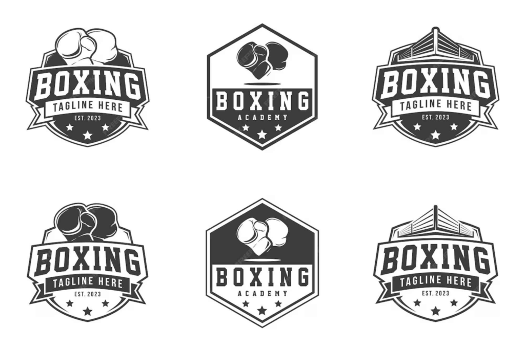
Symbols are the foundation of visual communication. Traditional boxing symbols include gloves, fighters, fists, rings and shields. These elements naturally connect with the sport and help the audience quickly understand what your brand represents. Many modern boxing logos designs use abstract shapes that hint at movement or impact. Some brands also incorporate animals such as lions, eagles or bulls to convey power and dominance. Typography-focused logos are also rising in popularity, especially when the brand name carries strong meaning or rhythm.
When selecting symbols, consider longevity. A trendy design may look impressive today but may not remain relevant in a few years. Timeless symbols make your identity adaptable across digital and print media. Whether displayed on merchandise, signage or uniforms, the logo should maintain clarity and impact.
The Importance of Typography in Boxing Logos Designs
Typography is often overlooked, yet it plays a key role in shaping brand personality. Boxing logos typically feature strong, bold typefaces that express authority and energy. Serif fonts communicate tradition, while sans-serif fonts offer a modern and clean look. Distressed or textured typefaces add toughness and grit, often used for fight clubs or underground boxing communities.
Spacing, letter height and weight must be carefully considered. A well-crafted wordmark can be as powerful as an illustrated logo. The goal is to ensure that your typography is readable at all sizes. Your brand name may appear on small glove labels, large banners or digital screens, so clarity is essential.
Colour Psychology and Branding Impact
Colour selection greatly influences how your audience perceives your boxing logos designs. Boxing brands often use intense colours like red, black and gold. Red symbolises energy, passion and aggression. Black represents power, mystery and sophistication. Gold expresses victory, excellence and premium quality. However, you should not limit yourself to traditional colours. Many modern boxing brands use blue for trust, white for purity or green for refreshment and progress. Choosing the right palette depends on your brand values and target audience. Contrasting colours help the logo stand out, but they must still align with your overall visual identity.
Creating Memorable and Functional Boxing Logos Designs
A boxing logo must be memorable and functional. This means it should be distinctive, easy to recognise and scalable across all platforms. When your logo appears on gloves, training gear, posters or digital media, it must maintain its integrity and impact. Functional design ensures versatility. Flat designs have become popular because they work well in both print and digital environments. They are also easier to reproduce on clothing and equipment.
In addition, the design should feature strong lines, balanced shapes and intentional spacing. Too much detail can make a logo difficult to reproduce, especially on small surfaces. The best boxing logos designs strike the perfect balance between uniqueness and simplicity.
Inspiration for Boxing Logos Designs
If you are looking for creative ideas, exploring different industries can offer fresh perspectives. Sports branding, fitness logos and martial arts designs often share themes with boxing, such as movement, strength and challenge. Many designers turn to real projects, case studies and packaging concepts to find new visual approaches. Websites like box design inspiration offer excellent creative references, and they can spark ideas you might not have considered. External industries such as automotive, gaming and music branding can also inspire dynamic shapes, modern type treatments and bold colour combinations.
If your boxing brand sells merchandise, packaging also becomes part of your identity. You may want to explore resources like Custom Boxes from Buddy Packaging to pair your new logo with strong product presentation.
For more visual exploration, platforms like Packaging of the World provide meaningful box design inspiration that aligns well with branding and marketing concepts. Even though this site focuses on packaging, many of its design principles apply directly to logo creation.
Mastering the Design Process Step by Step
Designing a boxing logo often involves several steps. However, each brand’s process is unique. Start with research. Look at competitors, athletes, gyms and sports brands in your region. Analyse what works and what looks outdated. Next, sketch different concepts based on your brand story and personality. Experiment with shapes, angles and typography. After choosing your strongest options, refine them digitally. Ensure the lines are clean, proportions are balanced and colours work well together.
Once the digital version is ready, test the design across different backgrounds and formats. You should see how it looks on merchandise, signage, websites and social media. If your logo remains strong in all situations, you have achieved functional versatility.
Feedback is important. Show the design to people you trust or to your target audience. Fresh perspectives help identify weaknesses or areas to improve. After revisions, finalise your logo and develop brand guidelines to ensure consistent use.
Common Mistakes to Avoid in Boxing Logos Designs
Many brands fall into common design traps. Overcomplicated elements can make the logo visually confusing. Trend-chasing can make your identity feel temporary or generic. Using too many colours may reduce readability. Poor typography choices often weaken the message and make the brand feel unprofessional. Avoid clipart or generic symbols that appear in countless other logos. Your brand needs originality to stand out.
Another mistake is ignoring scalability. A design may look impressive on a computer screen but lose clarity when printed small. A strong boxing logo should remain recognisable at any size.
Why Boxing Logos Designs Matter More Than Ever
Today’s boxing industry is global and highly competitive. Fans, athletes and businesses interact through social media, live streams and online platforms. Strong branding is essential for recognition and engagement. A memorable logo helps attract sponsors, students, customers and followers. It becomes part of your long-term identity and influences how people feel about your brand.
Whether you are building a personal brand as a boxer or establishing a gym with a strong reputation, your logo is one of your most valuable assets. It communicates professionalism, confidence and commitment.
Boxing logos designs play a vital role in shaping brand identity, capturing emotion and establishing a strong presence in the market. When done well, they inspire confidence, attract audiences and elevate your business or athletic profile. If you want a logo that truly reflects the power and passion of your boxing brand, now is the perfect time to start your design journey. Whether you work with a professional designer or develop your own concepts, focus on clarity, symbolism and long-term impact. Strong branding can transform your presence and set you apart from competitors. Begin your creative process today and craft a logo that embodies strength, discipline and excellence.
FAQs
What makes a good boxing logo?
A good boxing logo is clear, powerful and meaningful. It uses strong symbols, clean typography and balanced colours to reflect the sport’s spirit.
What colours work best for boxing logos?
Red, black and gold are popular because they symbolise power, energy and victory. Modern brands also explore blue, white or green for unique identities.
Should a boxing logo include gloves?
Gloves are common and effective symbols, but they are not essential. You can also use fists, silhouettes or abstract shapes.
How do I choose the right font for my boxing logo?
Choose a bold and readable typeface that expresses strength and aligns with your brand personality.
Can I use my boxing logo on merchandise?
Yes, but you must ensure that your design is scalable and clear across clothing, accessories and digital platforms.