Introduction
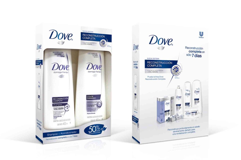
Dove has become one of the most recognisable personal care brands in the world. From beauty bars to body wash bottles, every product reflects a thoughtful visual identity. Dove packaging design plays a major role in building trust, emotional connection, and shelf appeal. Consumers often associate the brand with softness, simplicity, and care because its packaging consistently communicates those values.
Modern packaging is no longer only about protecting a product. It also influences buying decisions, supports sustainability goals, and shapes brand perception. Dove packaging design succeeds because it combines minimalism, emotional branding, and practical usability. The smooth curves, clean typography, and calming colours help the brand stand out in a crowded retail environment.
Businesses looking to improve their own product presentation often study successful global packaging systems. Many companies also explore tailored solutions through Custom Packaging services to create a unique visual identity that connects with customers.
This guide explores the history, branding principles, sustainability strategy, typography, colours psychology, and future trends behind Dove packaging design. It also explains why the brand continues to remain influential in the beauty and personal care market.
The Evolution of Dove Packaging Design
Dove first entered the market with a medical-inspired appearance that focused on trust and skin care benefits. Early packaging relied heavily on white backgrounds and simple layouts to create a clinical yet gentle impression. Over time, Dove packaging design evolved into a more emotional and lifestyle-driven visual system.
As the beauty market became increasingly competitive, Dove refined its identity. The packaging shifted from purely functional communication to a softer and more premium aesthetic. Curved bottle shapes, gold accents, and minimalist graphics became central features.
The evolution of Dove packaging design reflects changing consumer expectations. Modern shoppers value authenticity, sustainability, and emotional storytelling. Dove adapted by making its packaging cleaner, more approachable, and environmentally conscious.
Early Brand Identity
The original Dove soap bar packaging focused on skin nourishment rather than glamour. White colours palettes symbolised purity and cleanliness. This strategy helped differentiate Dove from heavily fragranced or brightly coloured competitors.
Transition Towards Premium Packaging
During the 2000s, Dove adopted more refined visual elements. Gold detailing and elegant fonts created a premium appearance without losing simplicity. The packaging became more sophisticated while remaining accessible.
The Digital Shelf Influence
Today, Dove packaging design also considers e-commerce visibility. Products must look attractive both on physical shelves and online marketplaces. Clear branding and recognisable layouts improve visibility on mobile screens and retail websites.
Why Dove Packaging Design Works
Dove packaging design succeeds because it combines emotional branding with practical usability. Every element supports the brand’s message of self-care and real beauty.
| Packaging Element | Purpose | Consumer Impact |
|---|---|---|
| White Colours Palette | Symbolises purity and softness | Creates trust |
| Gold Dove Logo | Adds elegance and premium appeal | Enhances recognition |
| Curved Bottles | Improves ergonomics | Better user experience |
| Minimal Typography | Increases readability | Modern appearance |
| Recyclable Materials | Supports sustainability | Positive brand perception |
The table above demonstrates how each design choice contributes to customer engagement and brand consistency.
The Psychology Behind Dove Packaging Design
Packaging psychology strongly influences consumer purchasing behaviour. Dove packaging design uses visual simplicity to create calmness and reassurance.
Consumers often associate cluttered packaging with confusion or low quality. Dove avoids this by maintaining a balanced design structure with plenty of white space. This approach creates a feeling of cleanliness and sophistication.
Colours Psychology
White dominates Dove packaging because it represents purity, softness, and simplicity. Gold accents add warmth and a subtle premium quality. Blue tones are occasionally used to communicate hydration and freshness.
These colours work together to reinforce the brand’s skincare positioning.
Emotional Branding
Dove focuses heavily on emotional messaging. Packaging often includes phrases about nourishment, self-care, or confidence. This creates a deeper relationship between the product and the customer.
Typography and Readability
The typography in Dove packaging design is modern, clean, and easy to read. Sans-serif fonts improve accessibility while maintaining a contemporary appearance.
Typography also helps establish consistency across product categories.
Minimalism in Dove Packaging Design
Minimalism is one of the defining characteristics of Dove packaging design. Rather than overwhelming consumers with excessive graphics, the brand keeps visual communication focused and refined.
Minimalist packaging performs well because it feels modern and trustworthy. Consumers can quickly identify the product and understand its benefits.
Clean Layout Structures
Dove uses clear hierarchy in its layouts. Product names, benefits, and branding appear in predictable positions. This consistency improves recognition across retail shelves.
Less Visual Noise
The absence of unnecessary design elements allows key information to stand out. This is especially important in competitive supermarket environments.
Luxury Through Simplicity
Many premium brands use minimalist aesthetics because simplicity often signals confidence and quality. Dove successfully applies this principle while remaining affordable.
Sustainable Innovation in Dove Packaging Design
Sustainability has become essential in modern packaging strategy. Dove packaging design increasingly incorporates environmentally friendly materials and manufacturing processes.
Consumers are now more conscious about plastic waste and carbon footprints. Brands that fail to address sustainability risks may lose customer trust.
Recycled Plastic Bottles
Dove has introduced bottles made from recycled plastic in several markets. This helps reduce virgin plastic consumption and supports circular economy initiatives.
Refillable Packaging Concepts
Refillable systems are becoming more common within the beauty industry. Dove has explored refill formats to minimise packaging waste.
Reduced Packaging Waste
Lightweight materials and efficient production methods reduce environmental impact while lowering shipping costs.
Many packaging professionals discuss these innovations through industry resources such as print & finishing insights, where evolving print and sustainability technologies are regularly analysed.
Dove Packaging Design and Brand Consistency
Consistency is critical in global branding. Dove packaging design maintains a unified identity across various product categories, including soap, deodorant, shampoo, and skincare.
Despite different product functions, the visual language remains recognisable.
Unified Brand Colours
White, gold, and soft blue shades appear consistently across the entire product range. This creates immediate recognition.
Logo Placement
The gold dove icon is always positioned prominently. Repetition strengthens brand familiarity.
Consistent Messaging
Whether promoting hydration, repair, or softness, Dove packaging consistently emphasises care and nourishment.
How Dove Packaging Design Influences Purchasing Decisions
Packaging significantly affects consumer buying behaviour. In many cases, customers make decisions within seconds of viewing a product.
Dove packaging design encourages purchasing through emotional trust and visual simplicity.
Shelf Visibility
Clean layouts help Dove products stand out among colourful competitors. Simplicity creates contrast in busy retail environments.
Consumer Trust
Consistent branding builds familiarity. Familiar products are often perceived as safer and more reliable.
Perceived Product Quality
Premium design elements increase perceived value. Customers may associate elegant packaging with better product performance.
The Role of Shape in Dove Packaging Design
Shape is often overlooked in packaging discussions, yet it strongly affects user experience.
Dove packaging design uses soft curves and ergonomic forms to reinforce comfort and care.
Ergonomic Bottles
Curved bottles are easier to hold during shower use. This practical detail improves customer satisfaction.
Feminine Design Language
Rounded shapes create a softer and more approachable appearance. Sharp edges are generally avoided.
Visual Flow
Smooth contours guide the eye naturally across the packaging, improving readability and aesthetic balance.
Packaging Materials Used by Dove
Material selection directly affects sustainability, cost, durability, and appearance.
Dove packaging design carefully balances all these factors.
Plastic Packaging
Many Dove products still use plastic because it offers durability and moisture resistance. However, recycled content is increasingly being adopted.
Paper-Based Packaging
Soap bars often use cardboard packaging, which is easier to recycle and environmentally friendlier.
Printing Techniques
High-quality printing ensures brand colours remain consistent globally. Premium finishing also enhances shelf appeal.
Businesses seeking manufacturing inspiration often visit Buddy Packaging Location to explore customized packaging solutions and printing options.
Digital Marketing and Dove Packaging Design
Packaging now plays a role beyond physical retail. Social media and e-commerce have transformed how consumers interact with brands.
Instagram-Friendly Packaging
Minimalist aesthetics perform well on visual platforms like Instagram because they photograph cleanly and professionally.
Online Product Recognition
Simple packaging helps consumers instantly identify Dove products during online shopping.
QR Codes and Smart Packaging
Future Dove packaging design may increasingly include interactive elements such as QR codes for sustainability information and customer engagement.
Challenges in Dove Packaging Design
Even successful packaging systems face challenges.
Balancing Sustainability and Cost
Eco-friendly materials can increase production costs. Brands must balance environmental goals with affordability.
Global Market Adaptation
Packaging preferences vary by region. Dove must maintain consistency while adapting to local consumer expectations.
Counterfeit Products
Popular global brands often face imitation products. Distinctive packaging helps consumers identify authentic items.
Future Trends in Dove Packaging Design
The future of Dove packaging design will likely focus on smart technology, sustainability, and inclusivity.
Smart Packaging Features
Interactive labels may provide skincare advice, ingredient transparency, and recycling guidance.
Increased Refillable Systems
Refill stations and reusable packaging are expected to become more common.
Biodegradable Materials
The beauty industry is exploring compostable and plant-based packaging materials.
Inclusive Design
Packaging accessibility for elderly and disabled consumers will become increasingly important.
Dove Packaging Design and Consumer Loyalty
Strong packaging design creates emotional familiarity. Customers often repurchase products because they recognise and trust the visual identity.
Dove packaging design supports long-term loyalty by delivering consistency, reliability, and emotional reassurance.
Consumers feel comfortable with products that look familiar and dependable. This emotional comfort becomes a powerful competitive advantage.
FAQs About Dove Packaging Design
Why is Dove packaging mostly white?
White symbolises cleanliness, purity, softness, and simplicity. It aligns perfectly with Dove’s skincare-focused branding.
Is Dove packaging environmentally friendly?
Dove has introduced recycled plastic bottles and continues working towards more sustainable packaging solutions.
What makes Dove packaging design effective?
Its effectiveness comes from minimalism, emotional branding, ergonomic shapes, and consistent visual identity.
How does Dove packaging influence customers?
The design creates trust, improves shelf visibility, and enhances perceived product quality.
Does Dove use recyclable packaging?
Many Dove products use recyclable materials, especially paperboard and recycled plastics.
Why is consistency important in Dove packaging design?
Consistency improves brand recognition and helps customers identify products quickly across different categories.
Dove packaging design represents one of the strongest examples of successful branding within the beauty and personal care industry. Through minimalism, emotional storytelling, ergonomic design, and sustainability efforts, Dove has created packaging that connects deeply with consumers.
The brand demonstrates how thoughtful packaging can influence purchasing decisions, strengthen customer loyalty, and communicate company values. As sustainability and digital commerce continue to evolve, Dove packaging design will likely remain a leading example of innovation and consumer-focused branding.
Businesses aiming to improve their own packaging strategies can learn valuable lessons from Dove’s consistent visual identity and customer-centred approach. If you want to elevate your product presentation and strengthen your market presence, now is the perfect time to invest in packaging that combines beauty, functionality, and sustainability.