Perfume Bottle Label Design: Crafting the Perfect Fragrance Identity
In the competitive world of perfumery, a fragrance is only as memorable as its presentation. One of the most crucial elements in making a lasting impression is perfume bottle label design. A thoughtfully crafted label not only conveys your brand identity but also influences a consumer’s perception of the scent within. Whether you are launching a luxury fragrance line or a boutique collection, mastering the art of label design is essential to stand out on crowded shelves.
This article dives deep into the principles, trends, and practical tips for creating exceptional perfume bottle labels. We’ll also provide actionable insights, industry examples, and a FAQ section to answer your burning questions about perfume label design.
Why Perfume Bottle Label Design Matters
The Psychology of Labels
A perfume label is the first interaction a customer has with your product. Colors, typography, and imagery evoke emotions and suggest the fragrance’s character. For instance, gold accents often convey luxury, while pastel shades hint at softness and romance.
Building Brand Recognition
Consistent perfume bottle label design reinforces brand identity. Consumers tend to recognize and trust brands that maintain cohesive visual language across all products. From the bottle shape to the typography and logo placement, every element plays a role in storytelling.
Impact on Sales
According to packaging industry studies, products with visually appealing labels experience higher shelf attraction and conversion rates. Investing in professional label design can directly influence revenue and customer loyalty.
Key Elements of Perfume Bottle Label Design
Typography
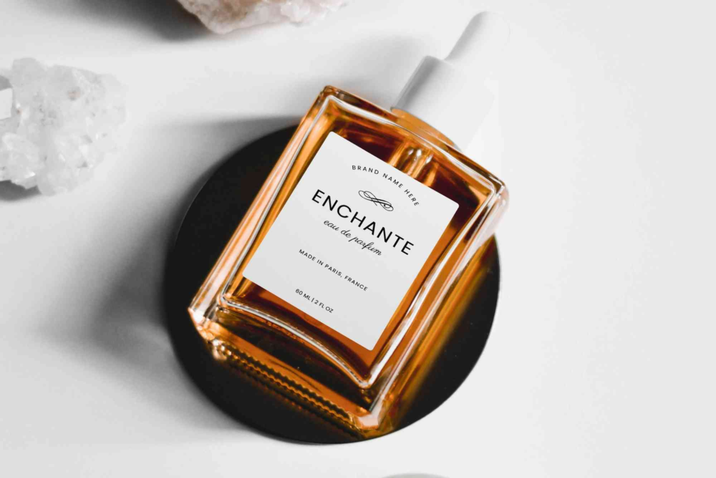
Typography sets the tone of your perfume. Luxury brands often use serif fonts to convey elegance, while modern niche fragrances might choose sleek sans-serif styles for minimalistic appeal. Hierarchy is crucial—brand names, fragrance names, and essential details must be distinguishable yet harmonious.
Color Palette
Color influences perception. Bold, dark shades like black and deep blue often suggest sophistication, while bright or pastel hues can indicate freshness or floral notes. Ensure your color palette aligns with your fragrance’s personality.
Material and Texture
The feel of the label contributes to the overall sensory experience. Matte, glossy, embossed, or metallic finishes can create tactile interest, making the perfume feel premium and inviting to touch.
Shape and Size
Labels should complement the bottle’s silhouette. A curved bottle may require a flexible label, while a rectangular bottle might accommodate a more structured design. Proportions must be precise to avoid looking cluttered or misaligned.
Visual Elements
Icons, patterns, and illustrations can enhance storytelling. For example, floral motifs hint at a floral fragrance, while geometric patterns suggest modernity. Visual consistency is key to maintaining a cohesive brand identity.
Trends in Perfume Bottle Label Design
Minimalist Designs
Simplicity is elegance. Minimalist labels with clean lines, limited colors, and subtle typography have gained popularity for their sophisticated, contemporary appeal.
Vintage and Retro Styles
Some brands evoke nostalgia using vintage typography, muted colors, and ornate detailing. This approach appeals to consumers seeking classic or artisanal fragrances.
Eco-Friendly Labels
Sustainability is a growing trend. Labels made from recycled materials with soy-based inks not only look appealing but also resonate with eco-conscious buyers.
Interactive and Personalized Labels
QR codes, customizable labels, and interactive packaging elements engage customers. Personalization allows consumers to feel a deeper connection with the brand.
Practical Tips for Creating Stunning Labels
- Understand Your Audience: Tailor your design to the target market’s preferences and lifestyle.
- Maintain Readability: Ensure text is legible even at small sizes.
- Test on Actual Bottles: Digital mockups are helpful, but physical testing ensures labels fit perfectly.
- Use High-Quality Printing: Poor print quality can ruin even the best design.
- Consider Custom Bottle Boxes: Complementary packaging enhances perceived value.
- Stay Updated on Label Design Tips: Keep learning from industry resources.
Common Mistakes to Avoid
- Overcrowding the label with information
- Ignoring brand consistency across products
- Using low-resolution graphics or fonts
- Choosing colors that clash with the bottle or fragrance theme
- Neglecting tactile and material considerations
Perfume Bottle Label Design Process
Conceptualization
Brainstorm ideas based on the fragrance’s characteristics, target audience, and brand identity. Mood boards can help visualize the direction.
Sketching and Mockups
Create initial sketches and digital mockups. Experiment with typography, colors, and placement until the design feels balanced.
Material Selection
Choose the label material and finish. Consider durability, print quality, and tactile experience.
Design Finalization
Refine graphics, typography, and color schemes. Ensure all elements are cohesive and align with brand guidelines.
Testing and Production
Print prototypes and test them on bottles. Check for legibility, alignment, and overall aesthetics. Adjust if necessary before full production.
Integrating Label Design with Packaging
A perfume label does not exist in isolation. Coordinating with the bottle, cap, and box design creates a complete sensory experience. Consider your Buddy Packaging Location for professional packaging solutions that enhance your label’s impact.
In the world of perfumery, your fragrance’s first impression is visual. Perfume bottle label design is an art form that blends aesthetics, psychology, and branding strategy. A well-designed label attracts attention, communicates your brand story, and ultimately drives sales.
Whether you are launching a new scent or revamping an existing line, investing in high-quality label design is essential. Start by understanding your audience, choosing complementary colors, typography, and materials, and testing your designs thoroughly.
FAQs
What makes a perfume label effective?
An effective label is visually appealing, legible, aligns with brand identity, and reflects the fragrance’s character.
How do I choose the right colors for my perfume label?
Consider the fragrance notes, target audience, and brand personality. Darker shades often suggest luxury, while pastel colors indicate softness or floral scents.
Can I use recycled materials for perfume labels?
Yes, eco-friendly labels using recycled paper and soy-based inks are increasingly popular and appeal to sustainability-conscious consumers.
How important is typography in perfume label design?
Typography communicates the brand tone and hierarchy of information. Choose fonts that reflect your brand and maintain readability.
Where can I find professional packaging support?
Check Buddy Packaging Location for expert packaging services that complement your perfume labels.