Printing Press Logo Design: The Complete Branding Guide
In today’s highly competitive printing industry, your brand is often judged before a single word is spoken or a page is printed. The first thing most customers notice is your logo. A strong printing press logo design tells a story about quality, reliability, and creativity. It shows clients that you are professional, modern, and ready to handle their projects—whether it’s business cards, packaging, or large-scale commercial prints.
This guide will walk you through everything you need to know about creating a memorable printing press logo. From understanding design principles to choosing colours, fonts, and symbols, you’ll learn how to build a logo that truly represents your printing business.
Why Printing Press Logo Design Matters
Your logo is more than just a graphic—it’s a visual promise to your customers.
First Impressions Build Trust
When a potential client sees your logo on your website, storefront, or packaging, they immediately form an opinion. A clean and modern printing press logo design signals professionalism, while a poorly made logo can create doubt about your services.
Brand Recognition in a Crowded Market
The printing industry is full of competitors offering similar services. A unique logo helps customers remember you and differentiate your business from others.
Consistency Across Marketing Channels
From business cards and brochures to vehicles and social media, your logo appears everywhere. A well-designed logo ensures consistency and strengthens your brand identity across all platforms.
Key Elements of an Effective Printing Press Logo
A powerful logo is built on a few essential design components.
Typography That Speaks Your Brand
Fonts communicate personality. A bold sans-serif typeface can feel modern and industrial, while a classic serif font suggests tradition and trust. For printing businesses, readability is critical—your name should be clear at any size.
Tip: Avoid overly decorative fonts that may become hard to read when printed small.
Colour Psychology in Printing Press Logos
Colour plays a major role in emotional response.
- Blue: Trust, reliability, professionalism
- Red: Energy, speed, confidence
- Black: Strength, authority, premium feel
- Green: Sustainability, eco-friendly printing
- Orange/Yellow: Creativity, friendliness
A balanced colour palette ensures your printing press logo design looks professional on paper, signage, and digital platforms.
Symbols That Represent Printing
Icons often used in printing logos include:
- Printing presses or rollers
- Paper sheets or stacks
- Ink drops or splashes
- Gears and mechanical elements
These visuals instantly communicate your industry and services.
Popular Styles in Printing Press Logo Design
Minimalist Logos
Simple shapes, limited colours, and clean typography create a modern and professional feel.
Vintage or Retro Logos
Perfect for long-established printing companies, these logos use classic fonts and textures to highlight heritage.
Industrial Logos
Bold lines, strong shapes, and mechanical imagery reflect durability and large-scale printing operations.
Creative and Artistic Logos
These appeal to design-focused print shops offering branding, packaging, and custom projects.
Process to Create a Printing Press Logo
Define Your Brand Identity
Ask yourself:
- Are you premium or budget-friendly?
- Do you focus on speed, quality, or creativity?
- Who is your ideal customer?
Research Your Competitors
Look at other printing companies. Identify what works—and what feels generic. Your goal is to stand out.
Choose a Design Direction
Decide on style, colours, and symbols that align with your brand values.
Work With a Professional Designer
A professional designer understands colour profiles, print clarity, and scalability—essential for any printing press logo design.
Test Your Logo
Print it on business cards, banners, and packaging to ensure it looks good in real-world applications.
How Logo Design Impacts Packaging and Branding
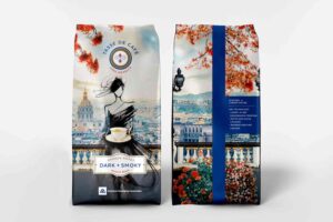
Your logo often appears on boxes, labels, and shipping materials. A strong logo elevates your packaging and reinforces your brand image. Many printing companies expand into packaging services, and your logo becomes a symbol of trust on every product you deliver.
If you also provide box solutions, consider exploring Custom Packaging to see how branding and packaging work together to create a cohesive customer experience.
For visual ideas, you can browse packaging design inspiration to understand how top brands integrate logos into their packaging systems.
Mistakes to Avoid in Printing Press Logo Design
- Too many colours: Makes printing expensive and inconsistent.
- Complex details: Small elements may disappear when scaled down.
- Following trends blindly: Trends fade, but your logo should last for years.
- Ignoring print compatibility: Some colours and gradients don’t translate well to physical printing.
How Your Logo Supports Business Growth
A professional printing press logo design does more than look good—it builds confidence. When customers see your logo on invoices, packages, or signage, they associate it with quality service. Over time, this recognition leads to repeat customers and referrals.
Your logo also becomes part of your business story. When placed on packaging, storefronts, or delivery vehicles, it acts as a silent salesperson for your brand.
Local Branding and Trust
Many clients prefer working with local businesses they can trust. Showing your physical presence alongside your logo adds credibility. If you want customers to easily find your business, you can share your Buddy Packaging Location to connect your brand with a real-world presence.
FAQs
What makes a good printing press logo?
A good logo is simple, memorable, and relevant to your industry. It should look great both digitally and in print.
How much does a printing press logo design cost?
Costs vary depending on complexity and designer experience. Basic logos may cost a few hundred dollars, while premium branding packages can cost more.
Can I design my own printing press logo?
Yes, but professional designers ensure your logo works across all print formats and maintains quality at different sizes.
What file formats should I get for my logo?
Always request vector formats like AI, EPS, or SVG, along with PNG and JPG for web use.
How often should I update my logo?
Most businesses refresh their logo every 8–12 years, or when rebranding or expanding services.
Your logo is the foundation of your brand identity. A well-crafted printing press logo design communicates professionalism, creativity, and trust—before you ever print a single page. Whether you serve local businesses or global clients, investing in a strong logo will pay off in long-term recognition and customer loyalty.

