Introduction
Creating effective supplement bottle label design is essential for any health and wellness brand. Your label is often the first touchpoint for customers. It shapes trust, communicates benefits, and supports compliance with strict industry rules. A well-designed label also helps your product stand out on crowded shelves. When done right, it can increase conversions and brand recognition.
In today’s competitive supplement market, visual appeal and clarity matter. Consumers want transparent information and professional packaging. Therefore, brands must balance aesthetics, compliance, and usability. This guide explains how to design labels that sell while meeting industry standards.
Why Supplement Bottle Label Design Matters
A supplement bottle label is more than decoration. It informs, persuades, and builds credibility. Shoppers often decide within seconds whether to trust a product. A clean and professional design helps them feel confident. Clear ingredient lists and readable fonts also support compliance and transparency.
Strong supplement bottle label design improves shelf visibility. It also enhances online product images. Many brands now sell through e-commerce platforms. Therefore, labels must look sharp both in person and on screen. Good design improves click-through rates and customer trust.
Another key benefit is brand consistency. A consistent label style builds recognition. Over time, customers remember your colours, typography, and layout. This familiarity can drive repeat purchases and loyalty.
Understanding Compliance and Regulations
Before starting your design, understand legal requirements. Supplement labels must follow strict guidelines in many regions. These include ingredient lists, dosage instructions, warnings, and nutritional information. Failing to comply can result in penalties or product recalls.
Mandatory Information
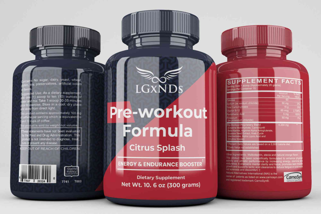
Most supplement labels require clear ingredient details. You must list active ingredients and their quantities. Serving size and directions must also appear. Additionally, include safety warnings and allergen statements. This information should be easy to read and not hidden.
Readability and Font Size
Regulators often specify minimum font sizes. Tiny text can lead to compliance issues. Use clean typography that remains legible on curved surfaces. Contrast is also vital. Dark text on a light background usually works best.
Claims and Accuracy
Avoid exaggerated claims. Statements like “miracle cure” can trigger legal problems. Instead, use evidence-based language. Focus on benefits supported by research. Accurate messaging builds trust and keeps your brand safe.
Key Elements of Effective Supplement Bottle Label Design
A successful label combines visual appeal with clear information. Every element should serve a purpose. Good design guides the customer’s eye from brand name to benefits and instructions.
Brand Identity and Logo
Your logo should be clear and memorable. Place it at the top of the label. This helps shoppers identify your brand quickly. Consistent colour schemes and typography reinforce recognition.
Colour Psychology
Colours influence buying decisions. Green often signals natural ingredients. Blue suggests trust and reliability. Bright colours can draw attention but must remain balanced. Choose colours that reflect your brand values.
Typography and Layout
Use simple fonts that are easy to read. Avoid overly decorative styles. Maintain spacing between sections. A clean layout prevents information overload. Customers should find key details at a glance.
Imagery and Icons
Minimal icons can enhance clarity. For example, use symbols for vegan or gluten-free products. However, avoid clutter. Too many visuals can confuse customers. Keep imagery simple and purposeful.
Designing for Different Bottle Sizes
Supplements come in many bottle shapes. Small bottles need compact labels. Large containers offer more space for design. Regardless of size, maintain readability and balance.
Wrap-Around Labels
Many supplement bottles use wrap-around labels. These allow more information. Divide sections clearly. Place the main message on the front. Move detailed information to the back.
Tamper-Evident Features
Some bottles require tamper seals. Ensure the label design accounts for these. Leave space for seals without covering essential text. This maintains both safety and aesthetics.
Material Choices and Finishes
Label materials affect durability and appearance. Supplements often face moisture and handling. Therefore, choose materials that resist wear.
Paper vs. Synthetic Labels
Paper labels are cost-effective. However, synthetic materials last longer. They resist water and oil. For premium products, synthetic labels often look more professional.
Finishes and Coatings
Matte finishes give a natural feel. Gloss finishes create shine and vibrancy. Soft-touch coatings add luxury. Choose finishes that match your brand image.
Integrating Packaging with Label Design
Label design should match overall packaging. The bottle, cap, and box must align visually. Consistent branding creates a cohesive look. It also strengthens shelf presence.
For brands using secondary packaging, consider pairing labels with Custom Bottle Boxes. These boxes protect products and enhance presentation. They also provide extra space for branding and information. Coordinated packaging improves perceived value and professionalism.
Creating Visual Hierarchy
Visual hierarchy guides the viewer’s eye. Start with the brand name. Then highlight the product type and key benefits. Follow with dosage and instructions. This order helps customers understand the product quickly.
Use font size and weight to create emphasis. Bold headings can highlight benefits. Smaller text can hold details. White space improves readability and reduces clutter.
Balancing Creativity and Clarity
Creative labels attract attention. However, clarity must come first. Avoid overly complex graphics. Ensure important information remains visible. A balanced approach works best.
Modern trends favour minimalism. Clean designs with bold typography are popular. Transparent labels also create a premium feel. They allow the product inside to show through.
If you need fresh ideas, explore label design inspiration from global packaging showcases. Studying successful designs can spark creativity. It also helps you stay updated with industry trends.
Designing for E-Commerce
Online sales require special considerations. Product images must be clear at small sizes. Labels should remain readable in thumbnails. High-contrast colours work well online. Simple layouts also improve clarity on screens.
Include key benefits on the front label. This helps online shoppers understand the product quickly. Avoid clutter that might blur in photos. Clean designs translate better to digital platforms.
Sustainability and Eco-Friendly Design
Many consumers prefer eco-friendly packaging. Sustainable labels and materials can attract conscious buyers. Use recyclable materials where possible. Soy-based inks and biodegradable adhesives are good options.
Highlight sustainability on the label. Simple icons can communicate eco-friendly practices. This builds trust and aligns with modern values. However, ensure claims are accurate and verifiable.
Working with Professional Designers
Hiring a professional designer can improve results. Experienced designers understand regulations and branding. They can also create print-ready files. This reduces errors and production delays.
Provide clear brand guidelines. Share your target audience and product benefits. Collaboration ensures the final design matches your vision. Professional input often leads to stronger shelf appeal.
Testing and Refining Your Label
Before final printing, test your design. Print samples and apply them to bottles. Check readability and alignment. Ask for feedback from potential customers. Small adjustments can improve usability and impact.
Consider A/B testing for e-commerce. Compare different label styles online. Monitor which version performs better. Data-driven decisions lead to stronger results.
Strong supplement bottle label design builds trust, improves visibility, and supports compliance. It combines creativity with clarity. By focusing on readability, brand identity, and regulations, you can create labels that stand out and sell. Consistent packaging and thoughtful materials enhance the overall experience.
Investing in quality design pays off. Customers notice professional packaging. They also trust brands that present information clearly. Whether launching a new product or rebranding, thoughtful label design makes a lasting impression. Start refining your design today to boost credibility and sales.
Glass bottle packaging design blends elegance with sustainability, making it a preferred choice for premium brands. Thoughtful shapes, textures, and labels enhance product appeal while protecting contents. From beverages to cosmetics, well-crafted glass packaging communicates quality, preserves freshness, and supports recycling goals. A creative, functional design helps products stand out on shelves and builds lasting customer trust.
FAQ
What should be included on a supplement bottle label?
A supplement label should include ingredients, serving size, directions, and warnings. It must also show brand details and contact information.
How do I make my supplement label stand out?
Use bold typography, clear colours, and strong branding. Keep the layout simple and easy to read. Focus on key benefits and trust signals.
Are there legal requirements for supplement labels?
Yes, regulations require accurate ingredient lists and dosage instructions. Claims must be truthful and supported by evidence.
What size should my supplement label be?
The size depends on your bottle. Ensure text remains readable. Leave space for mandatory information and seals.
Can I design a supplement label myself?
You can, but professional designers help ensure compliance and quality. They also create print-ready files and cohesive branding.