Whisky Bottle Label Design: Crafting Identity, Story, and Elegance
The art of whisky bottle label design is far more than printing a name on glass—it’s a delicate blend of storytelling, brand identity, and visual craftsmanship. A label acts as a silent ambassador for the spirit within, communicating its character and heritage before a single drop touches the glass. Whether it’s a classic Scottish single malt or a modern craft blend, a well-designed label can elevate perception, drive sales, and build a lasting brand image.
Understanding the Importance of Whisky Bottle Label Design
A whisky label is often the first thing that attracts a buyer’s attention. In a competitive market filled with heritage brands and innovative newcomers, a well-crafted label can make or break a first impression. It’s not only about beauty; it’s about trust, emotion, and identity. A thoughtful whisky bottle label design tells consumers about the whisky’s age, origin, craftsmanship, and personality—without overwhelming them.
The Role of Storytelling in Whisky Labels
Every great whisky tells a story. Some whiskies embody the rugged Scottish Highlands, while others carry a tale of craftsmanship and innovation from small independent distilleries. The label is where these stories come alive visually. Through typography, imagery, and tone, a label can convey a narrative that speaks directly to the target audience.
A traditional whisky label might feature vintage typography and muted colours that suggest heritage and refinement. In contrast, modern brands may adopt minimalist or abstract designs to project sophistication and innovation. This storytelling approach makes the consumer feel emotionally connected—making the whisky not just a drink, but an experience.
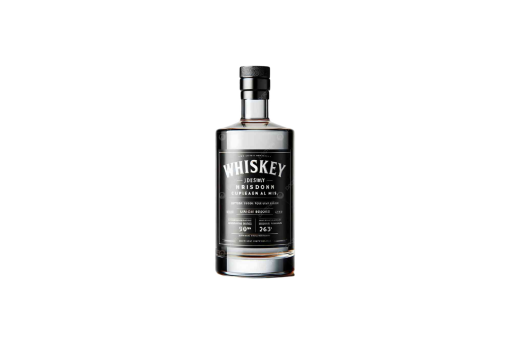
Core Elements of a Whisky Bottle Label
Creating an effective whisky label involves harmonising several design elements. Each component contributes to the overall perception and appeal of the product.
Typography
Typography sets the tone of the brand. Serif fonts often signify tradition and authority, while sans-serif or hand-lettered fonts add a modern or artisanal feel. The font should be legible and complement the whisky’s character. For example, bold, copperplate typography might be ideal for a robust Highland whisky, while elegant script suits a refined blend.
Colour Palette
Colour plays a vital psychological role in label design. Deep golds, blacks, and earthy tones evoke luxury and maturity, while whites and metallics suggest purity and innovation. The colour scheme must align with the bottle’s shape and the whisky’s tone. Premium whiskies often use a combination of dark backgrounds with embossed gold or silver foiling to enhance visual appeal.
Logo and Brand Mark
A distinctive logo gives the whisky a strong identity. It should appear prominently but harmoniously on the label. Many brands incorporate heritage symbols like crests, landscapes, or distillery emblems to signify authenticity and tradition.
Texture and Finishing
Texture adds depth and tactility. Embossing, debossing, metallic foils, or matte finishes can make the label feel as premium as the product. When a consumer holds the bottle, these subtle tactile cues reinforce quality perception.
Legal and Informational Details
Regulatory details are an unavoidable part of whisky labels. Information such as alcohol volume, age statement, distillery location, and batch number must be clearly visible. The challenge is integrating these elements elegantly without cluttering the design.
Balancing Tradition and Modernity
Whisky brands walk a fine line between honouring heritage and embracing modern aesthetics. Established distilleries often highlight tradition, using heraldic designs, ornate scripts, and historical imagery. Meanwhile, new-age distillers experiment with minimalist layouts, abstract art, and unconventional materials to stand out. The key is finding harmony—where history meets innovation, and authenticity meets creativity.
How Design Influences Perception and Sales
A compelling whisky bottle label design can significantly impact consumer buying behaviour. Studies in consumer psychology show that visual design accounts for nearly 70% of first impressions on store shelves. A striking label can prompt impulse purchases, even among consumers unfamiliar with the brand. Moreover, a distinctive label enhances recognisability, encouraging repeat purchases and word-of-mouth referrals.
Trends in Whisky Bottle Label Design
The whisky industry is constantly evolving, and so are its design trends. Here are some of the most prominent ones shaping 2026 and beyond.
Minimalist Aesthetics
Less is more. Clean lines, restrained typography, and neutral colour schemes communicate confidence and sophistication. Minimalism appeals especially to modern, younger consumers who prefer understated elegance.
Sustainability and Eco-Design
Eco-conscious consumers are influencing packaging trends. Labels made from recycled paper, vegetable-based inks, and biodegradable adhesives are gaining popularity. Brands that highlight sustainability not only attract modern buyers but also enhance their ethical brand image.
Custom Finishes and Personalisation
Brands are increasingly offering limited editions and personalised labels. These bespoke designs allow customers to feel exclusive ownership and emotional attachment to their bottle. For businesses, using premium Custom Bottle Boxes that complement the label design can create a complete luxury experience.
Illustrative Art and Handcrafted Detail
Illustrations add charm and uniqueness. Hand-drawn maps, botanical sketches, or vintage landscapes can turn an ordinary label into a collectible piece of art. These visual details enhance storytelling and authenticity.
Transparent and Minimal Labels
Modern craft distilleries often use clear or semi-transparent labels that allow the whisky’s golden hue to shine through. This minimalist approach conveys purity and openness, aligning with contemporary brand values.
Inspiration from the World of Label Design
For designers seeking creative direction, platforms like label design inspiration offer countless examples of exceptional whisky and spirits packaging. Analysing these designs can reveal insights into typography combinations, layout balance, and colour psychology. It’s a valuable resource for understanding how the best in the industry craft visuals that evoke both emotion and curiosity.
Crafting a Label that Reflects Brand Personality
No two whisky brands are the same—and neither should their labels be. The design process must begin with a deep understanding of the brand’s ethos, target audience, and story. For instance, a family-run distillery might highlight craftsmanship and authenticity, while a new-age brand may focus on innovation and artistry. Visual consistency across all brand elements—from the bottle to the Buddy Packaging Location—reinforces brand recall and recognition.
How to Create a Winning Whisky Bottle Label Design
Here’s a concise breakdown of how professionals approach label creation from concept to completion.
Research and Brand Discovery
Start with understanding the brand story, values, and target demographics. Research competing brands to identify visual gaps and opportunities for distinction.
Concept Development
Sketch or brainstorm ideas that align with the whisky’s identity. Create multiple visual directions to test tone, typography, and layout options.
Digital Design and Mock-ups
Translate concepts into digital prototypes. Use mock-ups to visualise how the label looks on the actual bottle under different lighting conditions.
Material and Print Selection
Choose paper textures, foils, and finishes carefully. The label should feel premium yet functional—resistant to condensation and wear.
Compliance and Proofing
Verify that all regulatory requirements are met before final printing. Ensure readability, accuracy, and quality consistency.
Production and Application
Partner with skilled printers and packaging experts. The printing technique can make or break even the most beautiful design.
Common Mistakes to Avoid in Whisky Label Design
While creativity is vital, it’s easy to fall into design traps that diminish impact. Overcomplicating visuals, using unreadable fonts, or ignoring legibility in low light can all backfire. Another frequent error is inconsistent branding—using different tones, colours, or logos across products. Cohesion is key to brand trust and recognition.
Psychology Behind Effective Whisky Label Design
Consumers often buy with their eyes before their taste buds. Subtle design cues—like symmetry, texture, and spacing—affect perception subconsciously. Labels that feel balanced and harmonious create a sense of reliability and prestige. Additionally, gold foiling and deep hues evoke premium quality, while rustic textures appeal to authenticity seekers. Understanding this psychology allows designers to connect emotionally with consumers before they even taste the whisky.
The Art of Timeless Whisky Label Design
A whisky bottle label isn’t just packaging—it’s a visual embodiment of the brand’s story, passion, and promise. From typography to texture, every element contributes to how the world perceives that first sip. Whether you’re a distillery owner, designer, or brand strategist, investing in exceptional whisky bottle label design is an investment in lasting brand legacy.
If you’re ready to elevate your whisky’s presentation, partner with a professional packaging expert who understands your brand essence. Explore bespoke solutions such as Custom Bottle Boxes to complement your label design and make your whisky stand out both on shelves and in the hands of consumers.
Looking for reliable, high-quality packaging solutions for your business? Buddy Packaging offers a wide range of custom packaging options designed to protect your products and enhance your brand image. From durable boxes to eco-friendly materials, they deliver quality you can trust.
FAQs
What makes a good whisky bottle label design?
A good whisky label balances aesthetics, readability, and storytelling. It reflects the brand’s character through typography, colours, and textures while maintaining legal clarity.
Why is label design important for whisky brands?
Label design shapes first impressions and influences purchase decisions. A striking design enhances brand recognition and communicates authenticity.
How can I design a whisky label for a new brand?
Begin with brand discovery—define your whisky’s story, audience, and values. Then collaborate with professional designers to translate that identity into a visual experience.
What printing techniques are best for whisky labels?
Foil stamping, embossing, and textured finishes work best for premium whiskies, while minimalist labels may benefit from matte or transparent materials.
Where can I find whisky label design inspiration?
Visit label design inspiration for examples of top whisky label projects from around the world. It’s an excellent resource for trends and creative insights.
Are sustainable materials used in whisky label design?
Yes, eco-friendly materials such as recycled paper, soy-based inks, and biodegradable adhesives are now widely used to appeal to environmentally conscious consumers.