Introduction
Whiskey bottle label design is far more than decoration. It is the first handshake between your brand and the buyer. Before a cork is pulled or a dram is poured, the label tells a story. It signals quality, heritage, flavour, and trust in seconds. In a crowded market, that first impression often decides the sale.
Modern consumers are more design-aware than ever. They compare bottles carefully, both online and on shelves. A strong label can justify a premium price and build long-term loyalty. A weak one can make even excellent whiskey feel forgettable. That is why investing in thoughtful whiskey bottle label design is now essential, not optional.
This guide explores how effective label design works, what makes whiskey labels successful, and how brands can stand out while staying authentic.
Why Whiskey Bottle Label Design Matters
Whiskey is a product steeped in tradition. Buyers expect craftsmanship, patience, and authenticity. Your label must reflect those values clearly and instantly.
A well-designed label builds credibility. It reassures customers that the liquid inside is worth their time and money. It also communicates key information without overwhelming the eye. Balance is crucial here.
From a marketing perspective, whiskey bottle label design helps define brand positioning. A minimalist label may suggest modern craft. A detailed, vintage label may signal heritage and age. Every choice shapes perception.
In retail settings, labels also work hard at a distance. On a shelf full of amber glass, contrast, typography, and layout become powerful tools. The right design makes a bottle recognisable even from several feet away.
Understanding the Whiskey Buyer’s Mindset
To design well, you must understand how whiskey buyers think. Most buyers fall into two broad groups. One group seeks familiarity and trusted names. The other looks for discovery and uniqueness.
For loyal buyers, consistency matters. They want labels that feel stable and recognisable over time. Sudden redesigns can cause confusion or distrust.
For curious buyers, storytelling matters more. They want to know where the whiskey comes from, who made it, and why it is different. Clear narrative elements on the label help here.
In both cases, clarity is vital. The buyer should instantly understand the type of whiskey, its origin, and its key characteristics. Confusion leads to hesitation, and hesitation often leads to a lost sale.
Core Elements of Effective Whiskey Bottle Label Design
Typography and Readability
Typography carries enormous weight in whiskey bottle label design. Serif fonts often suggest tradition and age. Sans-serif fonts feel modern and clean. Script fonts can suggest craftsmanship but must be used carefully.
Readability should never be sacrificed for style. A label that looks beautiful but is hard to read fails its primary purpose. Text should remain clear under different lighting conditions.
Hierarchy also matters. The brand name should stand out first. The whiskey type should follow. Supporting details should guide the eye naturally.
Colour Psychology in Whiskey Labels
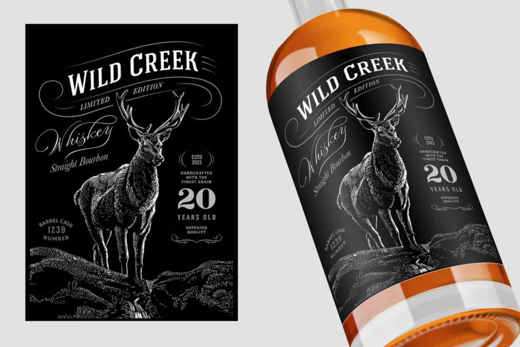
Colour choices influence emotion more than most people realise. Dark tones such as black, deep green, or navy often suggest richness and maturity. Warm tones like amber, gold, and copper connect directly to the liquid inside.
Limited colour palettes tend to work best. Too many colours can cheapen the appearance. Thoughtful contrast helps key elements stand out without clutter.
Metallic finishes, when used sparingly, can add a premium feel. Gold foiling remains popular, but subtle matte effects are gaining ground in modern whiskey bottle label design.
Materials and Finishes
The physical feel of a label matters as much as its look. Textured paper can suggest craftsmanship and age. Smooth finishes feel contemporary and refined.
Embossing and debossing add depth and tactile interest. They also encourage customers to pick up the bottle, increasing engagement.
Labels should align with the overall packaging. Many premium brands pair strong label design with protective outer packaging like Custom Bottle Boxes. This combination reinforces quality and creates a cohesive unboxing experience.
Balancing Tradition and Innovation
Whiskey brands often walk a fine line between heritage and modern appeal. Too much tradition can feel outdated. Too much innovation can feel inauthentic.
Successful whiskey bottle label design respects history while adapting to current tastes. This might mean using classic layouts with cleaner typography. It could also involve traditional symbols presented in a simplified way.
Craft distilleries often experiment more boldly. Limited editions allow room for creative freedom without risking brand consistency. These releases can attract collectors and generate buzz.
Established brands usually evolve slowly. Small refinements over time maintain recognition while keeping the design fresh.
Storytelling Through Label Design
Every whiskey has a story. It might be about place, process, people, or time. The label is where that story begins.
Good storytelling does not mean overcrowding the label with text. It means choosing the right details and presenting them clearly. A short origin note can be more powerful than a long paragraph.
Visual storytelling also plays a role. Illustrations, symbols, and icons can communicate heritage quickly. A distillery illustration can evoke place. A date can suggest legacy.
Consistency matters here. The story on the label should match the story on the website and marketing materials. Mixed messages weaken trust.
Legal and Practical Considerations
Whiskey labels must meet legal requirements. These vary by market but often include alcohol content, volume, origin, and health warnings.
Designers must plan for this information early. Trying to squeeze legal text into a finished design often leads to clutter. Instead, integrate it thoughtfully from the start.
Durability is another practical concern. Labels must withstand moisture, handling, and temperature changes. Materials and adhesives should be chosen with care.
A beautiful label that peels or fades quickly damages brand perception.
Adapting Whiskey Bottle Label Design for Digital Spaces
Many buyers now discover whiskey online before seeing it in person. Labels must perform well on screens as well as shelves.
Small details may disappear in thumbnail images. Clear shapes and strong contrast help maintain impact. Simplified layouts often translate better digitally.
Photography also matters. Labels should photograph well without glare or distortion. Matte finishes can reduce reflections and improve image quality.
Designers increasingly test labels in digital mock-ups before finalising production. This helps ensure consistency across platforms.
Sustainability and Modern Expectations
Sustainability is becoming more important to whiskey buyers, especially younger ones. Label materials can support this message.
Recycled paper, water-based inks, and minimal finishes reduce environmental impact. When used honestly, these choices can strengthen brand trust.
However, sustainability claims should be clear and accurate. Vague statements can backfire. Transparency is key.
Sustainable design does not mean sacrificing beauty. Many eco-friendly materials offer rich textures and natural tones that suit whiskey branding well.
Working with Designers and Printers
Great whiskey bottle label design is a collaborative process. Clear communication between brand owners, designers, and printers is essential.
Briefs should include brand values, target audience, price point, and distribution plans. The more context designers have, the better the outcome.
Printers can offer valuable advice on materials and finishes. Early consultation helps avoid costly revisions later.
Testing prototypes is always worth the time. Seeing a label on an actual bottle often reveals issues that screens cannot show.
Designing Labels That Last
Whiskey bottle label design shapes how your brand is seen and remembered. It influences trust, curiosity, and perceived value. When done well, it becomes part of the whiskey’s identity.
Strong labels balance clarity, storytelling, and craftsmanship. They respect tradition while embracing thoughtful innovation. They work equally well on shelves and screens.
If you are launching a new whiskey or refreshing an existing brand, invest in design with intention. Study your audience, honour your story, and collaborate with experienced professionals. The right label does not just sell a bottle. It builds a legacy.
Ready to refine your packaging and presentation? Start by reviewing proven label design tips and align your label with packaging that protects and elevates your product. Thoughtful design always pays off.
Medicine bottle label design plays a vital role in ensuring product safety, regulatory compliance, and brand trust within the pharmaceutical industry. A well-designed label clearly communicates dosage instructions, ingredients, and warnings while maintaining a professional and clean appearance. Effective medicine bottle label design also enhances shelf appeal, improves readability for patients, and supports accurate identification, helping healthcare providers and consumers make informed decisions with confidence.
Frequently Asked Questions
What makes a good whiskey bottle label design?
A good whiskey bottle label design is clear, readable, and authentic. It reflects the brand’s story and quality. It also stands out without feeling forced.
How important is typography on whiskey labels?
Typography is crucial. It sets the tone and improves readability. The right font can suggest tradition, modernity, or craftsmanship instantly.
Should whiskey labels be minimalist or detailed?
This depends on the brand and audience. Premium and modern brands often prefer minimalism. Heritage brands may use more detail. Balance is key.
Do whiskey labels need to change for different markets?
Yes, sometimes. Legal requirements vary, and cultural preferences differ. However, core branding should remain consistent.
How often should a whiskey label be redesigned?
Major redesigns should be rare. Subtle updates every few years help keep the brand fresh without losing recognition.