Introduction
Medicine bottle label design plays a critical role in healthcare, safety, and brand trust. It is not simply about making a bottle look attractive. A well-designed label helps patients understand dosage, usage, warnings, and expiry dates clearly. In the UK, where regulations are strict and patient safety is a priority, medicine bottle label design must balance clarity, compliance, and visual appeal. This article explores the full scope of medicine bottle label design, from legal requirements to typography, colours, materials, and user experience, while sharing expert insights to help you create labels that truly work.
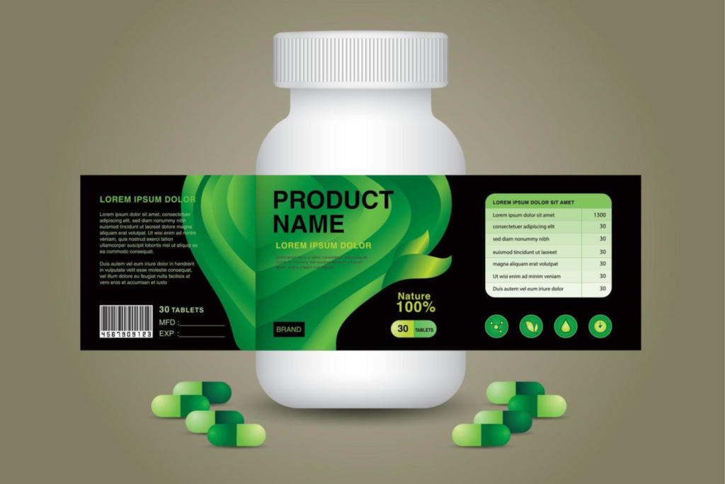
Medicine Bottle Label Design
Medicine bottle label design is often the first point of contact between a patient and a pharmaceutical product. When someone picks up a medicine bottle, they rely on the label to guide them. Clear information can prevent misuse, overdosing, or confusion. Poor design, on the other hand, can lead to serious health risks.
In the UK healthcare and pharmaceutical sector, labels must communicate complex information in a limited space. Designers must consider readability, hierarchy, and accessibility. At the same time, brands want labels that reflect trust, professionalism, and quality. This makes medicine bottle label design a specialised discipline that requires both creative and technical expertise.
Why Medicine Bottle Label Design Matters
Medicine bottle label design directly affects patient safety. A clear label reduces the risk of medication errors. It ensures patients can quickly identify the medicine, understand how to take it, and recognise warnings.
From a commercial perspective, good label design builds brand credibility. Pharmacies, hospitals, and consumers trust products that look professional and well-organised. In competitive markets, thoughtful design can also differentiate a product without compromising compliance.
Moreover, medicine bottle label design supports healthcare professionals. Doctors, nurses, and pharmacists rely on labels to identify medicines accurately, especially in busy environments. Consistency and clarity save time and reduce stress.
Regulatory Requirements in the UK
In the UK, medicine bottle label design must comply with guidelines set by authorities such as the Medicines and Healthcare products Regulatory Agency. Labels must include the medicine name, active ingredients, strength, dosage instructions, warnings, batch number, and expiry date. Prescription medicines require additional details, including patient name and dispensing pharmacy information.
Designers must ensure that mandatory information is easy to find and read. Font size, contrast, and layout are closely scrutinised. Overly decorative fonts or low-contrast colours are discouraged because they reduce readability.
Regulations also emphasise plain language. Medical jargon should be avoided where possible. This ensures that patients of different ages and literacy levels can understand the information. Medicine bottle label design must therefore prioritise clarity over creativity.
Typography and Readability
Typography is one of the most important elements in medicine bottle label design. The choice of font can determine whether information is readable at a glance. Sans-serif fonts are commonly used because they are clean and legible, even at small sizes.
Font hierarchy is equally important. The medicine name should stand out clearly. Dosage instructions and warnings should be easy to scan. Supporting information can be smaller, but never cramped. Adequate spacing between lines improves comprehension and reduces eye strain.
In the UK, designers must also consider elderly users. Many patients have reduced vision. Using larger font sizes and high contrast improves accessibility. This practical approach aligns with both ethical design principles and regulatory expectations.
Colour Psychology and Safety
Colour plays a subtle but powerful role in medicine bottle label design. While bright colours may attract attention, they must be used carefully. Colours should never distract from critical information.
In healthcare, colour is often used to indicate categories or warnings. For example, red may highlight caution, while blue often conveys trust and calm. However, designers must ensure that colour is not the only way information is communicated. Colour-blind users should still be able to understand the label.
Consistency is also important. Brands that use a consistent colour palette across their medicines help patients recognise products easily. This reduces confusion and builds long-term trust.
Layout and Information Hierarchy
A successful medicine bottle label design follows a clear information hierarchy. The eye should naturally move from the medicine name to dosage, then to warnings and additional details. Crowded layouts overwhelm users and increase the risk of mistakes.
White space is a valuable tool. It allows information to breathe and improves focus. Designers should resist the temptation to fill every inch of the label. Instead, they should guide the reader’s attention with alignment and spacing.
In many cases, wrap-around labels are used on bottles. Designers must consider how information flows around the bottle. Important details should not be hidden in awkward positions or creases.
Material Choices and Durability
Material selection is another critical aspect of medicine bottle label design. Labels must withstand handling, moisture, and temperature changes. In pharmacies and homes, bottles are frequently touched. Labels that smudge or peel quickly undermine trust.
Common materials include paper, synthetic films, and laminated finishes. Synthetic labels are often preferred because they resist water and tearing. Matte finishes reduce glare and improve readability under bright lighting.
Sustainable materials are also gaining importance in the UK. Eco-friendly labels appeal to environmentally conscious consumers and align with broader sustainability goals, without sacrificing durability.
Branding Within Medical Constraints
Branding in medicine bottle label design must be subtle and responsible. Unlike consumer goods, pharmaceutical products cannot rely on bold visuals or heavy marketing language. Trust and professionalism are more important than excitement.
Logos should be present but not overpowering. Brand colours can be used, but they should not interfere with legibility. A clean and consistent design across product ranges helps establish a strong brand identity.
Packaging also plays a role in branding. Many companies pair effective labels with well-designed packaging, such as Custom Bottle Boxes, to create a cohesive and professional presentation. This combination enhances both safety and shelf presence.
User Experience and Human-Centred Design
Modern medicine bottle label design increasingly focuses on user experience. Designers consider how real people interact with medicine bottles in daily life. This includes opening bottles, reading labels in low light, and storing medicines at home.
Human-centred design encourages empathy. Designers may test labels with different age groups to identify issues. Simple changes, such as clearer headings or better contrast, can significantly improve usability.
Clear instructions reduce anxiety. When patients feel confident about how to take their medicine, adherence improves. This makes good label design an important part of healthcare outcomes.
Common Mistakes to Avoid
One common mistake in medicine bottle label design is overcrowding. Trying to include too much information without proper hierarchy leads to confusion. Another issue is poor contrast, which makes text hard to read.
Using decorative fonts is also problematic. While they may look appealing, they often reduce clarity. In healthcare, function should always come before style.
Ignoring accessibility is another serious mistake. Labels should be designed for everyone, including those with visual impairments. Following proven label design tips from trusted design resources helps avoid these pitfalls and improves overall quality.
The Role of Technology in Label Design
Technology has transformed medicine bottle label design. Digital printing allows for high precision and flexibility. Variable data printing enables personalised labels, especially for prescription medicines.
QR codes are also becoming more common. They can link patients to additional information, such as usage videos or detailed leaflets. While QR codes should not replace essential printed information, they can enhance the user experience.
Design software and prototyping tools allow designers to test layouts quickly. This reduces errors and ensures compliance before mass production.
SEO and Online Visibility for Pharmaceutical Brands
Although medicine bottle label design is a physical product, online visibility still matters. Pharmaceutical companies often showcase their products on websites and digital catalogues. High-quality label design photographs improve credibility and trust online.
Consistent branding across labels and digital platforms strengthens recognition. When patients search for information, familiar visuals reassure them. This indirect connection between label design and online presence supports broader marketing and communication goals.
Medicine bottle label design is a critical intersection of safety, compliance, and branding. In the UK, effective design prioritises clarity, accessibility, and trust. Every decision, from typography to materials, affects how patients interact with their medicine.
Investing in professional medicine bottle label design reduces risks and enhances brand reputation. If you are developing or updating pharmaceutical packaging, now is the time to review your labels carefully. Work with experienced designers, follow regulations, and always put the user first. Thoughtful design can truly make a difference in healthcare outcomes.
Creative water bottle label design plays a vital role in shaping brand identity and attracting customer attention. A well-designed label combines eye-catching colours, clear typography, and practical information to create a strong first impression. By balancing creativity with clarity, brands can communicate their values, stand out on crowded shelves, and build trust with consumers while enhancing the overall appeal of the product.
Frequently Asked Questions
What information must be included on a medicine bottle label in the UK?
A UK medicine bottle label must include the medicine name, active ingredients, strength, dosage instructions, warnings, expiry date, and batch number. Prescription labels require additional patient and pharmacy details.
Why is readability so important in medicine bottle label design?
Readability ensures patients can understand instructions quickly and accurately. Clear labels reduce medication errors and improve safety.
Can branding be used on medicine bottle labels?
Yes, branding can be used, but it should be subtle. The primary focus must remain on clear and compliant information.
What materials are best for medicine bottle labels?
Durable, water-resistant materials are ideal. Synthetic labels with matte finishes are commonly used in the UK.
How can medicine bottle label design improve patient adherence?
Clear instructions and logical layouts reduce confusion. When patients understand how to take their medicine, they are more likely to follow instructions correctly.
If you want labels that are safe, compliant, and professional, focus on expert-led medicine bottle label design and thoughtful packaging solutions today.