Introduction
In today’s competitive marketplace, packaging has evolved beyond simple product protection—it’s a powerful branding tool. One of the most visually striking trends in recent years is gradient packaging design. This style, defined by the seamless blending of colours, creates emotional depth, sophistication, and a sense of modernity that instantly captures consumer attention. Whether you’re a designer, brand owner, or marketing professional, understanding the potential of gradient packaging can give your product a competitive edge on the shelf.
What Is Gradient Packaging Design?
Gradient packaging design refers to the use of gradual transitions between two or more colours to create a soft and visually appealing effect. Rather than relying on flat tones or single-colour backgrounds, gradients add a feeling of dimension and movement. They can evoke emotions, suggest quality, and help brands express their identity more dynamically. Gradients are not new in design, but their resurgence in packaging stems from the digital era’s love for fluid and expressive aesthetics.
The Psychology of Colour Gradients in Packaging
Colours have a profound psychological impact, and when blended strategically, they can enhance consumer engagement. Warm gradients—such as red to orange—evoke energy, excitement, and appetite, making them suitable for food or beverage packaging. Cooler gradients—like blue to teal—communicate calmness, trust, and sophistication, perfect for skincare or technology products. Pastel gradients give off a minimalistic yet modern vibe, aligning with contemporary, eco-friendly, and lifestyle brands.
Using gradients allows brands to communicate layered emotions rather than a single tone. For instance, a transition from pink to gold may suggest femininity mixed with luxury. This emotional storytelling through colour transitions gives gradient packaging design its unique charm and visual strength.
Why Gradient Packaging Design Works
Consumers are visually driven. In a crowded marketplace, the human eye is naturally drawn to patterns of light, shade, and colour transition. Gradient packaging creates a sense of motion and depth that makes the product appear more premium and engaging.
Gradients also help differentiate brands. A product using gradient tones stands out in a lineup of flat-coloured packaging. Moreover, gradients offer flexibility—they can be bold and loud for youth-oriented products or soft and elegant for luxury goods. Their adaptability makes them ideal for almost every industry, from cosmetics and electronics to gourmet foods and fashion accessories.
Modern Techniques for Gradient Packaging Design
Creating effective gradient packaging requires thoughtful use of digital tools and printing technologies. Designers often rely on vector software like Adobe Illustrator or Photoshop to craft smooth transitions. Advanced digital printing techniques now allow these gradients to be accurately reproduced on different materials—paperboard, plastic, metal, or fabric.
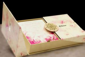
A crucial part of modern packaging innovation is Custom Packaging. Brands can now work with dedicated packaging providers such as Buddy Packaging Location, ensuring their designs are not only visually stunning but also perfectly tailored to their physical product. When gradients are integrated into Custom Packaging solutions, they bring a tactile and emotional experience that enhances perceived brand value.
Best Practices for Effective Gradient Packaging
To create visually harmonious designs, professionals must follow key principles. First, choose complementary colours that blend naturally. Sudden or clashing transitions can make packaging look unprofessional. Second, ensure contrast and readability—important information such as logos or product names should remain visible. Using a light-to-dark gradient background can make white or black text stand out beautifully.
Another vital consideration is consistency across brand touchpoints. Gradients used on packaging should align with digital media, promotional materials, and the brand’s overall identity. Cohesion strengthens recognition and builds trust. Designers can refer to expert packaging design tips to understand how colour harmony, typography, and minimalism enhance visual communication.
Popular Gradient Styles in Packaging Design
Soft Pastel Gradients
These gradients use gentle tones like peach, mint, lavender, and sky blue. They’re ideal for eco-conscious or beauty brands. The soft transitions communicate purity and calmness.
Vivid Multicolour Gradients
These bold transitions feature bright hues—perfect for tech, fashion, or youth brands. They suggest creativity, innovation, and excitement.
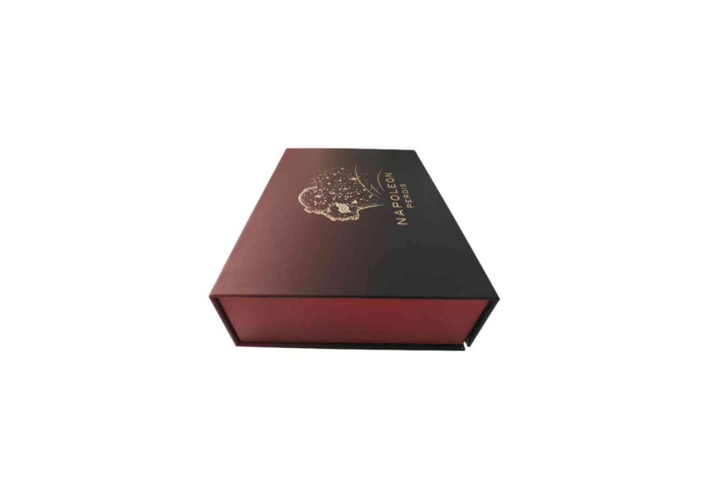
Metallic and Iridescent Gradients
Printing technologies now enable metallic finishes that mimic gradient lighting. These give products a high-end, futuristic appeal often used in luxury cosmetics or limited-edition goods.
Monochromatic Gradients
A single hue with light-to-dark shading can create depth while maintaining minimalism. It’s excellent for brands seeking elegance and sophistication without overcomplicating the visual palette.
Challenges in Gradient Packaging
While stunning, gradients can be tricky to print accurately. Colour shifts may appear differently across materials or under varying light conditions. To maintain quality, designers should test print proofs and collaborate closely with packaging suppliers experienced in colour calibration.
Another challenge is overuse. Gradients are trendy, but when poorly executed, they can feel forced or dated. The key is subtlety—using gradients as supportive design elements rather than overpowering visuals.
Sustainability and Gradient Packaging
Modern consumers value eco-conscious packaging. Fortunately, gradient packaging design can align with sustainability goals when paired with recyclable or biodegradable materials. Using digital printing minimises ink waste and supports short production runs, reducing environmental impact. Brands can combine vibrant design aesthetics with responsible manufacturing—showing that sustainability doesn’t mean compromising creativity.
The Role of Gradient Packaging in Branding
Gradient packaging is more than just an aesthetic trend—it’s a strategic branding choice. The smooth transition of colours mirrors the modern consumer’s lifestyle: dynamic, fluid, and expressive. Brands leveraging this style position themselves as forward-thinking and visually confident.
From startups to established companies, the versatility of gradients enables consistent brand evolution. When paired with tactile finishes like embossing, matte coatings, or foil stamping, the result is packaging that feels as luxurious as it looks.
Case Studies of Successful Gradient Packaging
Many global brands have adopted gradient packaging to redefine their image. Beverage brands use bright gradients to symbolise refreshment and energy. Tech brands like Apple and Google integrate gradients subtly to reflect innovation and inclusivity. Independent cosmetic brands use soft gradients to convey purity and modern beauty ideals.
This success across industries highlights how flexible and powerful gradient design can be when implemented thoughtfully. It helps products feel current while leaving a memorable visual impact.
How to Create a Winning Gradient Packaging Concept
- Start with Brand Identity: Understand the brand’s story, tone, and target audience.
- Select Purposeful Colours: Each shade should reflect emotion and brand value.
- Plan Gradient Direction: Horizontal, vertical, or radial transitions all create different visual effects.
- Test for Versatility: Ensure your design looks strong in both digital previews and printed form.
- Collaborate with Experts: Work with experienced designers and packaging partners who can deliver precision.
By focusing on clarity, balance, and emotional impact, brands can craft packaging that tells a story through every colour transition.
How Gradient Design Enhances Shelf Presence
Gradients have a unique ability to make packaging pop in physical and digital environments. The human eye is drawn to variation and light, and gradients simulate both. They give the illusion of texture and movement even on flat surfaces. This effect makes products appear more dynamic compared to competitors relying solely on static colours.
Moreover, gradient backgrounds photograph beautifully, making them ideal for social media marketing. As consumers increasingly share unboxing experiences online, packaging aesthetics directly influence brand perception and word-of-mouth marketing.
Future Trends in Gradient Packaging
The next evolution in gradient packaging design will likely merge technology with sustainability. Expect to see smart packaging integrated with digital printing techniques, AR experiences, and eco-friendly inks. Customisation will also grow—where customers can choose or personalise gradient patterns during the order process. As gradient packaging design continues to evolve, it will remain a bridge between creativity and emotion, art and commerce, design and sustainability.
Gradient packaging design represents the perfect balance of art and strategy. It’s not just about making a product look beautiful—it’s about creating an emotional connection that reflects a brand’s essence. With colour gradients, brands can communicate sophistication, creativity, and dynamism in one cohesive visual language.
Whether you’re launching a new product or refreshing an existing line, now is the time to embrace gradients. Partner with professionals who understand design precision, colour psychology, and modern packaging production. If you’re ready to elevate your brand presence through innovative visuals, explore Custom Packaging and learn more about expert packaging design tips to bring your creative vision to life. You can even visit Buddy Packaging Location to discuss your design needs and transform your packaging into an unforgettable brand statement.
FAQs
What is the purpose of gradient packaging design?
Gradient packaging helps brands stand out by adding depth, energy, and emotional storytelling through colour transitions.
How do you choose colours for gradient packaging?
Select colours that reflect your brand’s tone and complement each other naturally. Test them under different lighting conditions.
Is gradient packaging expensive to produce?
Not necessarily. Modern digital printing technologies make it cost-effective, especially for small to medium production runs.
Can gradient packaging be eco-friendly?
Yes, when combined with recyclable or biodegradable materials and low-impact printing methods.
Which industries use gradient packaging most often?
Cosmetics, beverages, technology, and luxury goods brands frequently use gradients to enhance shelf presence and perceived value.