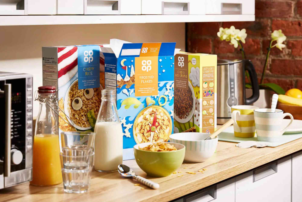
Packaging is more than protection — it’s storytelling. Among all packaging types, cereal boxes hold a special place in design history. From bright colours to engaging mascots, the cereal aisle has long been a battlefield of creativity. In today’s world, creative cereal box designs are not only about visuals; they are about crafting an experience that connects emotionally with customers while standing out on crowded shelves.
The Art of Cereal Box Design
Cereal packaging is often a customer’s first touchpoint with a brand. The box must communicate flavour, nutrition, and brand personality — all within a few seconds of visual contact. Great cereal box design captures attention, creates curiosity, and drives purchase decisions. A blend of smart typography, unique shapes, and thoughtful colours palettes ensures that a brand doesn’t just sit on the shelf — it shines.
How Creativity Shapes Brand Identity
Creative cereal box designs play a major role in how consumers perceive a brand. Think of the excitement children feel when they spot their favourite cereal mascot, or the trust adults associate with minimalist, eco-friendly packaging. A creative design can make a product feel premium, nostalgic, or playful, depending on the audience. It’s not just about being beautiful — it’s about being meaningful.
Brands that experiment with shape, material, and storytelling often see better customer engagement. For instance, limited-edition packaging and interactive QR codes allow brands to create memorable experiences that extend beyond breakfast.
Colours Psychology in Packaging
Colours choice is crucial in cereal packaging. Warm tones like orange and red trigger appetite and excitement, while greens and browns signal health and sustainability. Designers use these cues strategically to appeal to specific consumer emotions. For example, a cereal aimed at fitness enthusiasts may use calming greens and whites to express purity and balance, while a children’s cereal might feature bold primary colours to evoke fun and energy.
Trends in Modern Cereal Box Designs
The cereal industry constantly evolves, and design trends reflect broader cultural shifts. From sustainability to storytelling, brands are reimagining how they present themselves.
Minimalism Meets Functionality
Modern cereal boxes are increasingly embracing minimalism — clean lines, simple fonts, and uncluttered visuals. This trend reflects consumer preferences for authenticity and transparency. Shoppers today want to understand what’s inside their food, and minimalist designs allow important information like ingredients and nutritional facts to stand out.
A prime example can be seen in boutique brands that use soft pastels and matte finishes, creating a refined yet approachable aesthetic. These designs often rely on the quality of typography and subtle illustrations to deliver impact.
Sustainability as a Design Driver
Sustainability is more than a buzzword — it’s a responsibility. Creative cereal box designs now frequently include recyclable materials, soy-based inks, and biodegradable coatings. This not only appeals to environmentally conscious consumers but also aligns brands with global movements toward greener living.
Brands using compostable packaging or refillable containers position themselves as innovators in a changing marketplace. A creative approach to eco-design doesn’t have to sacrifice visual appeal; in fact, natural textures and earthy tones can make a design feel more genuine and desirable.
Interactive and Digital Elements
Technology has reshaped how we experience packaging. QR codes, augmented reality, and online games integrated into cereal box designs are bridging the gap between physical and digital engagement. These elements offer extra value — whether through nutrition tracking apps, loyalty programmes, or playful interactions for children.
Such experiences help brands build loyalty and encourage repeat purchases. When design meets interactivity, the packaging becomes a platform rather than a mere container.
The Balance Between Creativity and Clarity
While creativity drives interest, clarity ensures comprehension. A cereal box must communicate key product details instantly — flavour, dietary information, and portion size. Overly complex designs risk confusing buyers. The best creative cereal box designs achieve harmony: bold enough to attract attention, yet clear enough to inform.
Typography plays a central role here. Readable fonts paired with smart hierarchy guide the consumer’s eye naturally across the box. The placement of brand logos, taglines, and nutritional claims should support an effortless flow of information.
Emotional Storytelling Through Design
Every cereal box tells a story. For some brands, it’s nostalgia — reviving classic characters or retro illustrations to reconnect with long-time fans. For others, it’s innovation — showcasing new flavours or healthier ingredients. The emotional pull of design helps turn casual buyers into loyal customers.
For example, using hand-drawn illustrations or photography that reflects real-life moments creates a personal bond with consumers. Storytelling isn’t just written on the box; it’s visually embedded in every curve, line, and shade.
How Creative Packaging Influences Buying Decisions
Packaging is often a silent salesperson. Studies have shown that visual design influences consumer perception even before they read the label. Cereal brands that invest in creative design often see measurable growth in sales and brand awareness.
Whether it’s through clever use of space, texture, or colours contrast, the goal is to make the product unforgettable. In many cases, innovative design also becomes shareable content — inspiring customers to post and promote their breakfast experiences online, expanding organic reach.
Finding Inspiration for Your Own Cereal Box Design
If you’re a brand or designer exploring new packaging concepts, learning from successful examples is invaluable. Looking at platforms such as box design inspiration can help spark creativity and show what’s trending in the industry.
Meanwhile, if you’re planning a custom project or launching a new product, you can explore tailored options through Custom Boxes. Choosing the right materials, finishes, and printing techniques will make your packaging stand out in both look and quality.
And if you’d like to connect with design experts directly, you can find directions to their studio via Buddy Packaging Location.
FAQs About Creative Cereal Box Designs
What makes a cereal box design successful?
A successful design balances creativity, clarity, and storytelling. It captures attention while clearly communicating what the product offers.
How can I make my cereal box stand ouming popular?
Consumers are more environmentally aware, and brands using recyclable or biodegradable materials gain both trust and long-term loyalty.
Do cereal box designs affect sales?
Absolutely. Creative designs attract attention on shelves, influence perception, and encourage impulse buying.
What tools do designers use to create cereal box designs?
Designers often use software like Adobe Illustrator or Photoshop, combined with 3D mock-ups, to visualise how designs look in real life.
The Future of Cereal Packaging
Creative cereal box designs are shaping the future of branding. They merge art, psychology, and strategy into one compelling package that speaks to consumers before they even taste the product. As technology evolves and sustainability grows more important, packaging will continue to be a key differentiator in a competitive market.