Introduction
The world of 70s packaging design remains one of the most influential eras in visual branding. This decade brought bold experimentation, expressive typography, and vibrant colours that still inspire designers today. From supermarket shelves to iconic product branding, 70s packaging design created a strong emotional connection with consumers.
Today, brands revisit this nostalgic style to stand out in crowded markets. Whether you run a small business or explore Custom Packaging, understanding this era can elevate your brand identity. Let’s explore what made 70s packaging design so unique and why it continues to shape modern packaging trends.
The Origins of 70s Packaging Design
The 1970s was a time of cultural change and creative freedom. Designers moved away from strict, minimal styles of the 1960s. Instead, they embraced bold graphics and playful experimentation. This shift influenced every aspect of packaging design.
During this period, brands aimed to capture attention quickly. Supermarkets were expanding, and competition increased. As a result, packaging became a powerful marketing tool rather than just a protective layer.
Moreover, technological advancements allowed designers to experiment with printing techniques. This opened doors for richer colours and more detailed illustrations. These changes defined the essence of 70s packaging design.
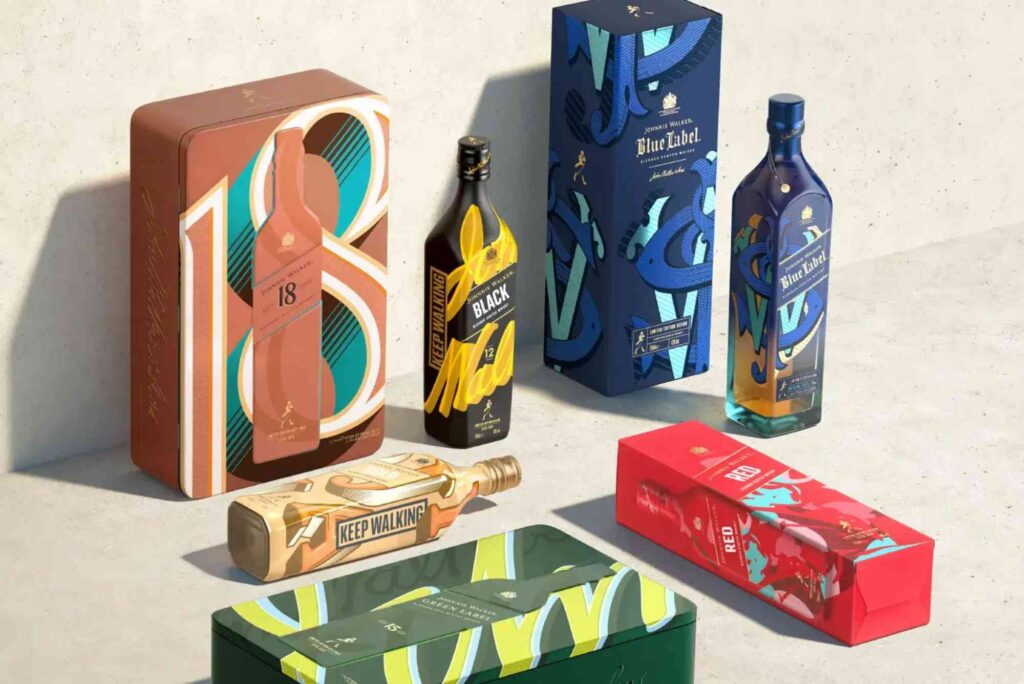
Key Characteristics of 70s Packaging Design
Bold Colour Palettes
One of the most recognisable elements of 70s packaging design is its vibrant colour use. Designers often used earthy tones like mustard yellow, burnt orange, olive green, and deep brown. At the same time, bright shades such as neon pink and electric blue also appeared.
These colour combinations created a warm yet energetic visual experience. They helped products stand out on shelves and made brands memorable.
Retro Typography
Typography in 70s packaging design was expressive and unique. Fonts were often curved, chunky, and playful. Many designs used custom lettering instead of standard typefaces.
This approach gave packaging a personal and artistic feel. It also made brand names more recognisable. Today, many designers still follow these packaging design tips when creating retro-inspired products.
Organic Shapes and Patterns
Another defining feature of 70s packaging design is the use of organic shapes. Instead of straight lines, designers preferred flowing curves and abstract forms. Patterns often included waves, swirls, and geometric designs.
These elements created movement and visual interest. They also reflected the cultural trends of the time, including music and art movements.
Illustration and Hand-Drawn Elements
Hand-drawn illustrations played a major role in 70s packaging design. Unlike modern digital graphics, these designs had a human touch. This made products feel authentic and relatable.
Illustrations often told a story or highlighted product features. This storytelling approach remains a valuable strategy in modern packaging.
Why 70s Packaging Design Still Matters
Despite being decades old, 70s packaging design continues to influence modern branding. Many companies revisit this style to evoke nostalgia and trust.
Consumers often associate retro designs with authenticity and quality. This emotional connection can increase brand loyalty and recognition. Additionally, the bold visuals of 70s packaging design help products stand out in today’s competitive market.
Another reason for its relevance is its versatility. Designers can blend retro elements with modern techniques to create fresh and unique packaging.
How to Apply 70s Packaging Design Today
Incorporating 70s packaging design into modern branding requires balance. You want to capture the essence without making the design feel outdated.
Start by choosing a suitable colour palette. Earthy tones combined with bold accents can create a retro feel. Next, experiment with typography. Select fonts that reflect the playful nature of the 70s while remaining readable.
Adding hand-drawn elements can also enhance authenticity. However, ensure the overall design aligns with your brand identity. Consistency is key when applying 70s packaging design principles.
The Role of Sustainability in Retro Packaging
Modern consumers care about sustainability. While 70s packaging design focused on aesthetics, today’s brands must consider environmental impact.
Combining retro design with eco-friendly materials is a smart approach. Recyclable packaging, minimal waste, and sustainable inks can enhance your brand image. This approach allows you to honour the past while meeting modern expectations.
Common Mistakes to Avoid
While 70s packaging design offers many benefits, it’s important to avoid certain mistakes. Overusing retro elements can make your packaging look cluttered. Instead, focus on a few key features.
Another mistake is ignoring your target audience. Not all customers connect with retro styles. Therefore, ensure your design appeals to your specific market.
Finally, avoid copying old designs directly. Instead, use them as inspiration to create something original.
The Future of 70s Packaging Design
The influence of 70s packaging design is unlikely to fade. As trends cycle, nostalgia continues to play a significant role in branding. Designers are constantly finding new ways to reinterpret retro styles.
In the future, we can expect to see more hybrid designs. These will combine vintage aesthetics with modern technology. For example, augmented reality features may be added to retro packaging.
This blend of old and new ensures that 70s packaging design remains relevant for years to come.
Conclusion
70s packaging design is more than just a trend. It represents a creative revolution that changed how brands communicate with consumers. Its bold colours, unique typography, and artistic elements continue to inspire designers worldwide.
By understanding and applying these principles, you can create packaging that stands out and connects emotionally with your audience. Whether you are exploring Custom Packaging or refining your brand strategy, the lessons from the 70s remain valuable.
Now is the perfect time to experiment with retro-inspired designs. Start small, test ideas, and refine your approach. With the right balance, 70s packaging design can transform your brand and capture attention in today’s market.
FAQs
What is 70s packaging design?
70s packaging design refers to the bold, colourful, and expressive style used in product packaging during the 1970s.
Why is 70s packaging design popular again?
It creates nostalgia and helps brands stand out. Consumers often trust retro-inspired designs.
What colours are used in 70s packaging design?
Common colours include mustard yellow, burnt orange, olive green, and bright neon shades.
How can I use 70s packaging design today?
You can combine retro colours, typography, and patterns with modern design techniques.
Is 70s packaging design suitable for all brands?
Not always. It works best for brands targeting audiences who appreciate nostalgic and creative styles.
Can Packaging Design plays a crucial role in how products are perceived and chosen by consumers. It combines creativity with functionality, ensuring that items are both visually appealing and practical to use. From colour schemes to materials, every detail influences buying decisions. Strong packaging design not only protects the product but also communicates brand identity, helping businesses stand out in competitive markets.